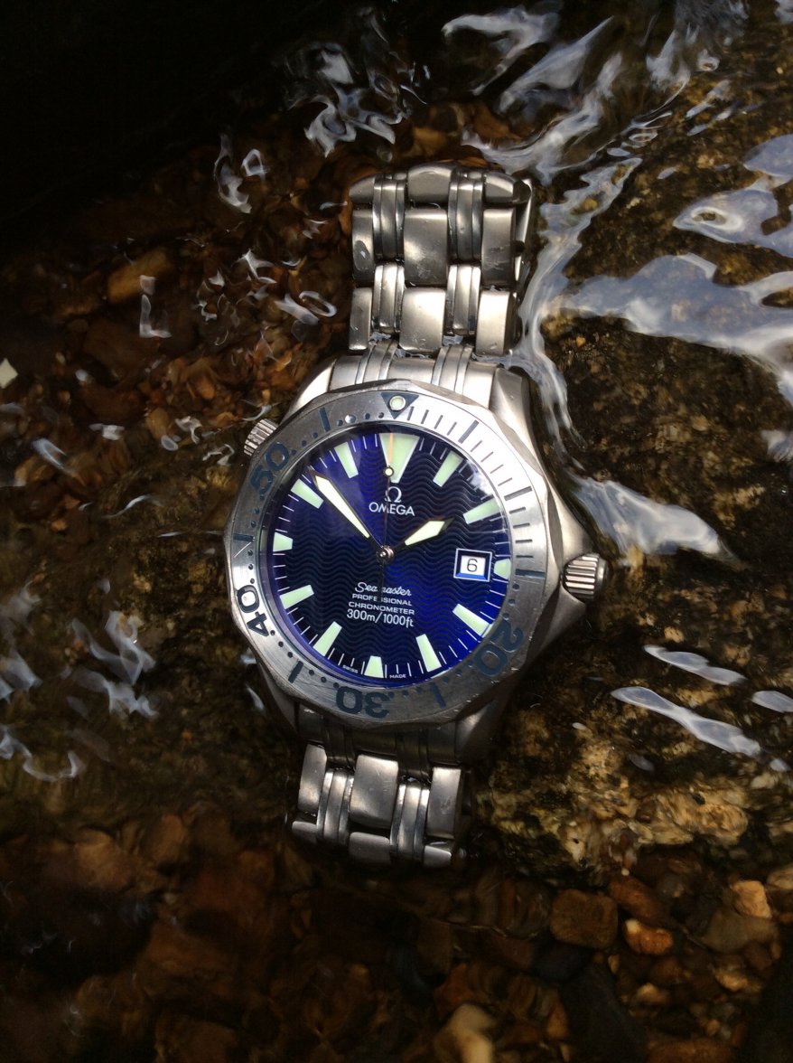
Here's a couple 11 more reasons:
1) it's too thin!...a dive watch should be thick and chunky so you always know it's on your wrist.
2) the scalloped bezel doesn't hurt your fingers when you turn it, what?!...that's what it's all about? It should have a coin edge or notches like all the other divers out there.
3) the almost hidden date window: what?!...if your going to have a date window it should be loud and obvious like with a white background, window frame or a magnification cyclops on the crystal. This is exactly reason the Sea-Dweller is so unpopular.
4) the domed crystal...No!...it's should be flat so you can make sun reflection spots on the walls for you cats to play with. Also it's nice to have an abrupt edge to the crystal so it can chip.
5) the painted logo, script and markers on the dial...a tool watch should be more blingy with applied white gold logos and white gold surrounds...that's why the vintage Subs, GMT's, Seamasters etc. are not very popular with collectors.
6) the 2254 lacks a ceramic bezel!...I hate that because it's not shiny enough!
7) the clasp is too contoured and we'll designed...it doesn't make enough noise when I open or close it by pushing the buttons
8) 2 matching sword hands....WRONG!...the minute hand should be baton style for more variety
9) the matte charcoal wave dial: yet another design error- it should be a shiny black surface, for a more bringy appearance.
10) the solid caseback: another mistake....it should be a glass-back. I mean who wants that Hippocampus thing on there? It never really went we the Seamaster branding.
11)What?!...no "Bond bracelet"?...that's inappropriate and unfashionable.
Oh yeah, terrible watch...I hate mine so much I don't ever want another diver....


