- Posts
- 20
- Likes
- 5
forpurpur
·Hi OF, been looking through the forums and learning a lot. Went through several threads, even linking to other sites and downloaded several pdfs to read through as well. Having said that, I'm still very new at this of course.
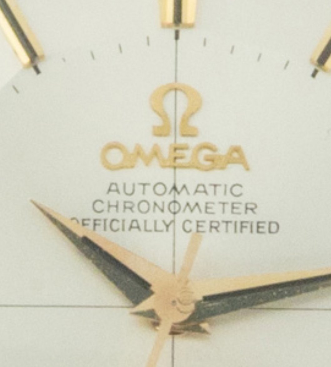
I'm seeing 3 issues with this dial. I could well be wrong.
1) The fonts seem slightly thick. Signs of retouch? Maybe just a hint.
2) The fonts seem overly serif. The tail-end of the font seems overly pronounced. An overemphasis?
3) MOY test... Drawing an imaginary line down the MOY, it cuts the edge of the O (instead of passing right through the middle as I've seen in many perfect examples). Is that right? Does it pass the MOY test? Is that acceptable?
What do you think?


