Omega @ Baselworld 2016
Jean Marc
·This image (in the form of a swirling .GIF) is now the first thing you see on Omega's official web site. Are we being told there is some orange ceramic on the way?
image credit: www.omegawatches.com
M'Bob
·I'm puzzled by this design direction. Last year, some refined and elegant offerings like the 300 and Tresor. This year, their only competition aesthetically would be G Shock.
Frunkinator
·I guess I'm NOT the only one who doesn't care for this year's offerings...
M'Bob
·the Explorer 1 is a classic..many consider it to be the definition of what Rolex tool watch should be...the Basel 2016 release has adjusted some design aspects to make it perfect.
Agreed. Sadly, Omega is not alone in their design botches. Excepting the Explorer you mention, most of the major companies have put forth nothing but dreck for this show.
Superdoc
·Riviera Paradise
·Agreed. Sadly, Omega is not alone in their design botches. Excepting the Explorer you mention, most of the major companies have put forth nothing but dreck for this show.
Sorry I beg to differ...I am not a natural Rolex fan and even less so a Daytona fan, but the new black ceramic bezel SS white dial Daytona together with the Explorer 1 are clear home runs for the "Crown". Tudor have also launched some interesting Black Bay variants with in-house movements.
Tag have an exciting new "Monza vintage" reissue, Glashutte has a very interesting Original Senator with a new 100h power reserve calibre, Blancpain has two lovely new versions of the Fifty Fathoms...Patek has a gorgeous world timer chronograph... the list goes on.
I am very sorry to say this, as I consider myself to be such a strong defender of the Omega brand....but they have gone completely over the top in their design language for Basel 2016.
I ended up buying three of the Basel 2014 watches (Apollo XI-45, Seamaster 300MC, Tresor)...I find it highly unlikely that I will buy any of the Basel 2016 watches launched so far.
Edited:
Riviera Paradise
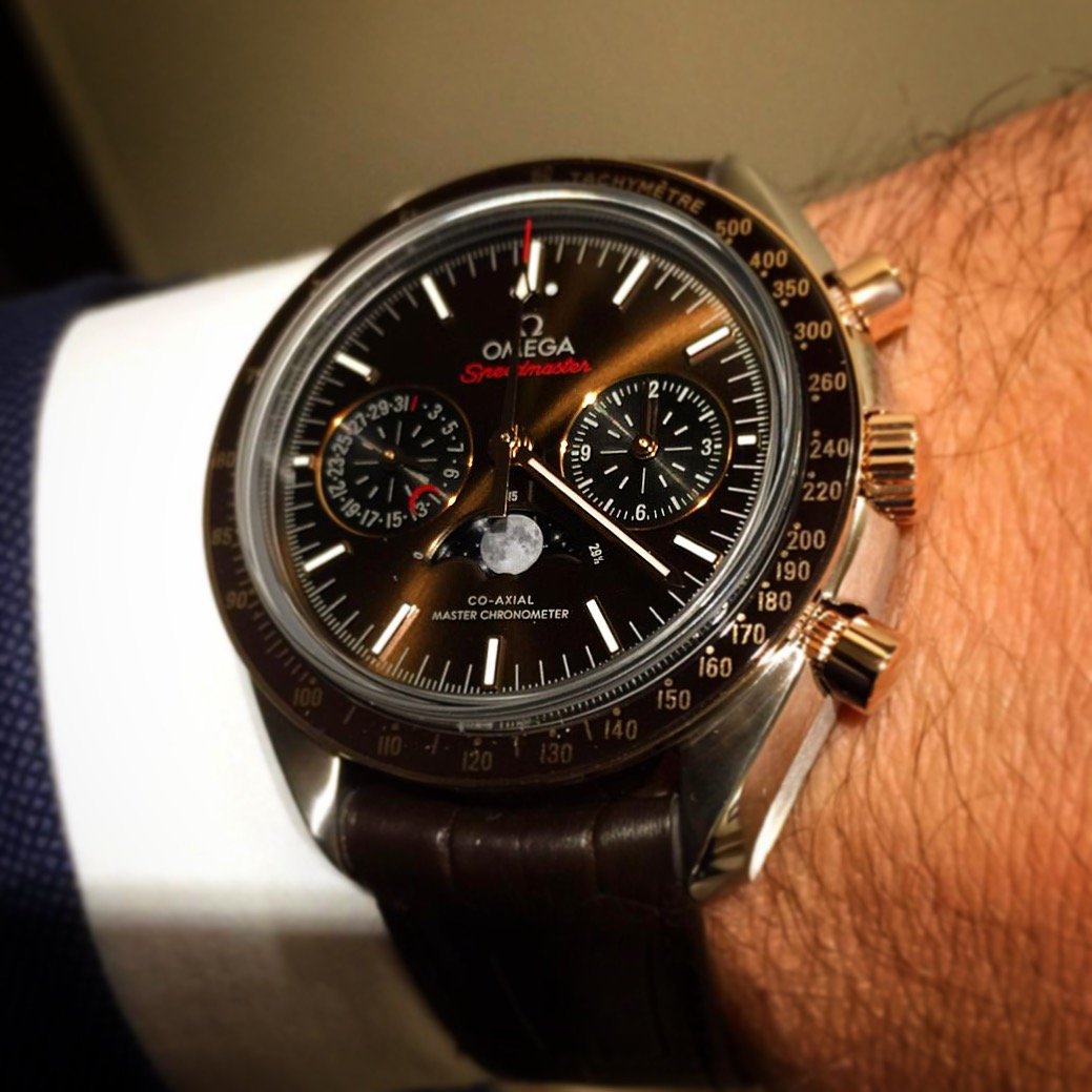
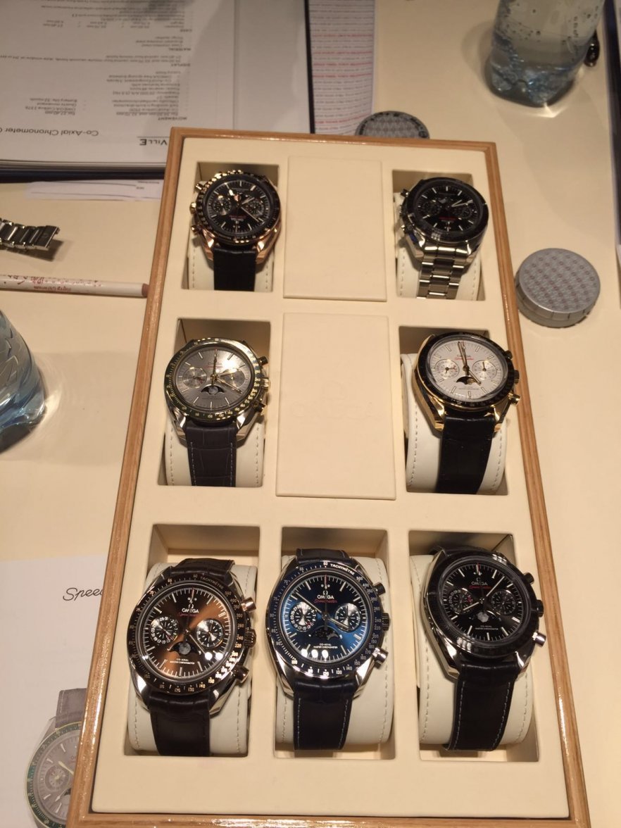
·Sorry @Superdoc...no...I don´t think a "dressy" gold case works well with a photo-shopped "techy" Moonphase. I have not seen the posted watch live, but I really think this new Moonphase watch should be purchased only with a stainless steel case.
In your posted pic, the black and blue dial variants look quite good.
Superdoc
·Sorry @Superdoc...no...I don´t think a "dressy" gold case works well with a photo-shopped "techy" Moonphase. I have not seen the posted watch live, but I really think this new Moonphase watch should be purchased only with a stainless steel case.
In your posted pic, the black and blue dial variants look quite good.
You've hit on a major point with which I'm struggling....
it's almost like there is just too much going on there...
If nothing else... there's an opportunity to catch up on some of the models that keep getting bumped from the front of the line... (tresor, Orange gold speedmaster 9300).... of course seeing a watch on your wrist and seeing the photos are two very very different things...
When I first saw the Globemaster from Basel photos, I was completely underwhelmed...
rbob99
·Going back to white numerals on the Explorer I from the shiny metallic numerals is a massive improvement. I don't have any excuses left for not owning an Explorer.
The Explorer 1 with the correct size hands - that's a buy for me.
Nobel Prize
·The Explorer 1 with the correct size hands - that's a buy for me.
ConElPueblo
·red side of the moon?
Could it actually follow a, eh, different cycle than the moon cycle? If that's the case, Omega may have a case for receiving the Nobel Peace Prize.
Longbow
·Could it actually follow a, eh, different cycle than the moon cycle? If that's the case, Omega may have a case for receiving the Nobel Peace Prize.
hansmaulwurf
··Senior Snoopy OwnerWell:
Omega did a great job at Basel 2016 ... after what i have seen from the novelties: The Price of the Snoopy2 will not drop for one Dollar 😝
Best Regards,
Hans
Omega did a great job at Basel 2016 ... after what i have seen from the novelties: The Price of the Snoopy2 will not drop for one Dollar 😝
Best Regards,
Hans
meganfox17
·Why is an Omega fan like me seem more interested in what Rolex is offering at Baselworld 2016?
i'm super impressed with new Rolex Explorer 214270. Really love the detailing & that old school sports vibe.... Shame on Me [emoji17]
i'm super impressed with new Rolex Explorer 214270. Really love the detailing & that old school sports vibe.... Shame on Me [emoji17]
Edited:


