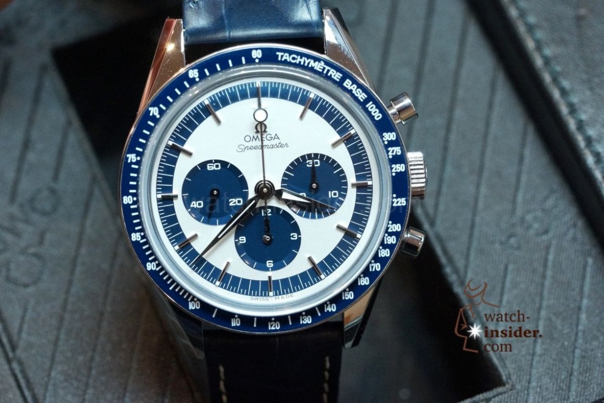
overall: a very mixed bag
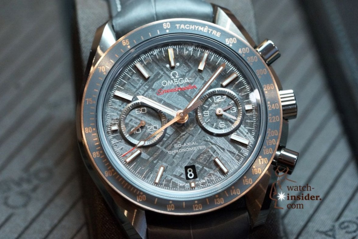
i like the GSOTM - if it werent for the ugly black hole in the dial

why don't they start hiring REAL DESIGNERS that get the BASICS right (there's nothing black on the watch - why a black date disk? ... did they even bother to check the name of the watch? ...I can so see a grey date dial with red numbers ... voilá - everybody happy ... but no

- the blue reduced is rather nice ...
👍
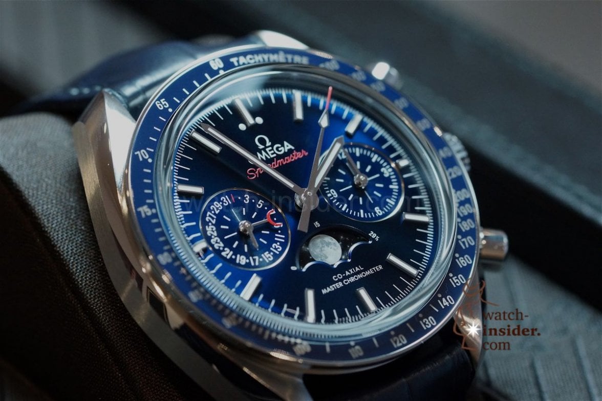
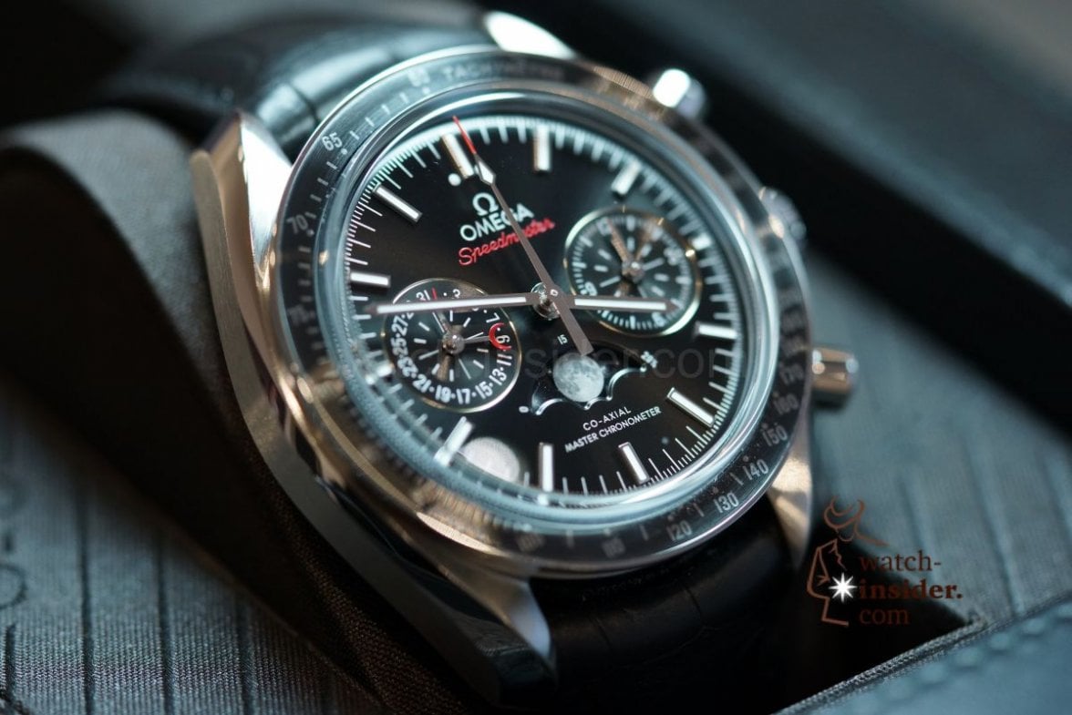
- the globemaster with monthly calender is imho horrible (from the POV of what they did ADDITIONALLY)... thats a complication searching for its need ... but you have a watch hand sitting on the dial and throwing off all symetry at weird angles for a whole month without moving ... plus a no-go font in celestial on the dial

... I feel thats def. a step in the wrong direction ... the original is good enough/way better ... the celestial colours they added makes it look CHEAP!

- the orange chrono is with 45.5mm unfortunately Breitling/Invicta/Hublot territory ... just for arab hip-hoppers with russian accent
 why don't they start hiring REAL DESIGNERS that get the BASICS right (there's nothing black on the watch - why a black date disk? ... did they even bother to check the name of the watch? ...I can so see a grey date dial with red numbers ... voilá - everybody happy ... but no
 ... I feel thats def. a step in the wrong direction ... the original is good enough/way better ... the celestial colours they added makes it look CHEAP!


