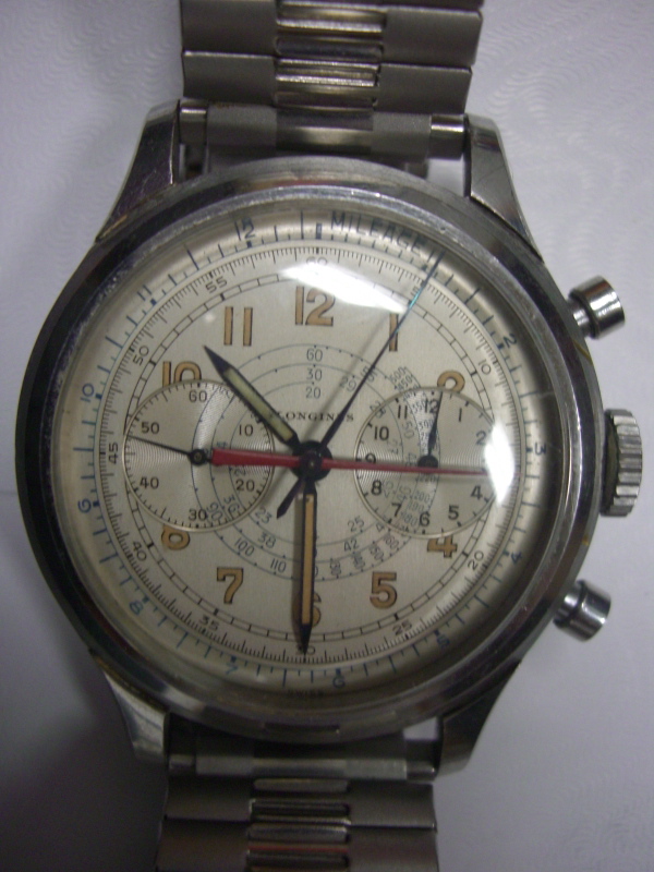
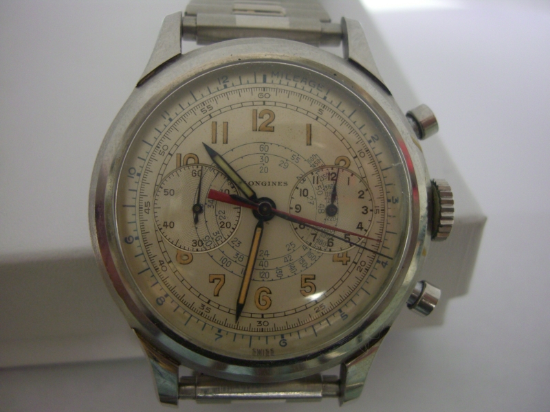
To chime in here, this is one of the most common dials I have seen from the era.
My thoughts are
1. They are in great condition with minimal wear. That alone does not and should not arise suspicion if the fonts are all correct, the subdials have the right depth, etc. Remember, the dealers that are selling these specifically look for the ones that have been preserved. Parmigiani, Mimandcroket, these dealers pretty much try to only buy the high quality NOS type pieces to then re-sell. I disagree strongly with
@DirtyDozen12 - I do not believe for a second that great condition should arose suspicion, unless consistency is not there... which brings me to point #2 ....
2. Consistency is very important. If the dial is pristine, the caseback should be pristine too - the engraved numbers should be sharp, probably little to no marks at all. The movement should likely also be pristine. They should all match. If the dial is perfect, but somehow the movement shows signs that any moisture got into the watch and thus the movement (and thus the dial), then that is suspicious. But if the dial is pristine, as is the case back and movement and case, then that is the top grade vintage Longines 13zns that exist in the market that are highly desired. We should not question well preserved watches while admiring damaged ones, that strikes me as foolish.
3. Some dials when pristine do arouse suspicion. For example, the sandwich dials are almost never seen in perfect NOS condition. But this dial here is a common one and layout. And this gold colored dial with blue fonts - it is always found on gold cases I believe. I have 3 examples below. The gold on gold look.
4. My issues with the 3 watches that
@DirtyDozen12 posted are this
- The first one has the weird Anti Mag font that looks added to the dial. I believe the dial is original and this may have been printed on it afterwards. Foolish but I have seen plenty of bad "Tiffany & Co" stamps added to vintage Pateks too
- The middle watch has the weird hands but the dial to me looks spot on. It is also unusual by having the "Base ... 60 ...1000 ...750" -- whereas nearly all of the "Gold dials with blue fonts" I have seen have the "60 ... Base ... 1000 .... 400...". That said, I do believe the dial is original and spot on, and other 13zns in larger cases with the "Base ... 60 ...1000 ...750" exist.
- The third one is a 5415 which does not have this dial usually, I can find no such examples. There is a chance this dial was taken from another piece and fitted to this 5415. I believe the dial is original and spot on but perhaps put on a 5415 which may have had another dial before. Possible but not for sure.
Back to the original watch then - I believe the hands are wrong, period. The case may not be made for this dial, there is a question there. Dealers have been known to swap dials. But I believe the dial is spot on and correct.
Some pictures of this dial layout and numerals for reference, along with the one
@Radiumpassion posted above, and including a Pulsations version of this gold dial and one that is more pink in nature (Pictures 1 and Last from Private Eyes, not sure about the others)


.jpg")
.jpg")