- Posts
- 10,520
- Likes
- 16,437
padders
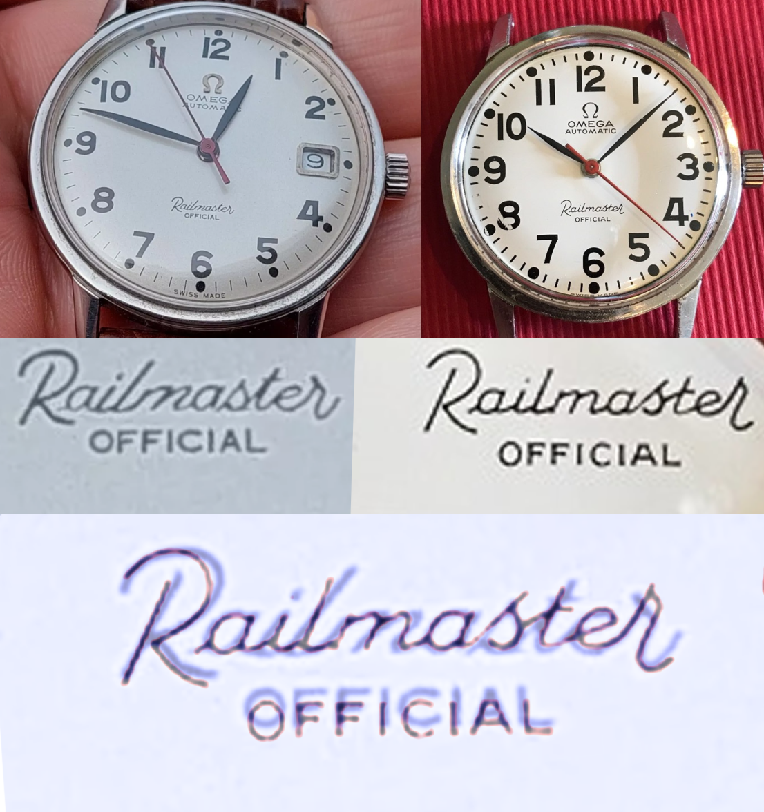
··Oooo subtitles!Since the OP feels he should now cover his tracks by deleting the links and pics, I thought I might repost these so future readers can judge for themselves.
Bobby why ask at all if you can’t handle the answer? The initial favourable response was unfortunate, but a buyer can always force a return on eBay in these circs so I don’t see why you feel you have a cause for complaint. Throw your toys out of someone else’s pram.


Bobby why ask at all if you can’t handle the answer? The initial favourable response was unfortunate, but a buyer can always force a return on eBay in these circs so I don’t see why you feel you have a cause for complaint. Throw your toys out of someone else’s pram.