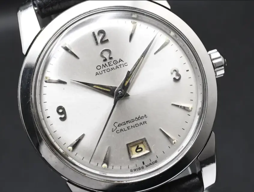
is this dial original or redial
SerP
·Redial
uk_onega
·Hour markers don't look well aligned so suggest probably a redial
Clelow
·The image appears overexposed. It would be nice to see the sheen and luster, or lack thereof, of the dial face.
redpcar
·Sun aged calendar wheel vs an un-aged dial is a quick tell that something is off.
seekingseaquest
·S font in Seamaster is the biggest giveaway, plus the lume color that looks like tritium, when it would have originally been radium.
MtV
·Also, sunburst finishes on Omega dials simply weren’t produced until later that decade.
JimInOz
··Melbourne Australiaadd: Swiss Made not correctly aligned.
Fallout Boy
·look closely at the "e" in Seamaster and compare...
