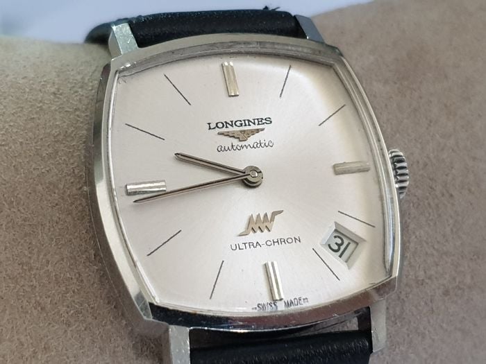
Beware: Problem Longines watches
imfagent449
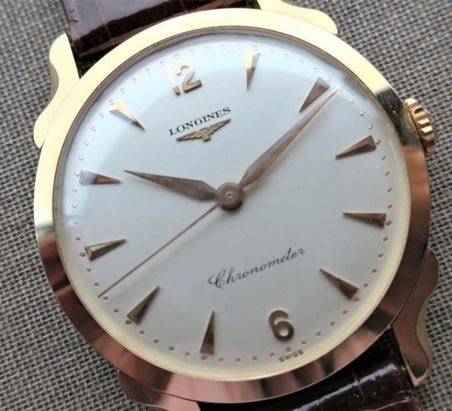
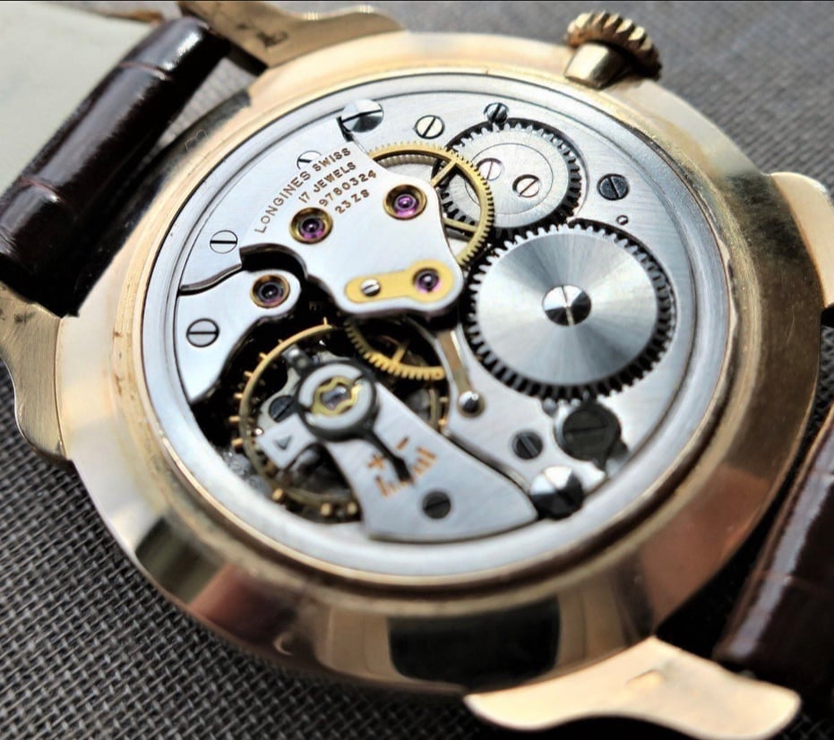
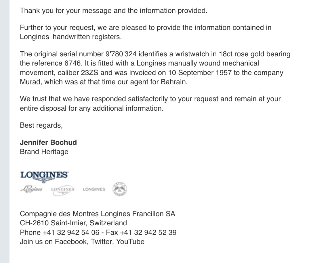
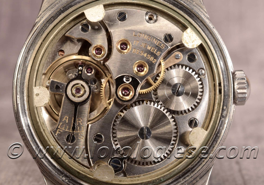
·@Rumar89 - That is a really nice looking watch - the movement looks really clear too.
I saw the following on the internet.
It is clearly a redial but I actually like it. It seems lyrical.
I saw the following on the internet.
It is clearly a redial but I actually like it. It seems lyrical.
DirtyDozen12
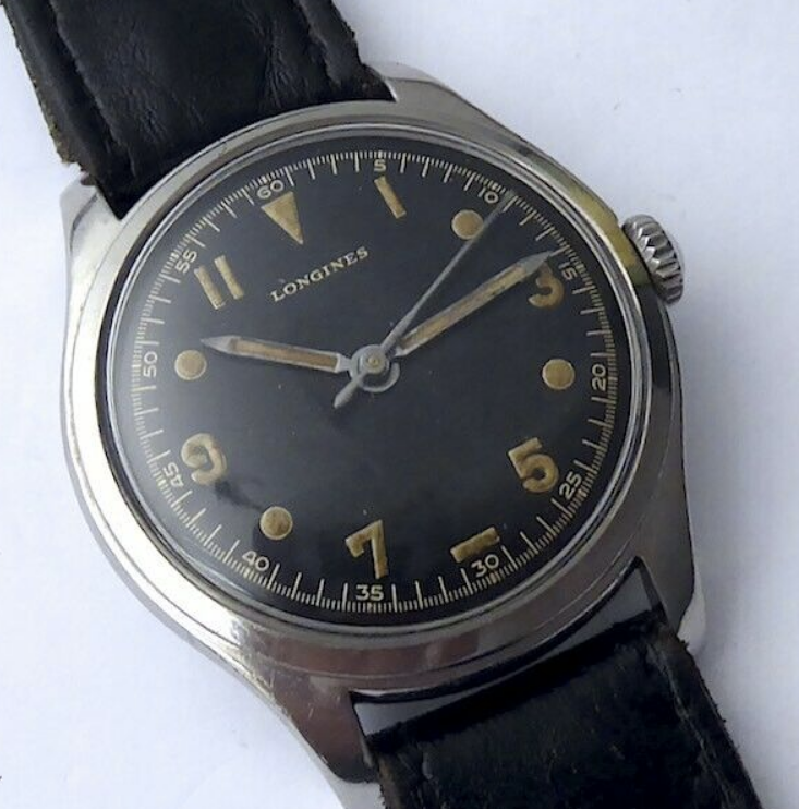
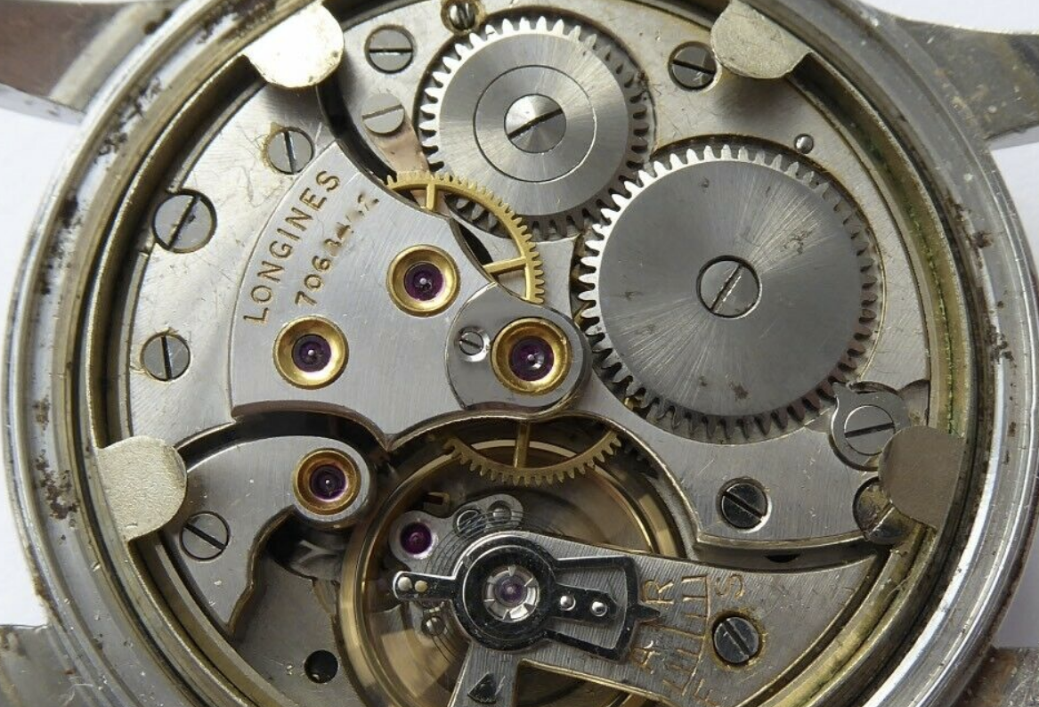
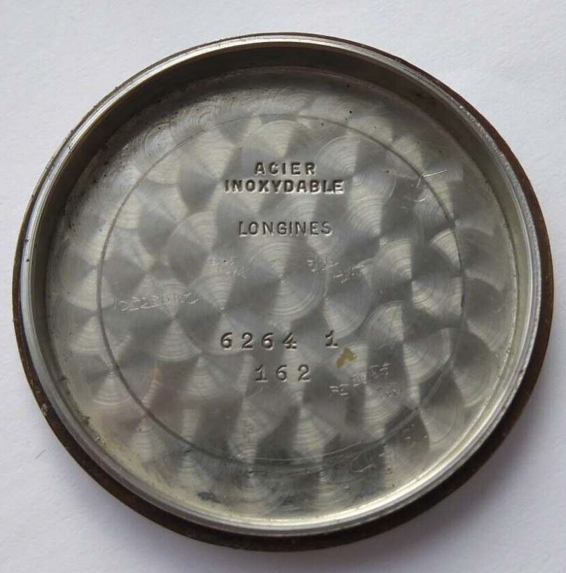
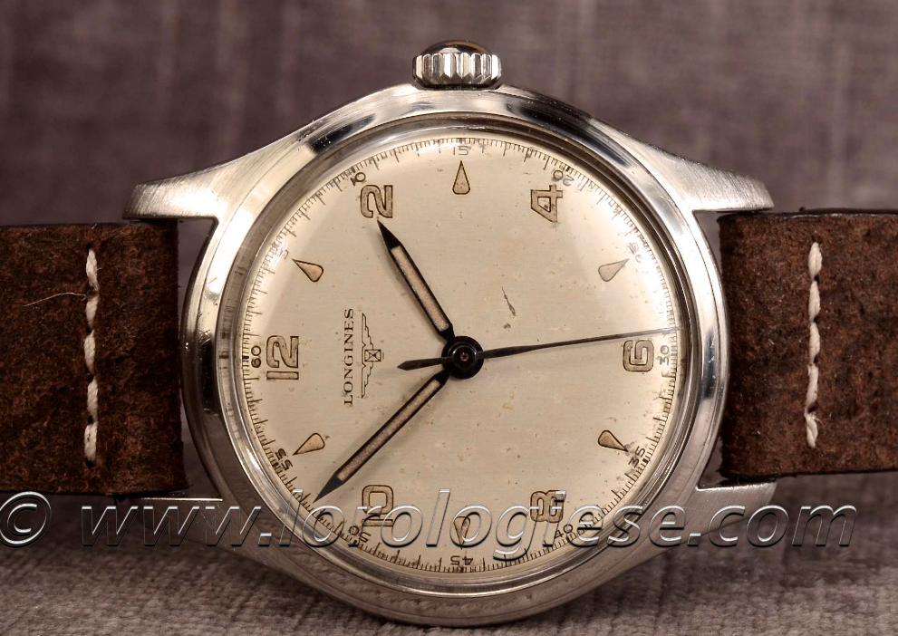
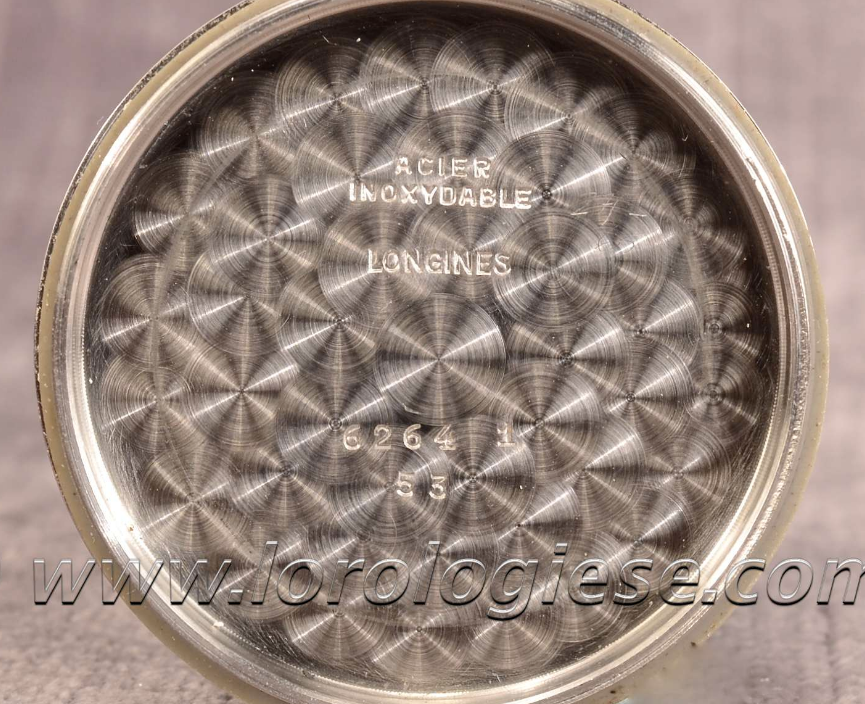
·The dial of this watch has almost certainly been refinished, a number of details are off. I also believe that the serial number does not fit with the reference. So, the watch is likely a franken, as well. Funnily enough, the seller has a correct sei tacche for sale at the same time and the present bid on it is far lower (670 GBP vs. 1550 GBP). Below are photos of the watch in question, followed by photos of a correct ref. 6264 for comparison. Listing: https://www.ebay.co.uk/itm/Longines...949656?hash=item366b54bd98:g:ya8AAOSwu6Vfcl12
This website may earn commission from Ebay sales.
BlueHands
·The dial of this watch has almost certainly been refinished, a number of details are off. I also believe that the serial number does not fit with the reference. So, the watch is likely a franken, as well. Funnily enough, the seller has a correct sei tacche for sale at the same time and the present bid on it is far lower (670 GBP vs. 1550 GBP). Below are photos of the watch in question, followed by photos of a correct ref. 6264 for comparison. Listing: https://www.ebay.co.uk/itm/Longines...949656?hash=item366b54bd98:g:ya8AAOSwu6Vfcl12
Agreed that the dial does not belong to the case, dial is clearly 1940s, the case 100% later. But what makes you sure that the dial is refinished. It looks overall fine to me?
This website may earn commission from Ebay sales.
bhoboo
·The dial above reminds me of the one we saw in the following OF thread. That watch fetched a magical price.
https://omegaforums.net/threads/the-dial-is-bewildering-in-the-cavalcade-of-subtle-details.76085/
Indeed, the dial looks very well executed to my eyes.
P.S. Maybe we will see the above black dial in a different case very soon?...
https://omegaforums.net/threads/the-dial-is-bewildering-in-the-cavalcade-of-subtle-details.76085/
Indeed, the dial looks very well executed to my eyes.
P.S. Maybe we will see the above black dial in a different case very soon?...
Edited:
DirtyDozen12
·I am sure that the sale of the example at Phillips is driving the price up. First problem with the dial is the signature. If you look closely, the font is not quite right. Also, the printing looks to be on top of the dial rather than below, as it should be on a proper, gilt dial. Next is the outer track. Looking at 4 other examples with this uncommon dial design, all have partially closed tracks and the same, characteristic font for the numerals. This dial has "floating" hash marks and the wrong font. Next, the "7" hour marker lacks the subtle curve found on the original dials. Finally, the dial foot is black rather than copper.
cchen
·- Posts
- 3
- Likes
- 4
shakishaki
·Hi all, in the spirit of the recent Hodinkee article on auction caution, figured it might be helpful to look at some of the Longines being offered at the upcoming Monaco Legends auction.
Presumably this is all low-hanging fruit, so additional eyes from the more experienced members here is much appreciated.
Lot 35: 12.68Z
Comments: Compared to other 12.68z examples, the sub-dial numeral font seems off here?

Lot 156: 13ZN
Comments: The serial number on the movement and inner case back don't appear to match. I would expect they should.


Lot 157: 13ZN
Comments: The left subdial font is completely different from the right subdial font. I would expect these to be consistent.

Lot 247: 13ZN
Comments: Longines extract says case is stainless steel. The case on this is obviously not stainless steel, so presumably re-cased.


Lot 248: 12.68Z
Comments: Crown not original? I would expect crowns on pre-1950s Longines to generally be unsigned. This example is supposedly from 1946.

Presumably this is all low-hanging fruit, so additional eyes from the more experienced members here is much appreciated.
Lot 35: 12.68Z
Comments: Compared to other 12.68z examples, the sub-dial numeral font seems off here?

Lot 156: 13ZN
Comments: The serial number on the movement and inner case back don't appear to match. I would expect they should.


Lot 157: 13ZN
Comments: The left subdial font is completely different from the right subdial font. I would expect these to be consistent.

Lot 247: 13ZN
Comments: Longines extract says case is stainless steel. The case on this is obviously not stainless steel, so presumably re-cased.


Lot 248: 12.68Z
Comments: Crown not original? I would expect crowns on pre-1950s Longines to generally be unsigned. This example is supposedly from 1946.

DirtyDozen12
·@shakishaki Sub-dial font on Lot 35 is correct. Lot 157 is a poor redial. Not all 13ZN sub-dials have matching fonts, though.
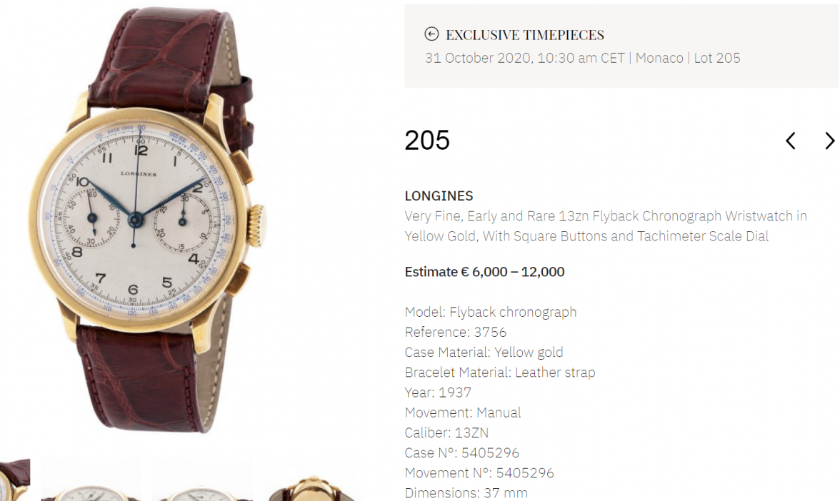
Adding to the above, Lot 205 has a replacement dial. The design is incorrect for such an early 13ZN. The second hand and minute hand are also wrong.
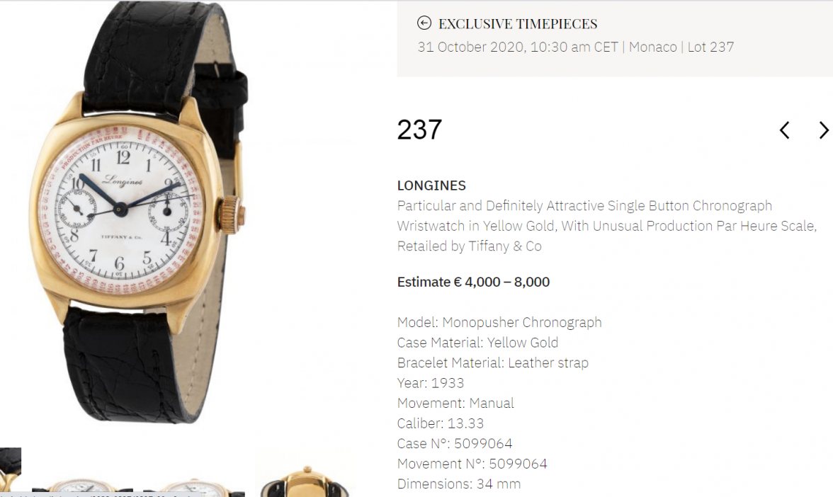
Lot 237 has a fake or redone dial. There are many issues with printing. Minute and hour hands are wrong, as well.
Adding to the above, Lot 205 has a replacement dial. The design is incorrect for such an early 13ZN. The second hand and minute hand are also wrong.
Lot 237 has a fake or redone dial. There are many issues with printing. Minute and hour hands are wrong, as well.
- Posts
- 3
- Likes
- 4
shakishaki
·Re: Lot 237 - Diving deeper on this one, the extract mentions this watch was delivered to Italy in 1933. Is it possible for a Tiffany signed example to have been delivered outside of the U.S. at this time? Has anyone seen any examples?
@DirtyDozen12 are there any specific resources that you would recommend when reviewing the originality of handsets?
@DirtyDozen12 are there any specific resources that you would recommend when reviewing the originality of handsets?
DirtyDozen12
·In my experience, Tiffany-signed Longines from this period all went to the USA.
As with dials, I think that the best way to learn about handsets is by studying many, original examples. There are certainly fewer variations than with dials so it is not quite as challenging in that regard.
As with dials, I think that the best way to learn about handsets is by studying many, original examples. There are certainly fewer variations than with dials so it is not quite as challenging in that regard.
Syrte
·Hi is this a thread for people to seek validation of their potential purchases?
I thought it was a thread where people with knowledge were flagging problems.
I thought it was a thread where people with knowledge were flagging problems.
DirtyDozen12
·You are right, this thread is not really the place for such a discussion. Either a thread dedicated to the auction or the 13ZN Information thread would be more appropriate.
Syrte
·I hate it when people comment on impending auctions anyhow. I know it’s allowed, but since we have free speech I’m also free to remind everyone how distasteful it is. (At least to me). And I don’t mind taking on the role of the shrew,
i’m past the cute age.
i’m past the cute age.
- Posts
- 3
- Likes
- 4
shakishaki
·I understand how commenting on an impending auction may be construed as distasteful and perhaps even disrespectful to the seller. I certainly agree there should be a balance. Although to be frank, I am less sympathetic where the seller is a major auction house whose premiums are arguably justified by their supposed value-add in authenticating the items they offer.
Back to the subject of commenting, is that not the original intention of this thread? To beware problematic Longines watches?
From OP's post: "Starting a thread of Longines watches that are for sale, advertised as original, and clearly (or not so clearly) refinished."
In this regard, I really do believe it is helpful for collectors in our community to benefit from the knowledge and experience of seasoned collectors such as @Syrte and @DirtyDozen12. If sellers aren't willing or don't have the ability to disclose the actual condition of what they are selling, then why shouldn't our community be able to do so? It might save a potential collector from a lot of pain later on.
In any case, if my original post is off-topic or against the rules in some way, I am happy to delete it.
Syrte
·Hi @Shashikaki, as I indicated your post is not against the rules. However as I have stated, I will also protest.
This thread is supposed to highlight problems.
My interpretation of your query is that you have just joined the forum and you’re asking the forum to validate an imminent auction.
Again, this is not against the rules, however and again I have personal objections to people creaming the knowledge of the forum to the detriment of other members.
I don’t care about the sellers as they should be disclosing problems.
The people I care about are the potential buyers who may already have made up their mind about some of those watches, who have the benefit of the hard work they have put into studying those watches, and whose bid may be impacted by people talking publicly about the watches in question.
While a large auction like this one is certainly in the public eye, I find it in general distasteful to discuss impending auctions for the sake of those who may have planned to participate.
Again what you did is not against the rules, however.
Syrte
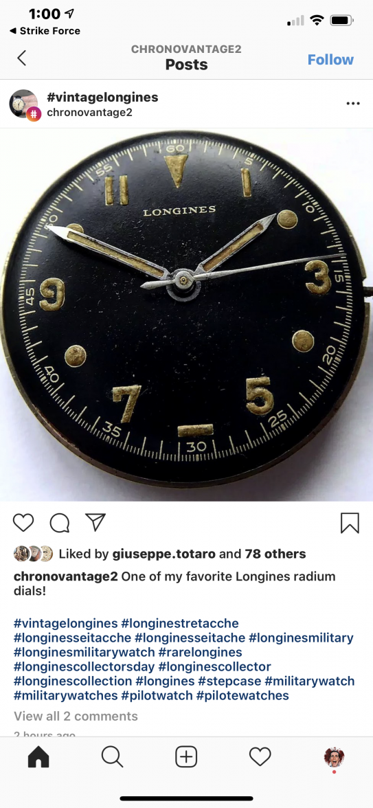
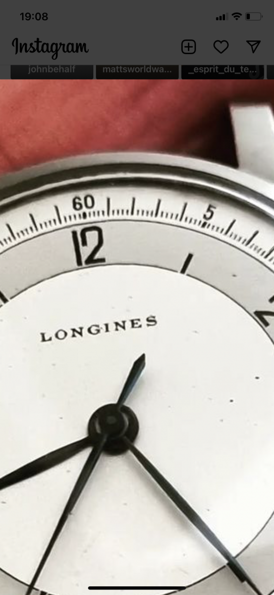
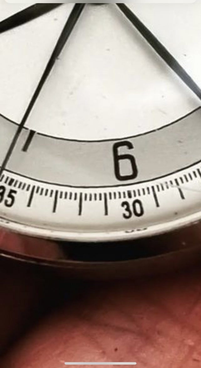
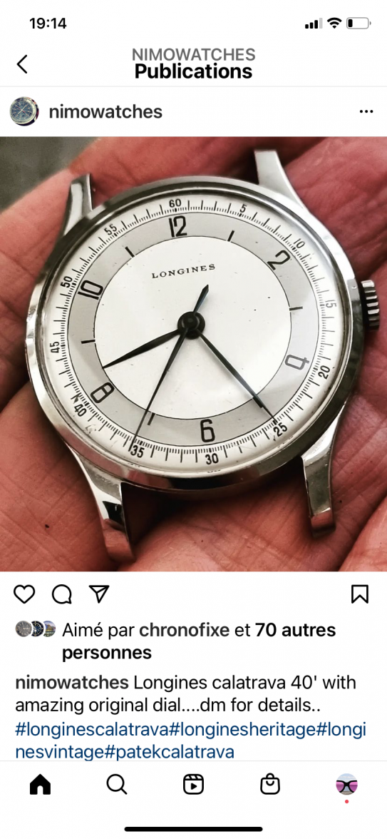
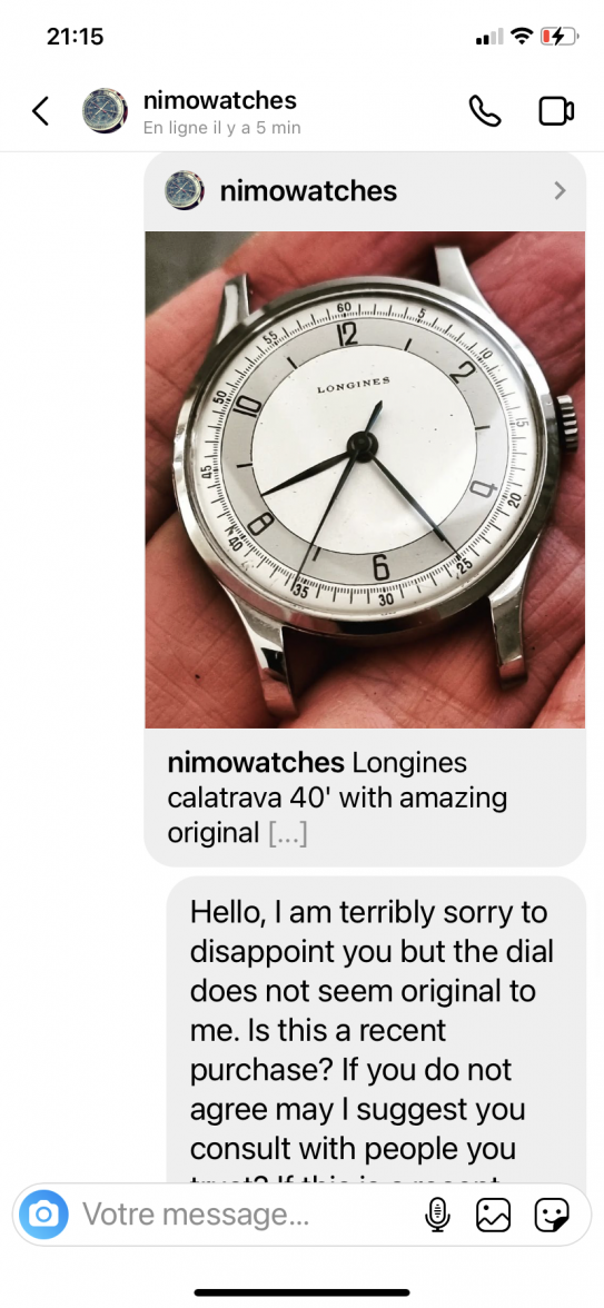
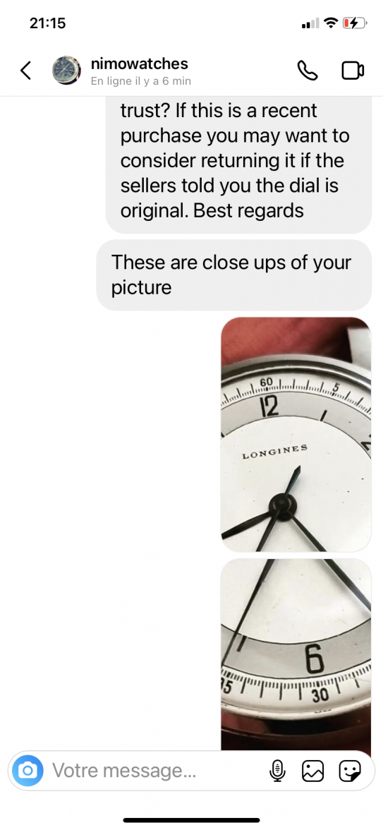
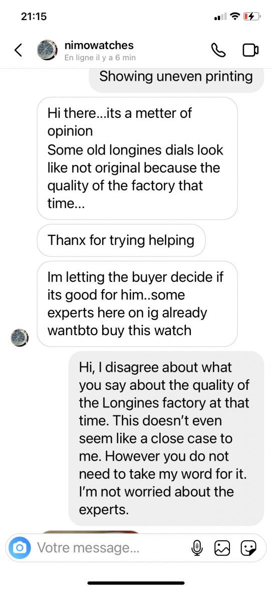
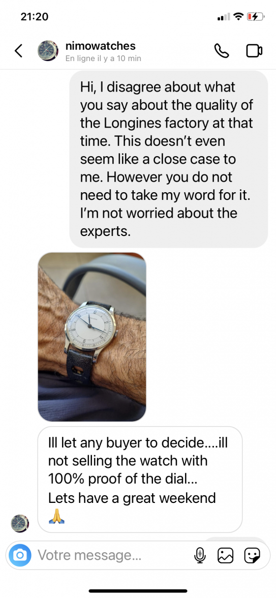
·Seller on Instagram who seems to be at least a part-time dealer is advertising a watch as having an “amazing original dial”, even though the dial seems clearly refinished. I contacted him politely and privately to express doubt, he proceeded to school me in what he deems to be quality variations of Longines dials at that time and said buyers will make up their own mind.
Here’s the watch and discussion for the record. I should mention that for the sake of fairness of process, I contacted two other very focused collectors of Longines before posting publicly.
Here’s the watch and discussion for the record. I should mention that for the sake of fairness of process, I contacted two other very focused collectors of Longines before posting publicly.
Modest_Proposal
·Oh, the cushy, comfortable cove of conjecture. We can never have 100% proof.
JwRosenthal
·Saying he will “let the buyer to decide” basically says he doesn’t care as long as it sells. Nice way of pulling himself out any accountability.
Syrte
·Saying he will “let the buyer to decide” basically says he doesn’t care as long as it sells. Nice way of pulling himself out any accountability.
