Not a QC issue necessarily.
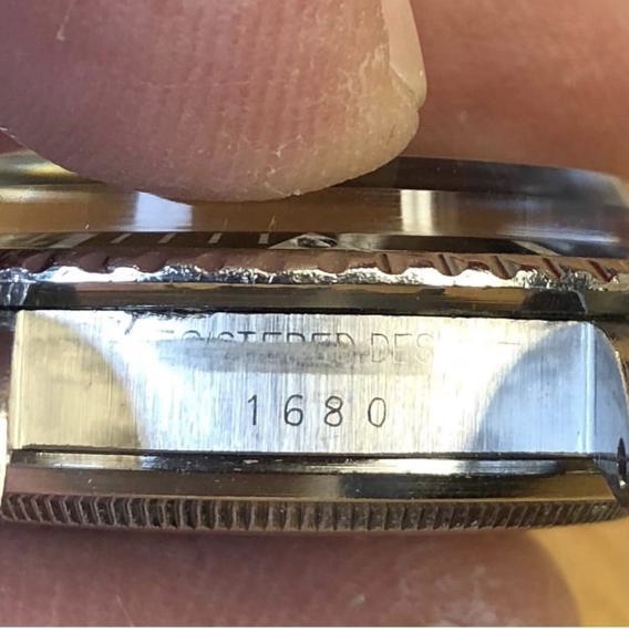
The serial number/model reference number font changed from year to year.
It is pretty common to see "Wonky" Sixes, Eights, etc..
Here's a 1978 also from HQ Milton site. Check out that same "Wonky" 8

And another:

Don't forget that back in the day this was just a $300 steel tool watch.
Nobody really cared about how neat the font on a serial number which 99.999999999% of the buyers would ever see or care about...