Here's my idea.
It's not about the investment perspective.
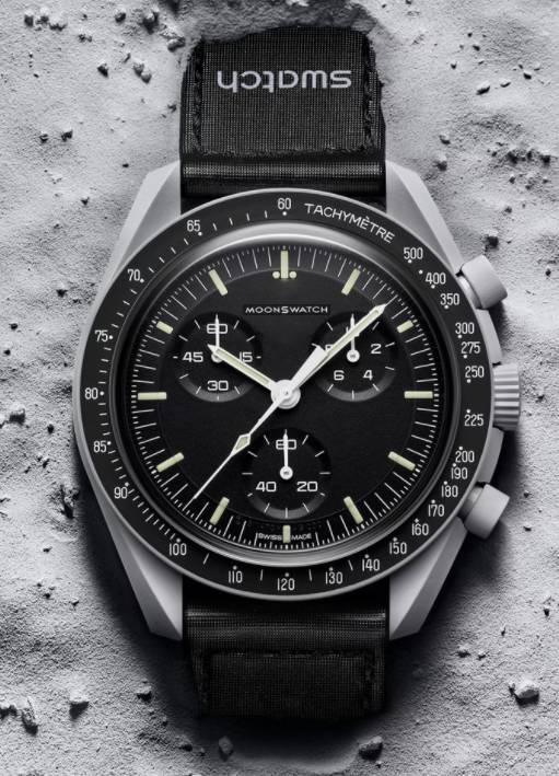
The whole idea of collaboration is nice. A Swatch with a Moonwatch DNA. Much like the Fiat Ferrari Tributo. Fiat with Ferrari DNA.
What Ferrari did right with that collab is that they didn't put the Ferrari prancing horse logo right on the front center and rear badge. They only put Ferrari Tributo on the sides and small rear emblem. It's playful, it's clear that it's a Fiat. But has Ferrari DNA.
Now here's the problem.
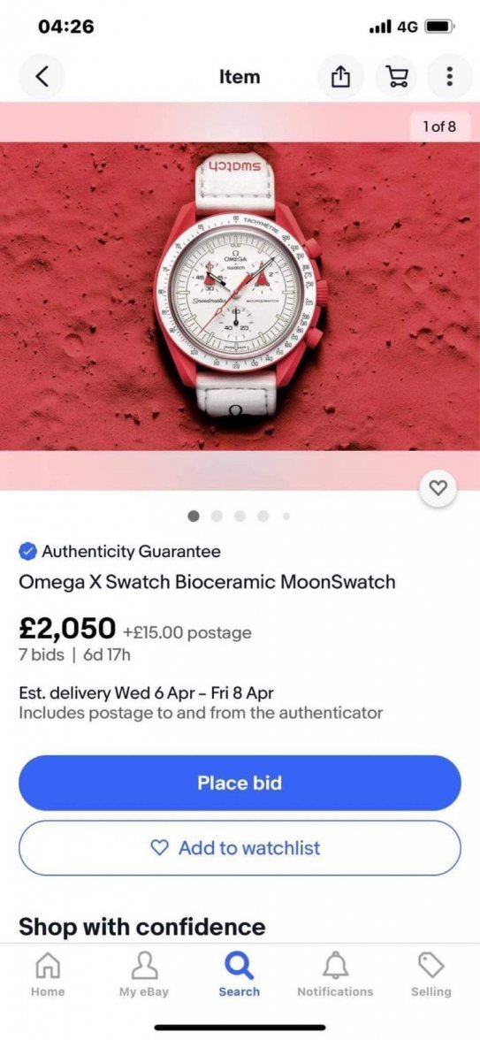
This Omega x Swatch release has Omega branding more prominent than the Swatch. It says Omega x Swatch on the dial. To me a logo symbolizes much more than a brand. Omega logo should only be placed right and center on items of high quality and luxury, synchronous with the image that Omega represents. Whatever it'd be, Omega pens, Omega glasses, Omega hats, Omega watch cases. They should all be on par with the luxury/quality that the brand symbolizes. Logos are sacred.
They should've just put Moonswatch on the dial. No Omega, No Speedmaster. People already know it has Moonwatch DNA. They could put Omega x Swatch on the caseback. That's a way more classy execution.


