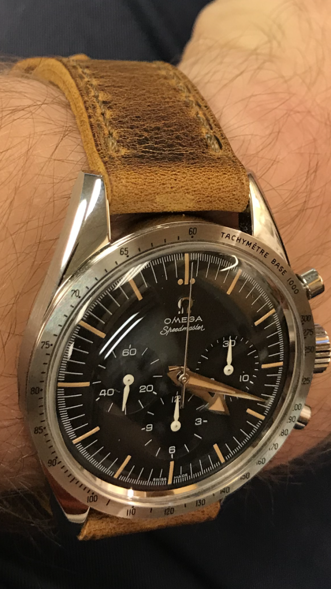
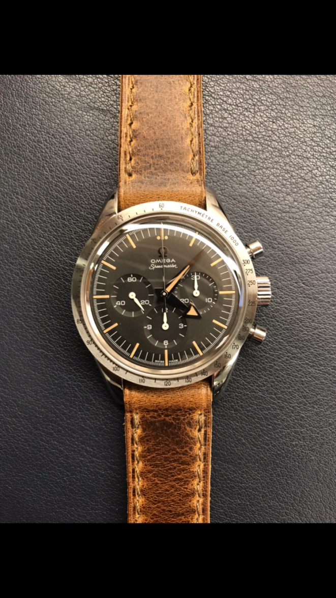
Due to its minimalist design and grey dial, the RMLE looks the least desirable when placed side by side with any of my watches. For example, beside the Moonwatch with its jet black dial, chrono subdials and shiny pushers, the RMLE looks bland. Against the PO with its ceramic bezel and applied indices, the RMLE looks plain and boring. Even a watch like the SKX-009 with its bezel's striking red and blue colors trumps the RMLE. Putting the RMLE beside a blingy and text-oriented Daytona will make the RMLE look cheap and uninspired.
In appreciating the RMLE, you need to think in absolute terms. So before you flip that beauty (that doesn't look good relatively when placed side by side with either the SM300LE and the Speedy 60th), you might want to try it out for a week and appreciate its design on its own merits. When you finally understand what it's all about, it will be hard to go back to busy dials and bezels. You will find all those pizzas distracting.