Forums Latest Members
  1. qazwsx1 Apr 22, 2020

    Posts
    699
    Likes
    2,820
    Hello, this forum. So sorry for my English isn't that good.

    I cannot find much information about Omega Seamaster 2854 model.
    (Also, no information in www.omegawatches.com)
    I want this forum to share the knowledge (+ add more pics) or share opinion on my watch.

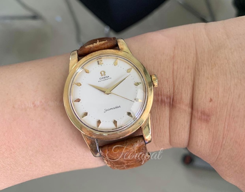
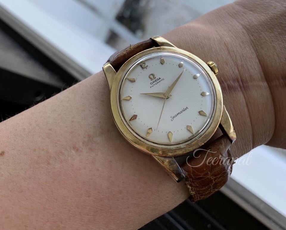
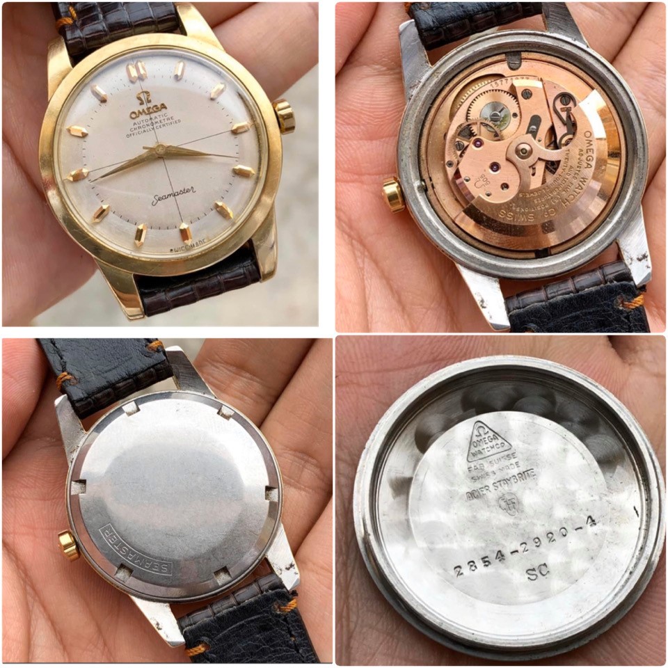
    Another watch in my collection was Omega Seamaster automatic in jumbo case (36mm) with clean white dial.

    Ref. 2854-1 SC, Serial number 14,827,xxx (production year was around 1955), Caliber 501 (19 Jewels)

    1.jpg 2.jpg 3.jpg 4.jpg 5.jpg 16.jpg 14.jpg 15.jpg

    When I search in this omegaforums, I can't find ref.2854 alone (as my watch).
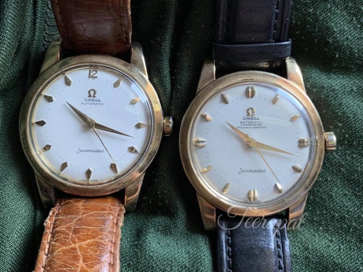
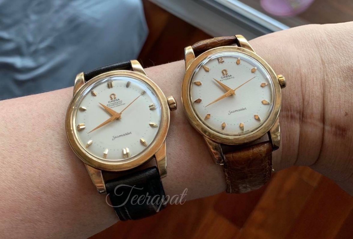
    I found 2854/2920 SC with both of them is the seamaster jumbo size with "chronometer officially certified".
    (This link was attached below.)
    https://omegaforums.net/threads/36-6-mm-seamaster-jumbo-chronometre.9352/
    https://omegaforums.net/threads/no-risk-no-fun.8361/

    In my opinion, I got legit watch with original dial, hands, crown and caseback too.
    (However,the crystal was not original.)
    This Caliber 501 in this model was correct too.
    (Reference from this website and picture was attached below.)
    http://cgi.julesborel.com/cgi-bin/m..._&label=CALIBRES_MANUFACTURED_BY_OMEGA&flag=C
    12.jpg 13.jpg


    Anywhere, I can found another 2854 SC model was sold in my country with both of them were Seamaster jumbo size with/without "chronometer officially certified" and got cal.501 with 20 jewels.
    10.jpg 10.1.jpg
    The difference between those and mine were 19 Jewels vs 20 Jewels (which both 19 and 20 jewels can correct in cal.501 too).

    My concern is about the difference in outer caseback design (both of them have seamaster word and small horse.)

    Thank you for your kindness and response.
    Teerapat
     
    6.jpg 7.jpg 8.jpg 9.jpg 11.jpg
  2. qazwsx1 Apr 22, 2020

    Posts
    699
    Likes
    2,820
    pdxleaf likes this.
  3. TNTwatch Apr 22, 2020

    Posts
    2,876
    Likes
    1,950
    Dial of the non-chronometre looks too new, not consistent to the rest of the watch, especially while the logo has already been tarnished, so it's likely a redial. So is probably the chronometre as well. Both look like good redials, but redial nonetheless.
     
    DaveK, tamura, qazwsx1 and 2 others like this.
  4. Noddyman Apr 22, 2020

    Posts
    1,116
    Likes
    1,774
    Looks like it was painted yesterday, far too clean to be original.
    Very skilfully done though.
     
    qazwsx1 likes this.
  5. gatorcpa ΩF InvestiGator Staff Member Apr 22, 2020

    Posts
    12,206
    Likes
    15,722
    I do not like that dial at all.

    It is very rough. Not a natural surface for vintage Omega.
    gatorcpa
     
    Mark020, mac_omega, tamura and 2 others like this.
  6. seekingseaquest Apr 22, 2020

    Posts
    2,338
    Likes
    6,177
    The text looks okay to me but this is definitely the first time I’ve seen that texture and I echo above concerns about the dial being cleaner than expected given condition of the rest of the watch.

    Attractive watch, though.
     
    qazwsx1 and Dr No like this.
  7. Maskelyne Apr 22, 2020

    Posts
    365
    Likes
    446
    It looks like it's printed on paper. I have never seen a dial like that. Also the print is not complete, parts are missing. It seems to be on bleached paper if it is paper.
     
    tamura and qazwsx1 like this.
  8. hejsam Apr 23, 2020

    Posts
    2,049
    Likes
    14,822
    Is that the new thing: printing new dials on paiper and attaching them to the dial. You could get all the fronts right very easy!:D
     
    DaveK, qazwsx1 and apsm100 like this.
  9. TexOmega Apr 23, 2020

    Posts
    7,318
    Likes
    54,419
    ^ "Say it ain't so, Joe!"
     
    qazwsx1 and apsm100 like this.
  10. NikoMartinez_SYD Apr 23, 2020

    Posts
    134
    Likes
    179
    It kind of looks like a GS snowflake dial ! I actually like it, but agree with others, not original.
     
    qazwsx1 likes this.
  11. Dan S Apr 23, 2020

    Posts
    18,814
    Likes
    43,264
    Weird dial texture. Bright clean white, with poorly aligned and crooked applied markers and logo that show some oxidation. It just sets all my alarm bells ringing. I can't definitively say that it's not legit, but I would personally avoid it.
     
    qazwsx1 likes this.
  12. qazwsx1 Apr 23, 2020

    Posts
    699
    Likes
    2,820
    About the markers, I found some examples.
    5B7F0984-C307-4093-88F3-E4041AB6E3E3.jpeg 1756F4A5-AA23-40DB-9548-508B803610D7.jpeg
     
  13. ConElPueblo Apr 24, 2020

    Posts
    9,587
    Likes
    26,978
    ...That are much, much worse. The last one is a downright fake, I'd say.


    Where are you located?
     
    qazwsx1 and Dero13 like this.
  14. qazwsx1 Apr 24, 2020

    Posts
    699
    Likes
    2,820
    Thailand
    Thanks,
     
  15. Dan S Apr 24, 2020

    Posts
    18,814
    Likes
    43,264
    Coffin markers are common, so this is not a situation where one needs to look at other examples. One needs to look closely at the alignment relative to the printed minute markers. Are the applied markers straight? Are they centered?
     
    qazwsx1 likes this.
  16. Dan S Apr 24, 2020

    Posts
    18,814
    Likes
    43,264
    No, if you read my last post, you will see that I mentioned the alignment of applied marker relative to the printed minute markers. You're overthinking it. It's not a mathematical analysis, but the overall effect of multiple issues.

    I would suggest just taking some time and reading other threads in the forum and looking at many watches online. These issues are frequently discussed, and with experience you will develop the ability to recognize problems.
     
    qazwsx1 and sonicosa like this.
  17. qazwsx1 Apr 24, 2020

    Posts
    699
    Likes
    2,820
    Thanks
     
  18. qazwsx1 May 5, 2020

    Posts
    699
    Likes
    2,820
  19. qazwsx1 May 5, 2020

    Posts
    699
    Likes
    2,820
  20. padders Oooo subtitles! May 5, 2020

    Posts
    8,993
    Likes
    13,941
    At the risk of sounding like our dear departed Nerdbed/Omeguy...

    When they reapplied the markers after the redial, they put the logo on slightly askew vs the text. Tarnished wonky markers with a clean paperlike texture dial with text irregularities? Sounds very like a good redial.
     
    qazwsx1 likes this.