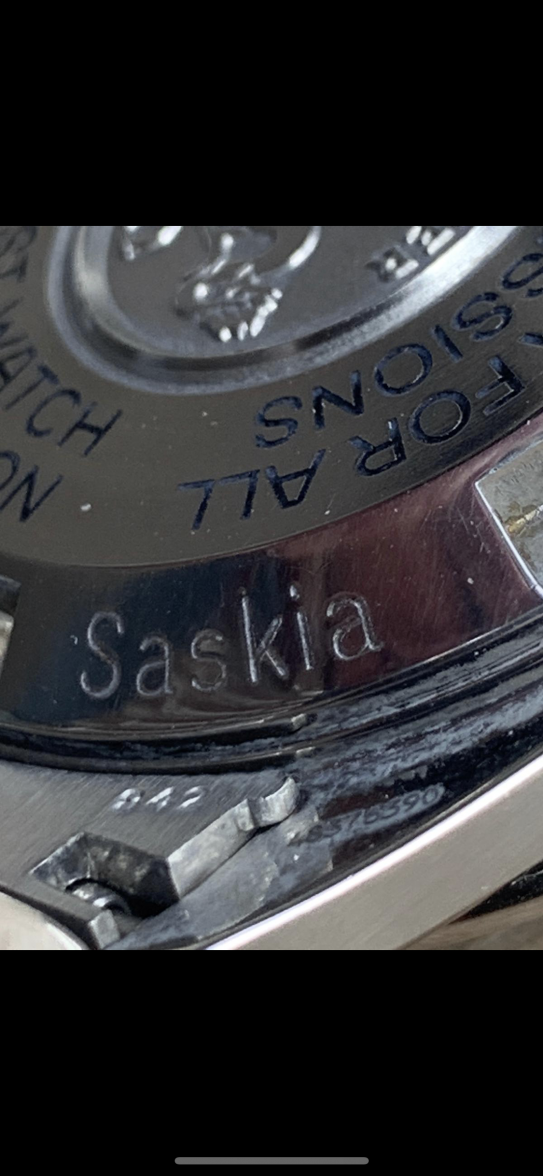
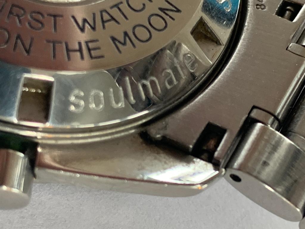
Is this the new Speedmaster?

Posts
27,418
Likes
69,882
Can you imagine sending in your old 1861 speedmaster to Omega for service in the next couple of months. If the caseback is damaged enough for them to want to replace it, you just might get the latest & greatest caseback with the returned watch. Not sure but after a while they will stop producing the caseback with the "old" engraving.

If past history is any indication, you won't have to worry about such a thing for a couple of decades at the very least...
 
Posts
64
Likes
89
The dials on PRO and FOIS are the same size. The diameter of the bezel is exactly the same, 39.7mm. The only difference is the case, and as you stated, the lack of crown guards on the FOIS and the existence them on the PRO. Therefore Omega indicates the size of the FOIS as 39.7mm and the size of the PRO as 42mm.
On my opinion, on the wrist the PRO seems to be a bit larger than the FOIS, but just a little bit.
Ignore. Should read twice next time
 
Posts
21
Likes
28
Can you imagine sending in your old 1861 speedmaster to Omega for service in the next couple of months. If the caseback is damaged enough for them to want to replace it, you just might get the latest & greatest caseback with the returned watch. Not sure but after a while they will stop producing the caseback with the "old" engraving.

That’s if the parts are interchangeable - the case is new so it’s possible they changed things like this to prevent people from swapping parts across models
 
Posts
15
Likes
19
I wonder why Naiad lock caseback wasn´t used in new Speedmaster. Isn´t it used in other 3861 models (Apollo, Snoopy).
 
Posts
26
Likes
15
That’s if the parts are interchangeable - the case is new so it’s possible they changed things like this to prevent people from swapping parts across models
The cases look the same but there definitely are slight differences. I think a lot of people would be relieved by Archer's post. Other people won't care.
 
Posts
85
Likes
156
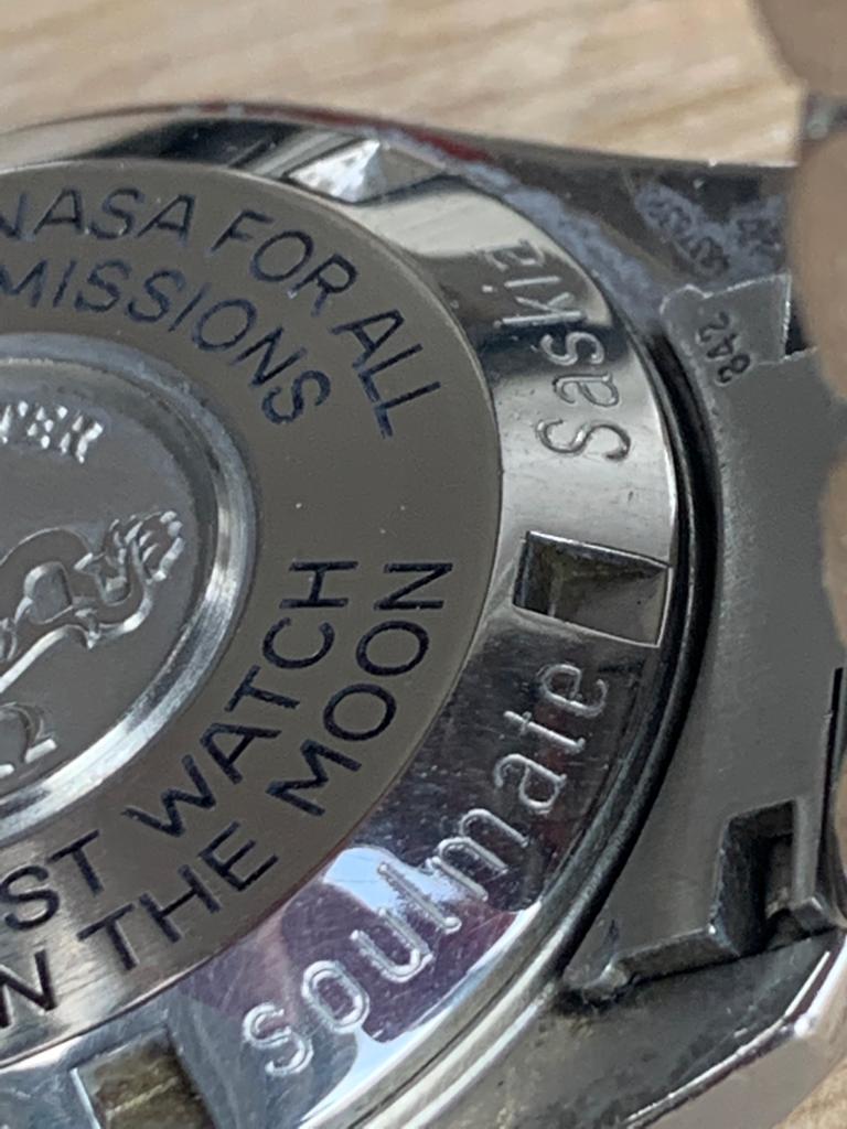
Out of interest I’m wondering how many people have needed a new watch back for any watch they’ve got or had. So far in 40 years I haven’t. Anyone? Could say the same about most parts yet we muddle through. If your daft enough to engrave one with a girls name then possibly a replacement needed when she’s gone. My friends in that one but a lazer weld fill will get rid of her!

Edited:
 
Posts
27,418
Likes
69,882
The cases look the same but there definitely are slight differences. I think a lot of people would be relieved by Archer's post. Other people won't care.

So I just checked...the earliest Speedmaster that a case back is available from Omega is the 145012. So that is roughly a 50 year old watch that you can still get a case back for. Like I said, it is hardly an immediate concern for anyone.

For anything earlier, you would have to go to the open market, where I'm sure you could find something, although it might not be cheap.
 
Posts
71
Likes
118
Do we have a sense of when this thing will actually be released?
 
Posts
38
Likes
19
One thing I'm surprised nobody has mentioned yet is the dial, being that it's pretty central to the watch. The new dial looks to have fewer tick marks (3 as opposed to the original 5). I imagine this is to align better with the 21,600 bph. However I don't like it and think it changes the look of the watch noticeable.

The other thing on the dial that I noticed is that the lume seems to be recessed into the dial instead of little blobs? That is a huge change for me. probably the biggest that's ever happened to dials for this watch. I don't like it. As far as the applied logos I prefer non applied logos generally. Since they're still using the modern shape I don't much see the point.

Did anyone else notice the silver rivets on the subdials, as opposed to all white ones on previous ones?

The one thing that I do really like about the new one and wonder if anyone would be able to do a swap is the teardrop chrono seconds hand. Does anyone know if they would be compatible? Do you think Omega would do it or would any indy watch repairman? Would Archer?

The new pushers seem a bit too flat, even when compared to vintage 105.012. So I don't like that.

I'd like to see a more in depth comparison of the lug shapes between old and new.

As far as manned vs "human". I am against the change. My real preference would have been to get rid of the wording all together for a nice clean minimalist caseback which actually would have been closer to what was on there originally. However, given the choice between both texts, I think "manned" sounds better and more spacey. "all human spaceflights" sounds strange and redundant. Manned just means piloted by people on board, not necessarily men. I think the reason that some are having more backlash to human than others is because it feels out of place with the intention of the phrase. I don't think that manned discredits the amazing accomplishments of women in spaceflight in any way. I'm quite certain that manned is a non sexed term, like piloted. In any case like I said, my preference would have been for no text. I dislike the "master chronometer-coaxial text even more than the "human" change. Sadly I really like the stepped caseback and think it's a nice throwback.

Someone else pointed out the little notches on the back of the watch, I don't like those.

Also, has anyone else noticed that the back of the lugs looks brushed instead of polished? What do people think of that? Is there any historical precedent for a brushed back lugs?

The lugs also look like they say "stainless steel?" Is that just the photos or will that be present? What do y'all think

Overall, things I like are: Chrono seconds hand, stepped caseback, machining rings on subdials.

Things I dislike are : Text on back of case, brushed back of lugs, "Stainless steel" on back of lugs, new dial markers, new dial tick marks. applied logo.
 
Posts
93
Likes
61
The other dial change that I noticed that I do not particularly like is that the word "Professional" on the dial appears to be narrower than the current version. In that one respect, I prefer the current dial, where each line of text is wider than the line above it.
 
Posts
38
Likes
19
The other dial change that I noticed that I do not particularly like is that the word "Professional" on the dial appears to be narrower than the current version. In that one respect, I prefer the current dial, where each line of text is wider than the line above it.
You are right, It looks to be a different font alltogether.
 
Posts
342
Likes
515
Regarding the manned vs human space flight debate, I wonder if 'crewed' might have been a better choice? Still, it's not a big issue as far as I'm concerned.
 
Posts
22
Likes
93
Human vs. manned...they mean the same thing and it’s on the back of the watch, I’m not sure what the big deal is.

I really like most everything about the new moon, especially the stepped dial and chrono hand. Hacking seconds will be a great upgrade. I’m curious about how the new shallower pushers will feel/function and I do prefer the more detailed minute track of the current speedy.

A more adjustable clasp would have been nice, especially for the $1000 price hike.
 
Posts
4,956
Likes
17,317
<sarcasm>

Time for a Boomer to Boomer chat.

Policemen are now called Police Officers.
Firemen are now called Firefighters.
Postmen are now called Postal workers.
Manned is not the same as Human.

I know, it's wierd. But there are now female cops and I can see their point about not wanting to be called a Policeman. Took me awhile too but after about ten times or so I got used to it. Practice, practice, practice. The plus side is the cops are now better looking.

Hopefully this interruption in the discussion of the new watch will spare anyone from being mocked by their children and grandchildren. Dag nab it, we boomers gotta help each other out, right?

</sarcasm>
 
Posts
9,555
Likes
15,071
<sarcasm>

Time for a Boomer to Boomer chat.

Policemen are now called Police Officers.
Firemen are now called Firefighters.
Postmen are now called Postal workers.
Manned is not the same as Human.

I know, it's wierd. But there are now female cops and I can see their point about not wanting to be called a Policeman. Took me awhile too but after about ten times or so I got used to it. Practice, practice, practice. The plus side is the cops are now better looking.

Hopefully this interruption in the discussion of the new watch will spare anyone from being mocked by their children and grandchildren. Dag nab it, we boomers gotta help each other out, right?

</sarcasm>
And weird is now called wierd? 😉
 
Posts
1,237
Likes
4,718
And weird is now called wierd? 😉
I wish they were still called police officer. In my world law enforcement officer is preferred. So now they find laws to enforce rather than keeping the peace. I'm told the derivation of police officer is peace officer. Semantics? Maybe.

Enough of me. Have fun
kfw
 
Posts
270
Likes
408
The other dial change that I noticed that I do not particularly like is that the word "Professional" on the dial appears to be narrower than the current version. In that one respect, I prefer the current dial, where each line of text is wider than the line above it.

Good observation. I thought the font size on Speedmaster was increased, rather than downsizing the Professional text.

We also see similar proportions on the Snoopy.
 
Posts
4,956
Likes
17,317
And weird is now called wierd? 😉


Being the nice guy that I am, I will not go back and edit my original post to correct my spelling because then your post will look wierd/ weird. 🤪

👍
 
Posts
51
Likes
22
I don’t quite like the stepped dial.. somehow makes the dial look less clean and more busy. what are “domed hands”? Does it mean they’re curved inwards at the tips?