Constellation case and movement mismatch?

Posts
96
Likes
116
Hello all,

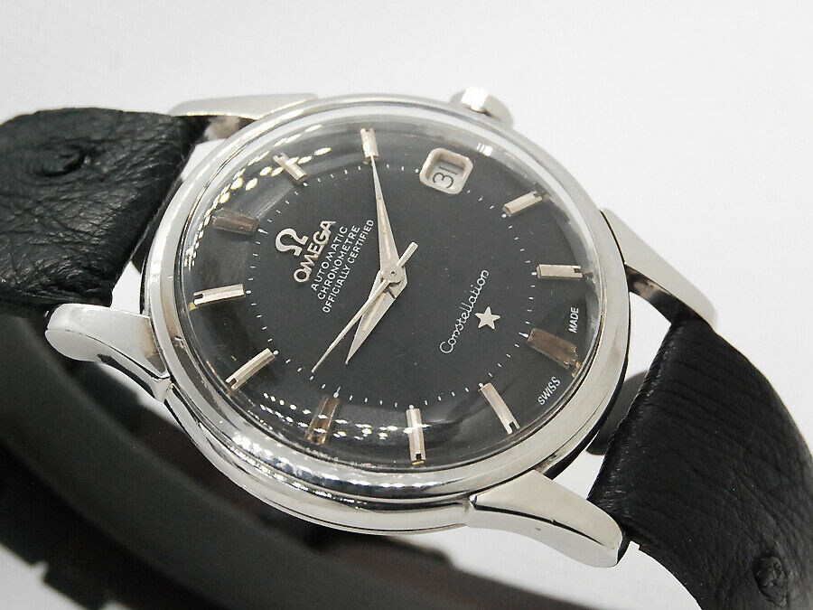
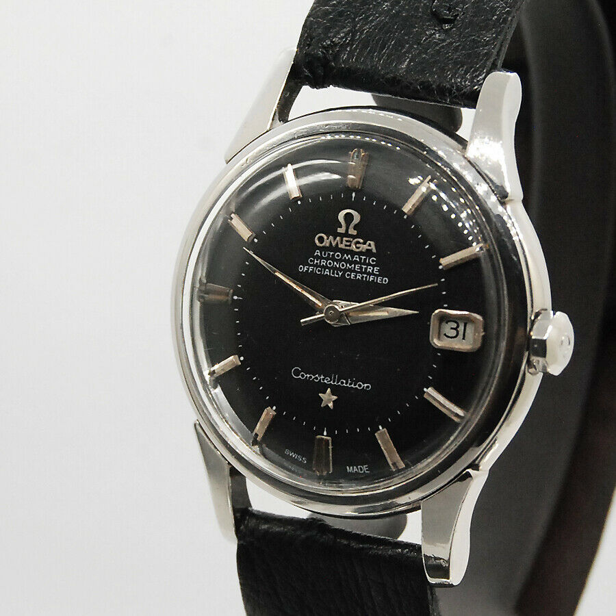
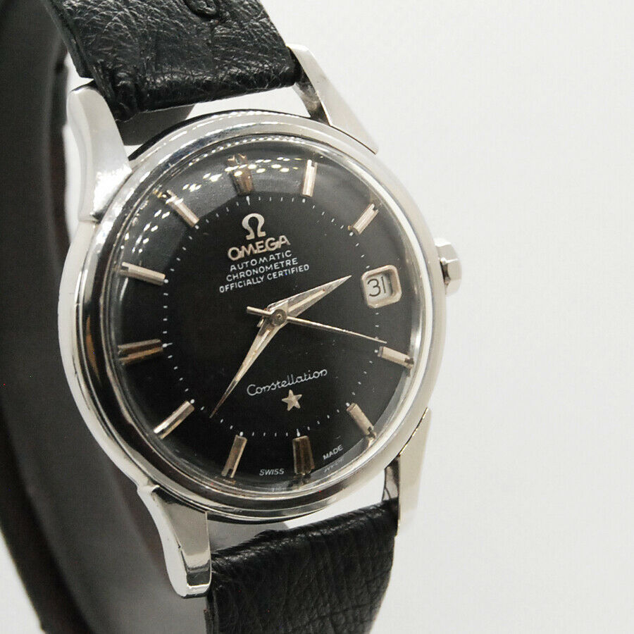
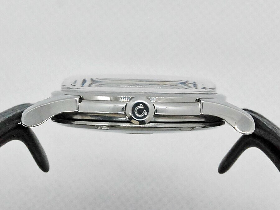
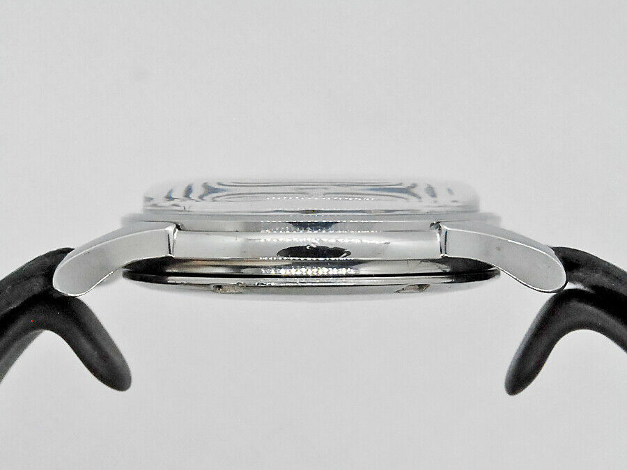
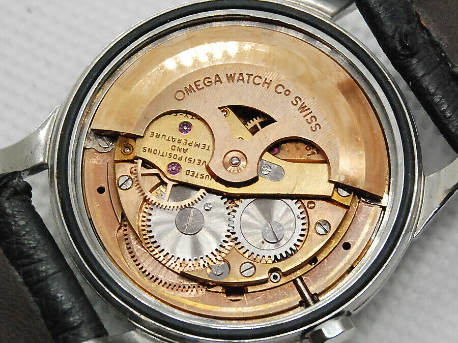
This watch is being advertised on Ebay. I already have doubts about the dial, but I wanted to ask you whether the case and movement are mismatched.
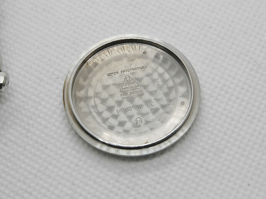
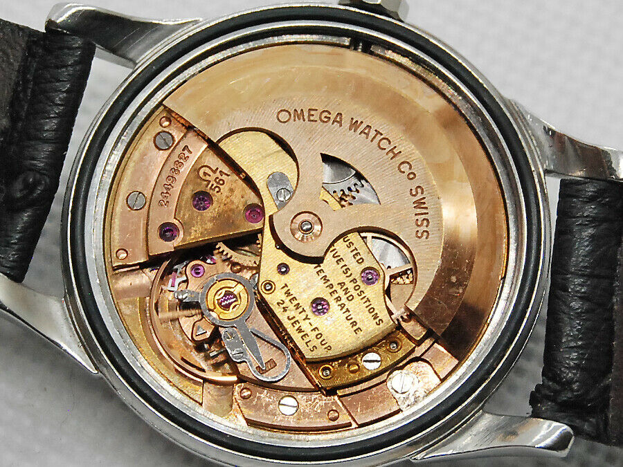
The reason I ask is that the cal 561 movement is 24xxxxxx, dating it to around 1966, but the case reference is 14393 10 SC, which started production in 1960. Did Omega keep producing these cases long enough to accommodate a 1966 movement? I had assumed that when a new case design came along, it superseded the old one, but maybe not.
The seller describes the watch as 1964, just to add to the confusion, but that can't be true with the 24xxxxxx movement.
I'm not planning to buy this one - it's more that it just prompted the above question.
Thanks.
 
Posts
5,683
Likes
8,813
@DorsetOmega

You’re pretty much correct on all counts.
Redial
Replacement movt.

the watch could have been sold in 64 but not manufactured then.


just for fun - why don’t you list what you think is wrong with the dial.
 
Posts
96
Likes
116
I'll have a go, but I'm an absolute beginner at this! So I'd have more a series of questions, rather than assertions. My questions would be:

1 In 'automatic' there seems to be too much space either side of the 'M' and the top of the first 'T' looks wobbly compared to the second one. The 'A's would seem to have the correct flat top though.
2 The 'M' in 'chronometre' is different to the one in 'automatic' - although it's my understanding that this sometimes happens.
3 Speaking of 'chronometre', were they still using that on the 14393? I thought that might only be on the earlier models, and they had gone over to the English spelling by that point.
4 The white markers between 4 and 6 and 10 and 11 are fairly evenly spaced but rather wonkily aligned. They don't follow a straight line. But even on correct pieces they tend to look a bit hand-made at close magnification (because of course they are, to an extent).
5 This one is clearly a different model - https://omegaforums.net/threads/my-omega-rail-track-14393-with-“black-stardust-dial”.118420/ - but I note that end of the hour markers come out as far as the white dots, which I think are called the rail track, whereas on the watch above, they stop short.
6 The hour markers for 12, 6 and 9 have little extended bits on the white dots beneath them. This is something I haven't seen elsewhere.
7 The MOY test seems OK to the naked eye (with thanks to the venerable @Peemacgee for teaching me that. But good watches often fail MOY and redials often pass it. It's not the hardest thing in the world to get right for a redialler, I think.
8 The Constellation looks OK to me too, with a dot over the 'i' and a cross only through the first 't' and not the second one, and the final 'n' being more curled at the bottom than the first.
9 The writing is a bit white overall isn't it? Remembering the dictum 'if it's white, it's shite'?
10 The 'Swiss made' looks totally wrong - bad size, bad font, and maybe a bad position (too high).

I'm probably wrong on most counts, but it's a useful exercise to do. I stress these would be questions rather than judgements - I'm a long way off judging anything! I've only been making daily visits to the forum for the last month or so (and now I'm hooked) and I don't think any of this would have occurred before I did so! So, thanks to you all. I'd still certainly ask before getting anywhere near a purchase.

Final question - why was I cursed with a love of black pie-pan Connies when I could have bought a nice C-case in about a day...?
 
Posts
375
Likes
324
I'll have a go, but I'm an absolute beginner at this! So I'd have more a series of questions, rather than assertions. My questions would be:

1 In 'automatic' there seems to be too much space either side of the 'M' and the top of the first 'T' looks wobbly compared to the second one. The 'A's would seem to have the correct flat top though.
2 The 'M' in 'chronometre' is different to the one in 'automatic' - although it's my understanding that this sometimes happens.
3 Speaking of 'chronometre', were they still using that on the 14393? I thought that might only be on the earlier models, and they had gone over to the English spelling by that point.
4 The white markers between 4 and 6 and 10 and 11 are fairly evenly spaced but rather wonkily aligned. They don't follow a straight line. But even on correct pieces they tend to look a bit hand-made at close magnification (because of course they are, to an extent).
5 This one is clearly a different model - https://omegaforums.net/threads/my-omega-rail-track-14393-with-“black-stardust-dial”.118420/ - but I note that end of the hour markers come out as far as the white dots, which I think are called the rail track, whereas on the watch above, they stop short.
6 The hour markers for 12, 6 and 9 have little extended bits on the white dots beneath them. This is something I haven't seen elsewhere.
7 The MOY test seems OK to the naked eye (with thanks to the venerable @Peemacgee for teaching me that. But good watches often fail MOY and redials often pass it. It's not the hardest thing in the world to get right for a redialler, I think.
8 The Constellation looks OK to me too, with a dot over the 'i' and a cross only through the first 't' and not the second one, and the final 'n' being more curled at the bottom than the first.
9 The writing is a bit white overall isn't it? Remembering the dictum 'if it's white, it's shite'?
10 The 'Swiss made' looks totally wrong - bad size, bad font, and maybe a bad position (too high).

I'm probably wrong on most counts, but it's a useful exercise to do. I stress these would be questions rather than judgements - I'm a long way off judging anything! I've only been making daily visits to the forum for the last month or so (and now I'm hooked) and I don't think any of this would have occurred before I did so! So, thanks to you all. I'd still certainly ask before getting anywhere near a purchase.

Final question - why was I cursed with a love of black pie-pan Connies when I could have bought a nice C-case in about a day...?
i think it is some great thoughts. i do not think its possible not to like a black pie-pan Connie
 
Posts
5,683
Likes
8,813
I'll have a go, but I'm an absolute beginner at this! So I'd have more a series of questions, rather than assertions. My questions would be:

1 In 'automatic' there seems to be too much space either side of the 'M' and the top of the first 'T' looks wobbly compared to the second one. The 'A's would seem to have the correct flat top though.
2 The 'M' in 'chronometre' is different to the one in 'automatic' - although it's my understanding that this sometimes happens.
3 Speaking of 'chronometre', were they still using that on the 14393? I thought that might only be on the earlier models, and they had gone over to the English spelling by that point.
4 The white markers between 4 and 6 and 10 and 11 are fairly evenly spaced but rather wonkily aligned. They don't follow a straight line. But even on correct pieces they tend to look a bit hand-made at close magnification (because of course they are, to an extent).
5 This one is clearly a different model - https://omegaforums.net/threads/my-omega-rail-track-14393-with-“black-stardust-dial”.118420/ - but I note that end of the hour markers come out as far as the white dots, which I think are called the rail track, whereas on the watch above, they stop short.
6 The hour markers for 12, 6 and 9 have little extended bits on the white dots beneath them. This is something I haven't seen elsewhere.
7 The MOY test seems OK to the naked eye (with thanks to the venerable @Peemacgee for teaching me that. But good watches often fail MOY and redials often pass it. It's not the hardest thing in the world to get right for a redialler, I think.
8 The Constellation looks OK to me too, with a dot over the 'i' and a cross only through the first 't' and not the second one, and the final 'n' being more curled at the bottom than the first.
9 The writing is a bit white overall isn't it? Remembering the dictum 'if it's white, it's shite'?
10 The 'Swiss made' looks totally wrong - bad size, bad font, and maybe a bad position (too high).

I'm probably wrong on most counts, but it's a useful exercise to do. I stress these would be questions rather than judgements - I'm a long way off judging anything! I've only been making daily visits to the forum for the last month or so (and now I'm hooked) and I don't think any of this would have occurred before I did so! So, thanks to you all. I'd still certainly ask before getting anywhere near a purchase.

Final question - why was I cursed with a love of black pie-pan Connies when I could have bought a nice C-case in about a day...?

pretty good actually. 👍
Don’t compare a railtrack to a normal 14381/14393 as they can have some special idiosyncrasies- like the mixed straight and sloping Ms, which shouldn’t be on this watch.
Chronometer should be spelled the English way.
-and a big give away is that the dial shouldn’t have ‘officially certified’ on it.

the second hand is definitely wrong and the hour hand may be a bit long.
 
Posts
96
Likes
116
Thank you, that was fun! I learned a lot from doing it, and from the very helpful feedback. I should have spotted the “officially certified” as I’ve been looking at similar ones which also have it omitted.