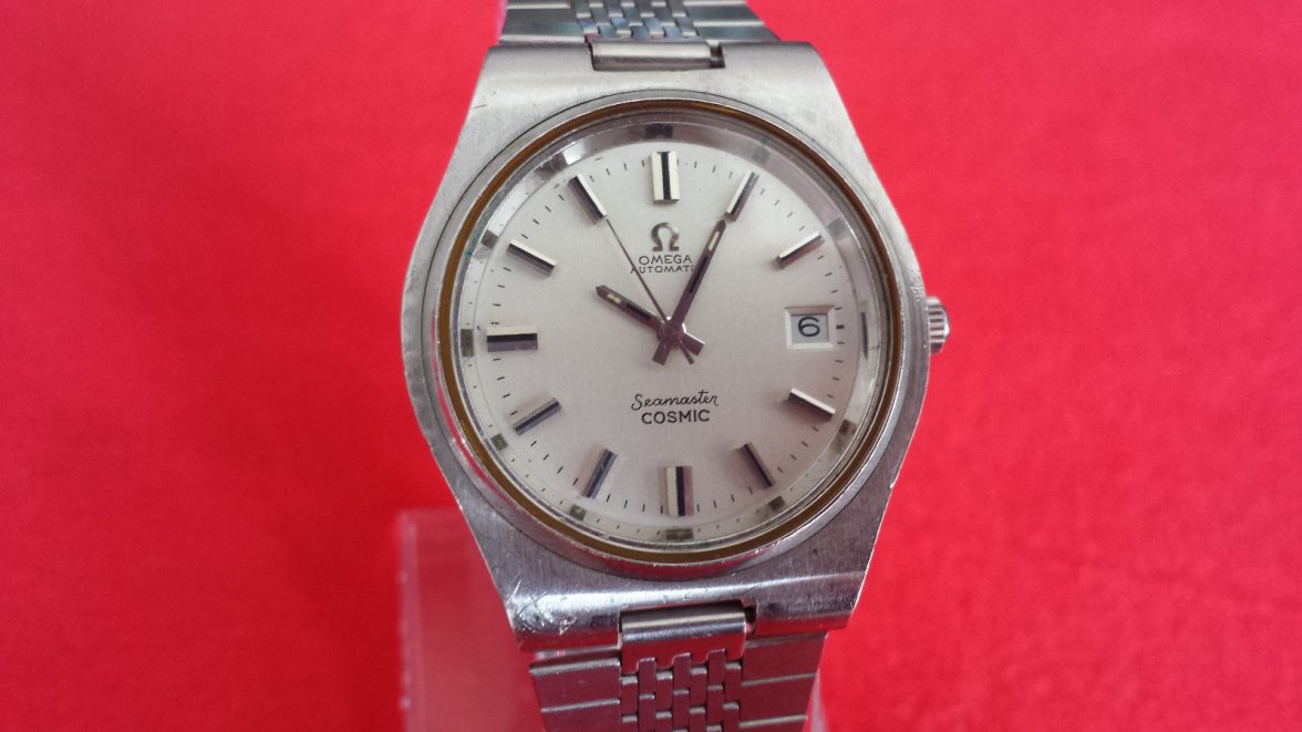
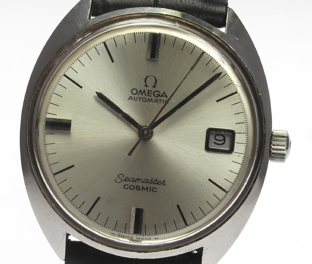
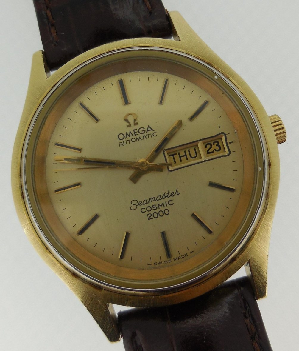
Relatively new to this, but the font seems so different from anything I've previously seen. Almost like it's a Times New Roman top text, Sans Serif bottom text
Relatively new to this, but the font seems so different from anything I've previously seen. Almost like it's a Times New Roman top text, Sans Serif bottom text