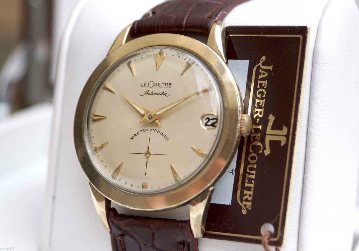
Vintage LeCoultre Master Mariner Automatic
AnotherDon
·Wow! Just gorgeous. Look at those lugs! And you got the box and papers? Surely a rare bird there. I can see why resistance was futile.
MAJ75
·That is absolutely beautiful, congratulations on a quality aquisition the B&P are really the icing on the cake....................
Larry S
··Color Commentator for the Hyperbole.I want to say "great catch!" I hate to look the proverbial gift horse in the mouth but I'm struggling with the dial. Sub dial printing is not consistent or consistent with images on Google. Minute markers seem a bit haphazard. Might be the pics or the angle. Deperately want to be wrong ....thoughts? I think this a redial.
Edited:
UncleBuck
··understands the decision making hierarchyI think this a redial
Larry, no disputes with your observations, I'd just love to see some more "MASTER MARINER" font examples.
Hello, Google!
UncleBuck
··understands the decision making hierarchyMan, hard to find with subdials...
They do all seem to have heavy font thickness on MASTER MARINER.
Can you point out your concerns, Larry? I'm having trouble seeing them.
They do all seem to have heavy font thickness on MASTER MARINER.
Can you point out your concerns, Larry? I'm having trouble seeing them.
Interstatetime
·I want to say "great catch!" I hate to look the proverbial gift horse in the mouth but I'm struggling with the dial. Sub dial printing is not consistent or consistent with images on Google. Minute markers seem a bit haphazard. Might be the pics or the angle. Deperately want to be wrong ....thoughts? I think this a redial.
I wish you could look at the watch with a loupe. I thought the "Master Mariner" font above the sub-dial looked odd but it is done in the same ink/paint/enamel as the rest of the print and there are other MM dials with this same incongruity. The minute markers are perfectly aligned. Also there is a bit of "patina" in the center of the dial which is hard to see in the photo.
I have been buying watches for 40+ years and, although I still make mistakes...I don't think this is one of them. I never say with 100% surety that a dial is right...but 98%...this dial is right.
JohnCote
Interstatetime
·You guys made me a bit paranoid so I did go look at the dial with a loupe. For me one of the tell-tale signs that a dial with raised gold markers has been repainted is paint on the sides of the markers. There is no sign of it on this dial. The writing is very perfect with all of the proper little serifs on the LeCoultre script. There is no pooled paint in the little ridges between the dial plate and the tiny raised gold minute markers. If this dial has been re-done it was done better than most factory dials. If it has been redone it is good enough for me...but it has not...again...98% been re-done.
JohnCote
JohnCote
UncleBuck
··understands the decision making hierarchyYou guys
Of course, I'm wrong more than right so that should really make you nervous!
Interstatetime
·Hey, I'm with you John!
Of course, I'm wrong more than right so that should really make you nervous!
It's always worth checking. Nothing wrong with a little paranoia. Paranoia pays off when buying vintage watches.
JC
Larry S
··Color Commentator for the Hyperbole.Interstatetime
·I really love this early Master Mariner series of watches. I recently posted pix of my MM Chrono...
https://omegaforums.net/threads/vintage-lecoultre-master-mariner-chron.60294/
What gets me is how little seems to be written about these watches but how many variations there seem to be....Just interesting.
JohnCote
https://omegaforums.net/threads/vintage-lecoultre-master-mariner-chron.60294/
What gets me is how little seems to be written about these watches but how many variations there seem to be....Just interesting.
JohnCote
Larry S
··Color Commentator for the Hyperbole.Don't forget that JLC was pegged as primarily a movement maker .. I think their vintage is largely underrated.
WatchVaultNYC
·oh nice
Interstatetime
·Don't forget that JLC was pegged as primarily a movement maker .. I think their vintage is largely underrated.
I agree Larry. Everybody knows the Reverso and the Alarm watches but they made some great chronos and normal dress watches.
JohnCote
Larry S
··Color Commentator for the Hyperbole.Let's not forget their Triple calendar watches .. also classic.
UncleBuck
··understands the decision making hierarchyWarren, @SpikiSpikester has one that may be the most beautiful watch I've seen on a wrist!
Interstatetime
·Warren, @SpikiSpikester has one that may be the most beautiful watch I've seen on a wrist!
Buck
If you have a link to that watch please post it.
JohnCote
UncleBuck
··understands the decision making hierarchyWow, might be 5 years back but I'll see, I was hoping Warren would pop by!


