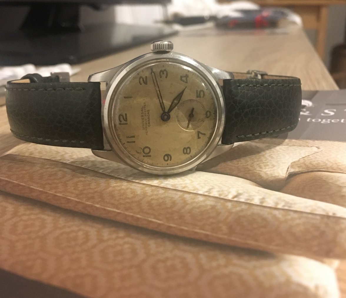
What do you guys think about that: https://www.ebay.com/itm/Vintage-19...820046?hash=item2cd9cf914e:g:yckAAOSw3mNbe0hQPurchases made through these links may earn this site a commission from the eBay Partner Network
Be patient and the watch of your dreams will appear!!! For me, what it really matters is to wear a watch that makes you smile when you look at it....
Hi there everyone. I also have a universal Geneve Henrique Pfeffer, very similar to the one mentioned, but I don’t know what price point to sell it at...any ideas?
Opinions? https://www.ebay.fr/itm/1934-Rare-Vintage-Universal-Watch-Geneve-Compur-First-Series-Two-Column-Wheel/183401280327?_trkparms=aid=111001&algo=REC.SEED&ao=1&asc=20160908105057&meid=2f6dbb364c4f403eb179561d8d6c1115&pid=100675&rk=1&rkt=15&sd=183401280327&itm=183401280327&_trksid=p2481888.c100675.m4236&_trkparms=pageci:f58e2e85-aa58-11e8-ad90-74dbd1804ca6|parentrq:7dec64081650aa66a830ad33fffdfffd|iid:1Purchases made through these links may earn this site a commission from the eBay Partner Network
look at the outer track, for example, the 7 near 4 o clock and the 17 near 10 o clock. one is thinner while the other thicker. likewise see the rest of the numbers i've highlighted. I think its a pretty evident redial considering my uneducated eye can spot these.... there's probably more...
Ahhh.... I see it now. On closer inspection, the letter U and T looks a little off. Is the compur supposed to be in the same font as universal watch?
I only questioned it because I thought on the seconds track some didn’t look the same. 0 in 60 and 0 in 10. Then 3 in 30 and 3 in 35. Still learning so I wanted another opinion Just noticed the 30 on the 45 min counter
aside from font inconsistencies, the fonts in general are not quite right. Plus the railroad tracks are not right. Plus the sub dial hands seem too long. Plus the minute hand seems too long (same length as chrono?). Plus the watch is from Italy. Lots of monkey business IMO. Still, attractive watch at the right price.
Got countered to 2400 Euros for this. Asked the seller for movement pics. How does this look? some scuffs on the dial but nothing major.
Gold hourly marker way too close or even overlapping the prints. Sub hands on the right register replaced.
Thanks. Priceless education. Just to verify, the fonts for Universal Geneve, itself looks abit uneven as well. Is that normal?