The Flightmaster thread
Mr Curta
·hanky6
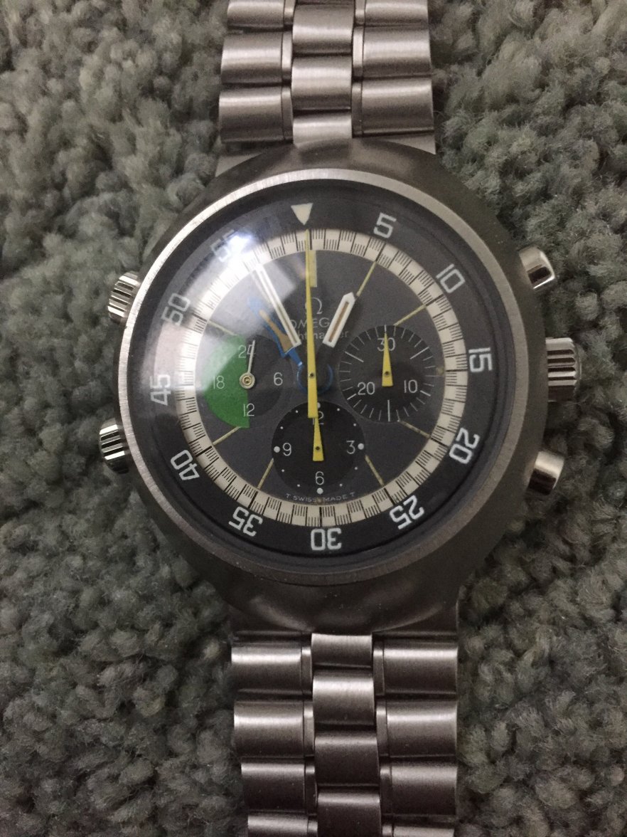
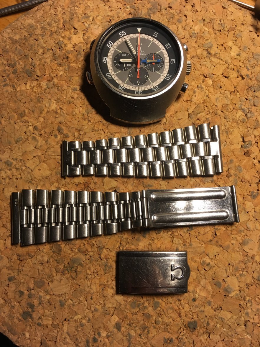
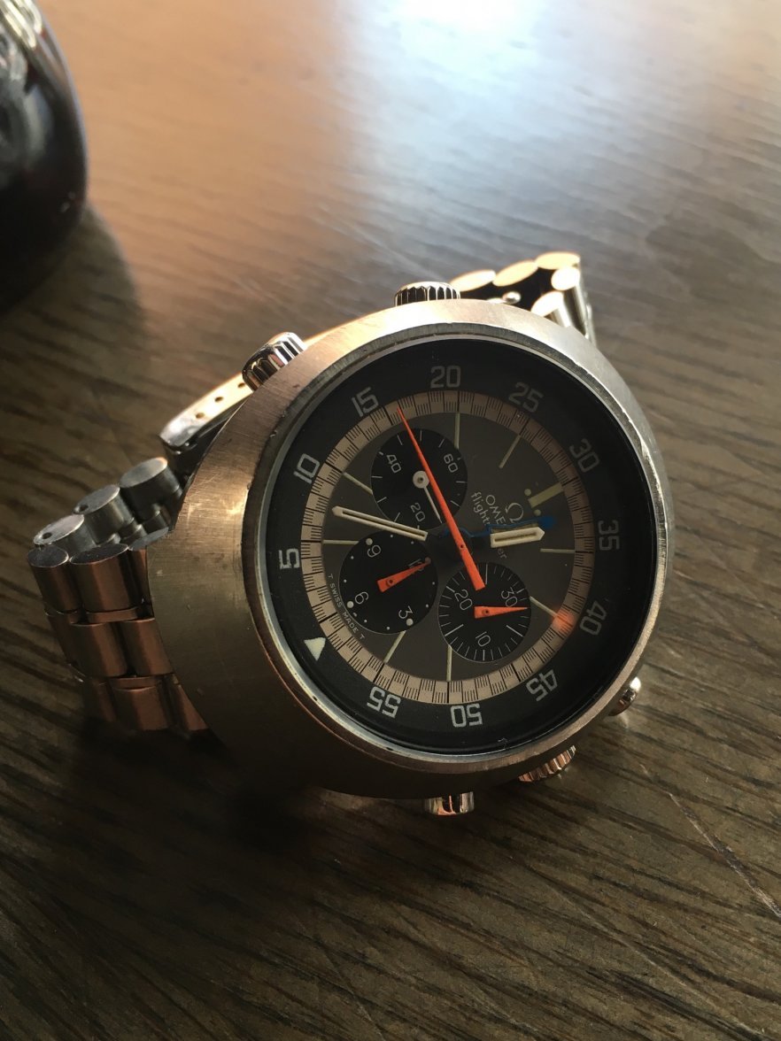
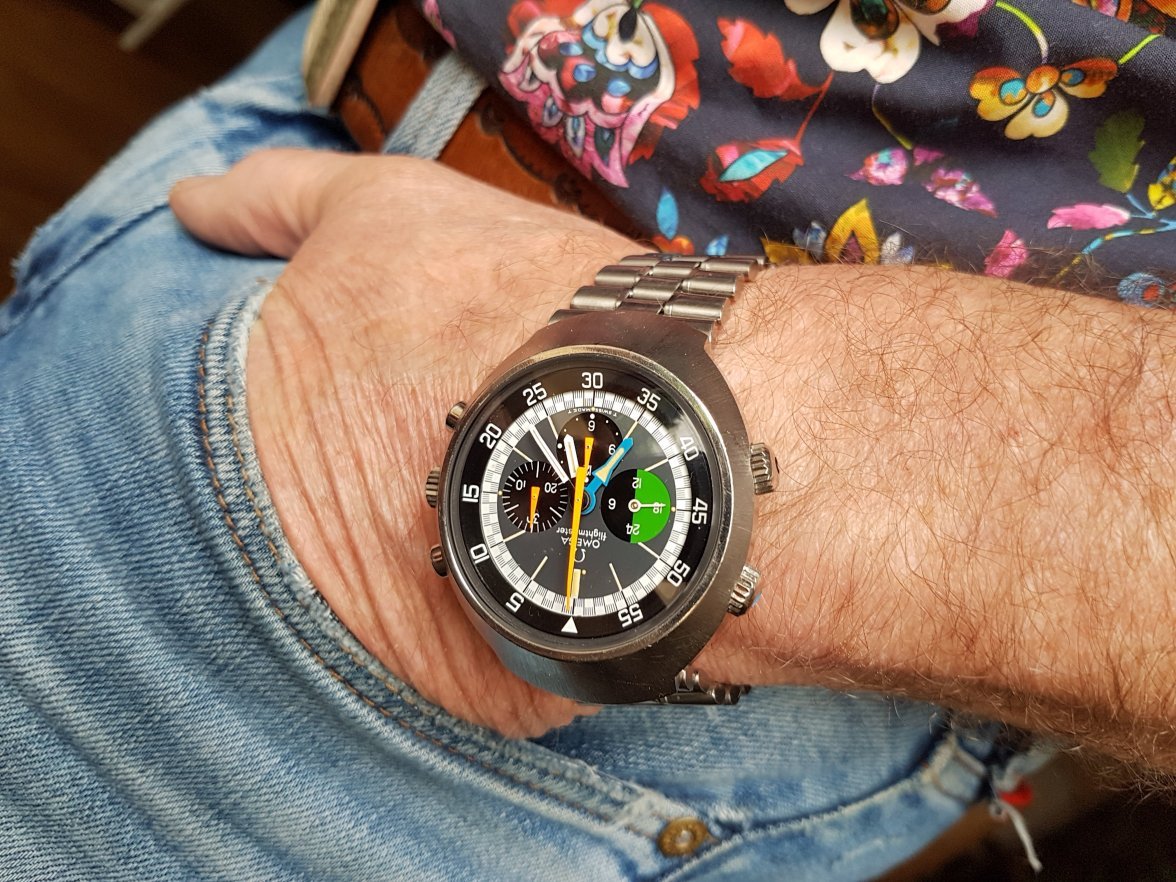
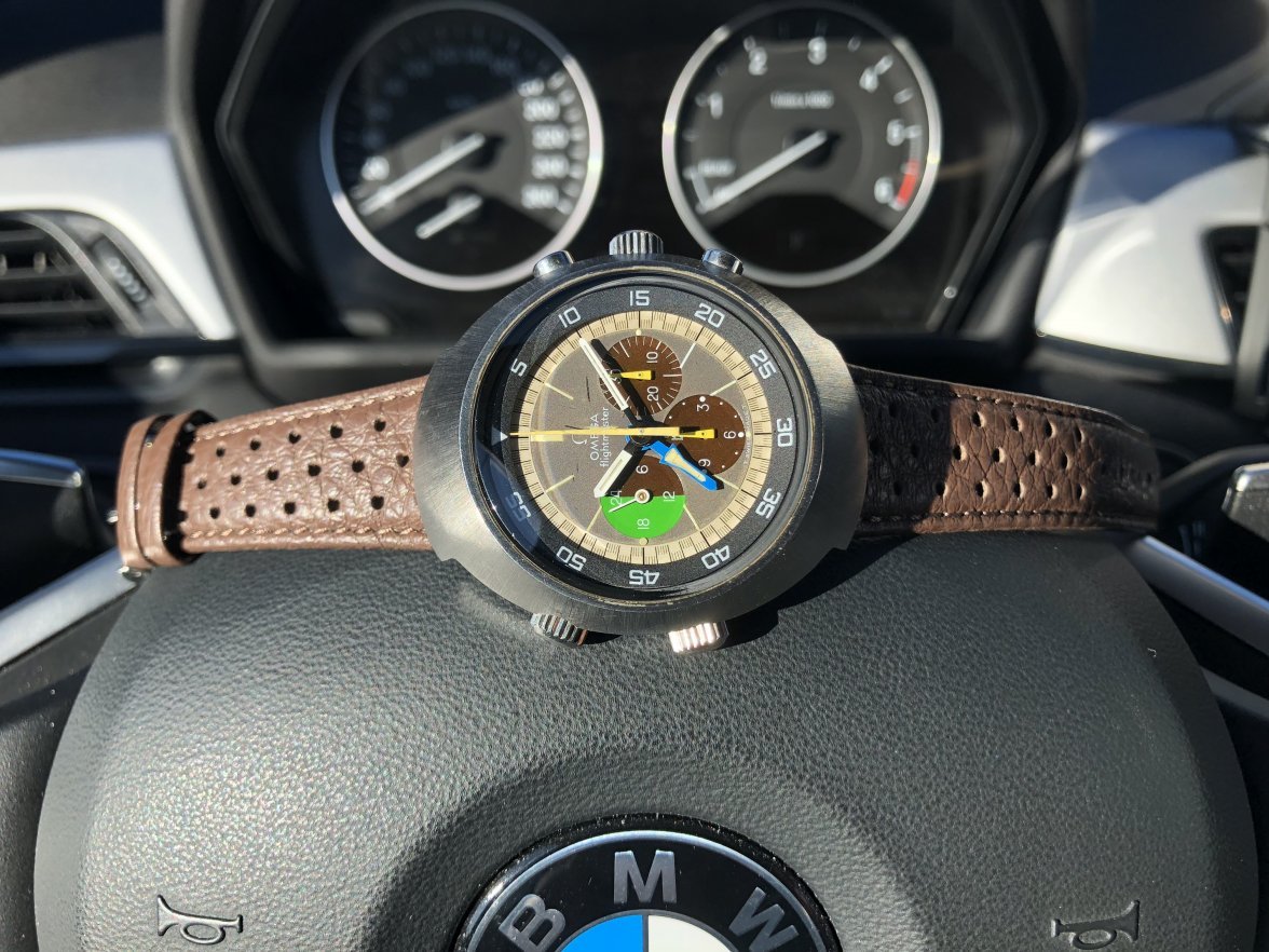
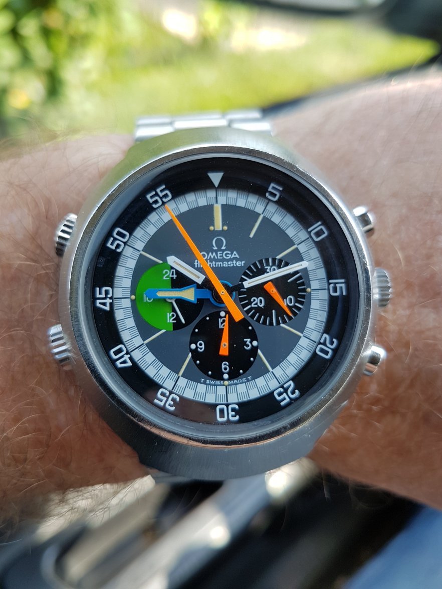
·Just got this the other day. I have been looking at the Flightmaster for a while, and I do love the looks. But the shape and dimensions made me think it would be to big. Found one for sale locally and decided to give it a try, and I have to say it is great on the wrist. The Flightmaster hugs the shape of the wrist really nice and sits low as well, does not feel any bigger than a Speedmaster.
Gefa
·Just got this the other day. I have been looking at the Flightmaster for a while, and I do love the looks. But the shape and dimensions made me think it would be to big. Found one for sale locally and decided to give it a try, and I have to say it is great on the wrist. The Flightmaster hugs the shape of the wrist really nice and sits low as well, does not feel any bigger than a Speedmaster.
Yes this is also my experience... On the wrist they are looking not as big as they are looking unworn on the bracelet. 😉
Gefa
·mancio
·I hate thi tread, now i want a flightmaster!!🤦🤦😗😁😁
monti
·kov
·JanV
·Yes this is also my experience... On the wrist they are looking not as big as they are looking unworn on the bracelet. 😉
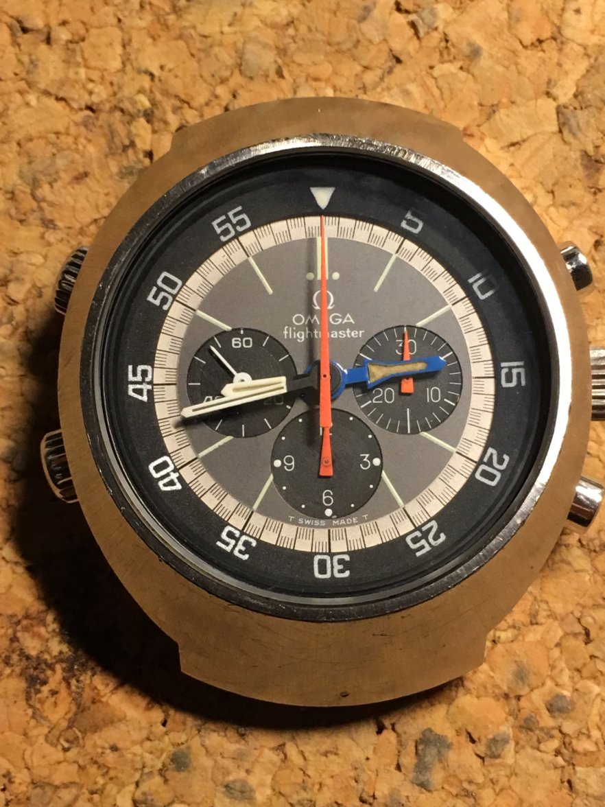
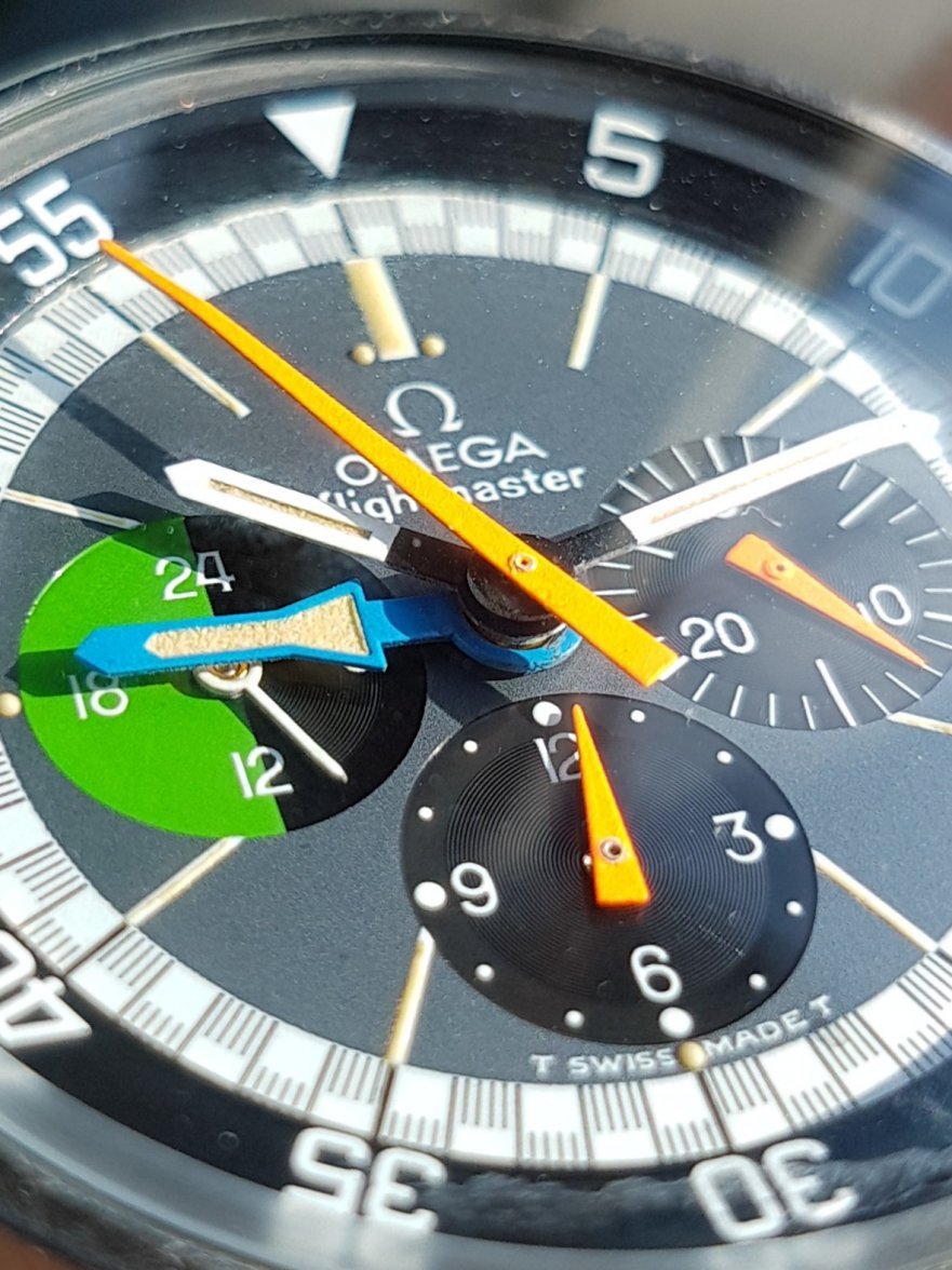
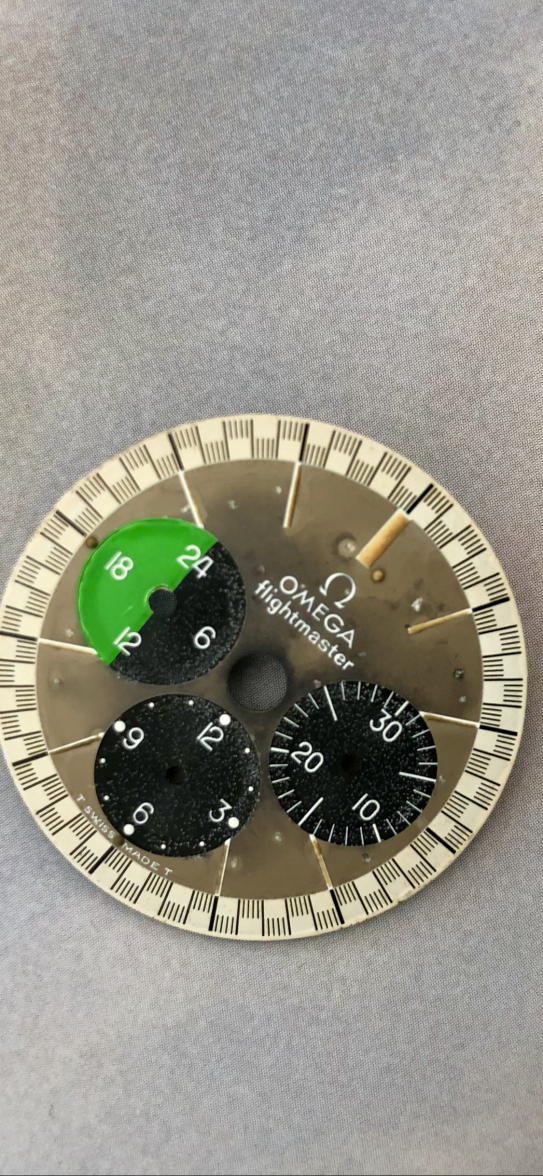
Your dial is one with lume dots on the 12 marker, but without the serif fonts. The Flightmaster Only book doesn’t mention this version in their book, but now as I see yours is the same as mine, this gives me assurance that there indeed was a version like ours in between the first and second edition of the dials. Here’s yours and mine (had a hard life) next to each other.
Gefa
·Do you know that you have a rare / unusual dial on your watch?
Your dial is one with lume dots on the 12 marker, but without the serif fonts. The Flightmaster Only book doesn’t mention this version in their book, but now as I see yours is the same as mine, this gives me assurance that there indeed was a version like ours in between the first and second edition of the dials. Here’s yours and mine (had a hard life) next to each other.
..Thanks for telling this..I didnt realized this till yet..??
What do the flightmaster profis think about this??
Do you know that you have a rare / unusual dial on your watch?
Your dial is one with lume dots on the 12 marker, but without the serif fonts. The Flightmaster Only book doesn’t mention this version in their book, but now as I see yours is the same as mine, this gives me assurance that there indeed was a version like ours in between the first and second edition of the dials. Here’s yours and mine (had a hard life) next to each other.
... Thanks for telling this, I didn't realize this till yet . 😕.... what do the "flightmaster profis" think about this ??
Mods
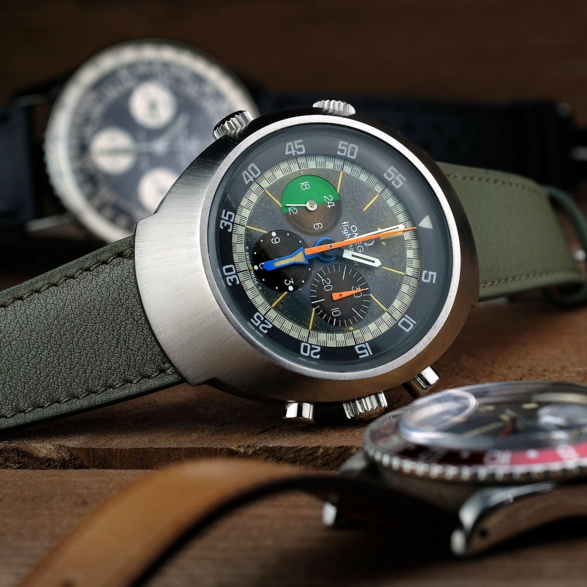
·I have to echo the earlier comments of @Gefa @hanky6 regarding how these look and fit on the wrist.
I can only speak re the first version which is slightly slimmer than the second iteration.
I have a skinny wrist, so much so that the bracelet doesn’t fit me with all the links removed (the wide taper restricts the amount of bracelet that can be hidden in the clasp).
It gets lots of wrist time amongst some strong competition and just keeps growing on me.
Gefa
·I have to echo the earlier comments of @Gefa @hanky6 regarding how these look and fit on the wrist.
I can only speak re the first version which is slightly slimmer than the second iteration.
I have a skinny wrist, so much so that the bracelet doesn’t fit me with all the links removed (the wide taper restricts the amount of bracelet that can be hidden in the clasp).
It gets lots of wrist time amongst some strong competition and just keeps growing on me.
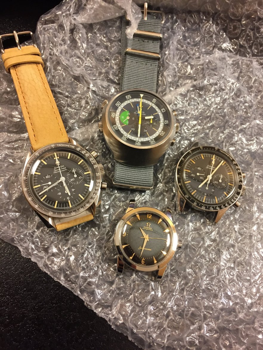
WOW..beautiful watches! 👍👍
Guiguit
·What a nice family portrait 👍👍
Gefa
·Do you know that you have a rare / unusual dial on your watch?
Your dial is one with lume dots on the 12 marker, but without the serif fonts. The Flightmaster Only book doesn’t mention this version in their book, but now as I see yours is the same as mine, this gives me assurance that there indeed was a version like ours in between the first and second edition of the dials. Here’s yours and mine (had a hard life) next to each other.
Maybe these are A4 dials "with Dots" around 12... the hooks of the Omega logos looks like in A4 and not as in A5 and A4 has Sans Serif font... 😉
JanV
·Maybe these are A4 dials "with Dots" around 12... the hooks of the Omega logos looks like in A4 and not as in A5 and A4 has Sans Serif font... 😉
