Strange Omega Logo on 1960s Speedmaster

Posts
82
Likes
50
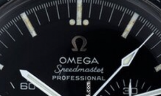
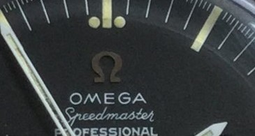
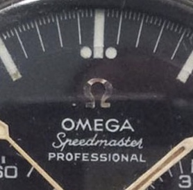
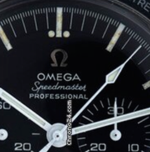
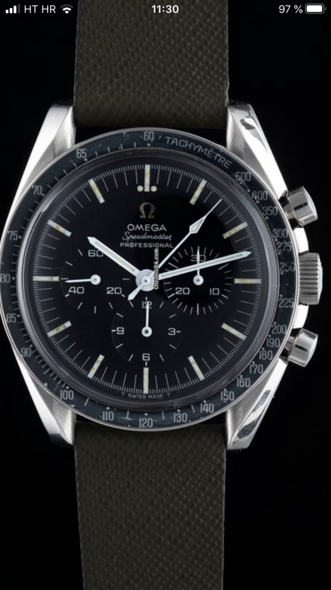
Saw this on Chrono24. It‘s a 105012-66 CB. It has got a wide spaced T dial, which is correct for this Ref number, but the Omega logo doesn‘t look like any other on a 105012-66 I‘ve ever seen. It also doesn‘t match any of the service dials I‘ve seen on Speedmaster101 or here on the forum. Does anybody know more about this?
 
Posts
88
Likes
24
The applied logo looks good to me tbh, but I don't like the patina and the hands look like service hands to me
 
Posts
1,921
Likes
2,658
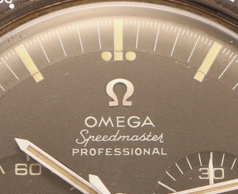
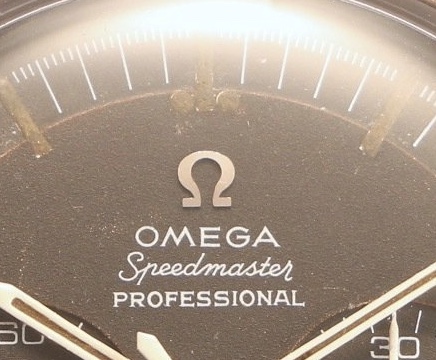
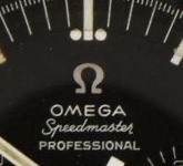
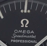
I also think that the Logo doesn't look the other ones on 105.012s

OPs


vs


(taken from Speedmaster101)


Calling the experts!!!
 
Posts
1,220
Likes
5,521
Agree. Compared to mine, this one has somewhat smoother ‘loop’ on the inside. Interested to hear what could explain this!
Edited:
 
Posts
295
Likes
148
Strange logo, indeed ! The lower part on the inside should be straight ! Something's wrong...
 
Posts
17,746
Likes
26,930
service dial. Remember that service dials where ordered in small batches and there are lots of variations on them not described on speedmaster101.
 
Posts
17,746
Likes
26,930
I am not seeing the issue, after further inspection, it seems to be a normal dial.


Fonts and small details are all correct. What exactly is on that dial that looks wrong. The photo seems to add some artifacts and is slightly compressed left to right.
 
Posts
82
Likes
50
I am not seeing the issue, after further inspection, it seems to be a normal dial.


Fonts and small details are all correct. What exactly is on that dial that looks wrong. The photo seems to add some artifacts and is slightly compressed left to right.
I also think that the Logo doesn't look the other ones on 105.012s

OPs


vs


(taken from Speedmaster101)
I think it‘s pretty visible in this post from @Passover. The dial looks correct in all parts except the applied logo. Take a look at the feet of the Omega logo: on normal 105012 they have a square shaped ending but in the one from the OP they are cut off diagonally on the ends
 
Posts
17,746
Likes
26,930
I think it‘s pretty visible in this post from @Passover. The dial looks correct in all parts except the applied logo. Take a look at the feet of the Omega logo: on normal 105012 they have a square shaped ending but in the one from the OP they are cut off diagonally on the ends

Google 105.012 and look at other examples. It’s not uncommon.
 
Posts
82
Likes
50
Google 105.012 and look at other examples. It’s not uncommon.
Those are the first few that pop up on google pictures where the logo is clearly visible:

I also looked further down but I couldn‘t find a single one with diagonally cut ends on the feet of the logo
 
Posts
1,921
Likes
2,658
Also couldn't find another example...

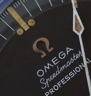
To point out the differences:

OP:


vs


As explained by @Luca.P the feet of the logo differ
 
Posts
88
Likes
24
Now that I see it side by side you are right, I think it looks odd too.

I still think that this patina is not desirable
 
Posts
83
Likes
151
Is the watch leaning slightly to the left? The angle of the photo doesn’t look like it’s head on with the watch lying flat, but maybe that’s just me
 
Posts
2,421
Likes
4,672
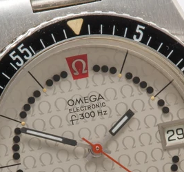
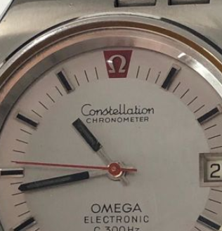
Took me moment, but I have seen this Logo-shape quite often before, not on a Speedmaster though. So either a "factory-error" or it was applied later, outside of the production line. Go check 70's F300, looks exactly like the one here.

 
Posts
88
Likes
24
Took me moment, but I have seen this Logo-shape quite often before, not on a Speedmaster though. So either a "factory-error" or it was applied later, outside of the production line. Go check 70's F300, looks exactly like the one here.

Very interesting, wondering if this applied logo is actually a transitional one that Omega had before printing it
 
Posts
82
Likes
50
Very interesting, wondering if this applied logo is actually a transitional one that Omega had before printing it
I don´t think it´s transitional because the 145012 still used the same applied logo as the 105012 and the watch in question here is a 105012
 
Posts
82
Likes
50
Took me moment, but I have seen this Logo-shape quite often before, not on a Speedmaster though. So either a "factory-error" or it was applied later, outside of the production line. Go check 70's F300, looks exactly like the one here.

The right one looks very similar, if not identical. The left one has a slightly wider gap between the 2 feet I think. Do you know when the left one was produced? I found the Ref. number is 198.0004 but I can´t find when these were made