Some Thoughts On The Forum Main Page Layout Re-Marketplace

Posts
4,593
Likes
10,788
The long-time trend is newly signed up members asking about an Omega they spotted somewhere on the net for sale and warned off as the majority of those watches are sub-par, to outright rip offs/frankens. Often times myself and other members post a suggestion for the new member to browse our own for-sale marketplace to have a better chance of buying something legit and priced reasonable.

Now of course there are decent watches for sale anywhere on the net if one is savvy, but why are these new members unaware of our own marketplace until they are told? Then it is like a revelation. This happens so often that there must be some subtle way to inform newly signed up members that there is a marketplace section. I know this site is not primarily a sales forum, but perhaps if there was some sort of heading on the main page that indicated a for sale section, it might be of service to new collectors who have come across our forum. Nothing tacky, just something to clue in new members who might be too excited to dive into the discussion sections with questions that they haven't scrolled completely down the forums sections list.

Many of us members sporadically post stuff for sale, and not many of us are in the reselling business so it's not imperative for the watches to go quickly. I myself just started popping a few on here for sale a couple months ago after over a year of not posting anything for sale online. Mostly we members list watches as they start to clutter up and are not being used, or to turn the cash into another watch. I think it would be beneficial for both seasoned members and new members alike if the marketplace section was listed in a way that the majority of new members spot it without needing to be enlightened. These newbies will surely benefit from safer dealings.


Thoughts? 😀
 
Posts
116
Likes
225
Not specifically regarding the for sale market place but I remember when I first joined it took me a while to realise there was more than just 3 areas on the forum and I may have done the same thing when I recently logged back on ::facepalm1::

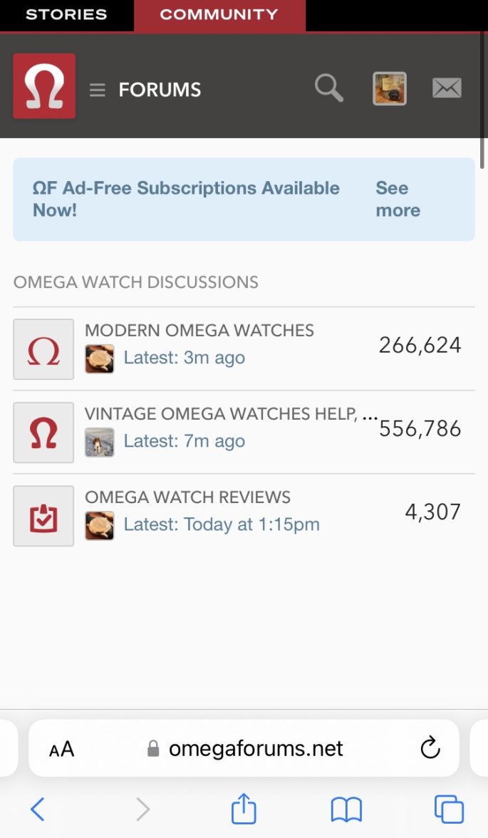
As I only use my phone to come on here when you’re at the main page it looks like this.

Maybe I’m the only one who didn’t instantly scroll down though…
 
Posts
618
Likes
2,241
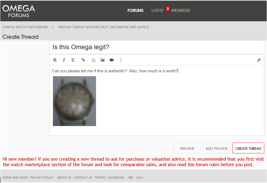
I think one option would be to show a warning on the "New Thread" window for new members with that advice. I'm not sure if it is technically possible to show a message based on post count, but here is a quick mock-up:

 
Posts
2,721
Likes
11,989
Not specifically regarding the for sale market place but I remember when I first joined it took me a while to realise there was more than just 3 areas on the forum and I may have done the same thing when I recently logged back on ::facepalm1::

As I only use my phone to come on here when you’re at the main page it looks like this.

Maybe I’m the only one who didn’t instantly scroll down though…
Happened to me too at first. It’s a big ole’ ad being blocked, so you just get a blank space. Time to cough up the membership fee. 😁
 
Posts
208
Likes
464
Initially, when I first joined, I was confused by the separation of 'Watches for Sale' and 'Private Watch Sales'. I kept looking in watches for sale, for these good deals that were mentioned in threads.

Tbh, it didn't take very long to work it out! But I agree with the OP making it a bit more obvious for newcomers is a good thought.
 
Posts
116
Likes
225
Happened to me too at first. It’s a big ole’ ad being blocked, so you just get a blank space. Time to cough up the membership fee. 😁
Ah I see 😟 Think I’ll see if I stay engaged for a bit longer this time before I plump for a year’s membership 😀 That and I’m a bit tight for spare cash until the end of Feb due to a recent new watch purchase and my pending wedding
 
Posts
1,910
Likes
5,697
Agree/Disagree...

You have a point but it won't net the desired result. Anon/New folks showing up for a "Legit?" or "What's It Worth?" style post, in my experience, are never about doing research and looking around... as a former forum creater/admin I can safely say, especially these days, folks asking those types of questions want immediate gratification ~ an answer.
They also never use the Search function.
 
Posts
2,345
Likes
3,740
Yeah last night when the power went out and I wanted to check if my post went through on the phone, This old boomer found the home screen confusing and hard to navigate. Even looking for a post I did a few minutes prior. (There is a lot of traffic here -- which is good.)

I think a lot here do use their phones. Especially when uploading photos.
 
Posts
1,910
Likes
5,697
Yeah last night when the power went out and I wanted to check if my post went through on the phone, This old boomer found the home screen confusing and hard to navigate. Even looking for a post I did a few minutes prior. (There is a lot of traffic here -- which is good.)

I think a lot here do use their phones. Especially when uploading photos.

99% phone user here.
I tried using my PC once... on a 37 inch screen the photos, outside of watch photos that is, were huge and off-putting with detail.
My nostrils, dust covered lenses of my glasses, unshaven mug and non-goo'd hair were too much for even me to look at on 37 inches of screen.
Evidence ~
 
Posts
12,894
Likes
51,575
Initially, when I first joined, I was confused by the separation of 'Watches for Sale' and 'Private Watch Sales'. I kept looking in watches for sale, for these good deals that were mentioned in threads.

Tbh, it didn't take very long to work it out! But I agree with the OP making it a bit more obvious for newcomers is a good thought.
Would not be a bad idea to add some short explaination: Like: For Sale By Dealers/For sale by Members.
 
Posts
1,910
Likes
5,697
Would not be a bad idea to add some short explaination: Like: For Sale By Dealers/For sale by Members.

This↑

until I figured it out that was confusing as shit.
 
Posts
5,847
Likes
42,194
SC1 SC1
99% phone user here.
I tried using my PC once... on a 37 inch screen the photos, outside of watch photos that is, were huge and off-putting with detail.
My nostrils, dust covered lenses of my glasses, unshaven mug and non-goo'd hair were too much for even me to look at on 37 inches of screen.
Evidence ~

Scared me for sure!
 
Posts
1,910
Likes
5,697
Me, I would offer the idea of a new sub-forum called, "Valuation & Authenticity Questions".

I detest drop-in anons who don't take the time to offer jackshit about themselves or contributions and just spew out "What's it Worth?" or "Legit?" or the like.

I see enough of that shit on Facebook in watch groups.
 
Posts
1,910
Likes
5,697
Scared me for sure!

Agreed.

Upside: you oughta seen me before the botched plastic surgery.
 
Posts
2,721
Likes
11,989
It’s not a bad idea but the people who need to read it ain’t gonna read it. It may filter a couple percent of the riff-raff. Maybe I’m wrong.

How about a bot that detects these types of posts and replies with the canned response? The “OF-Bot” could also auto-reply to all of Fred’s posts with SC1 flipping the bird and vice-versa.
 
Posts
1,910
Likes
5,697
It’s not a bad idea but the people who need to read it ain’t gonna read it. It may filter a couple percent of the riff-raff. Maybe I’m wrong.

How about a bot that detects these types of posts and replies with the canned response? The “OF-Bot” could also auto-reply to all of Fred’s posts with SC1 flipping the bird and vice-versa.

Bird-Bot, I'm down for it.

And no, you're not wrong... folks are going to bypass anything and everything to get that endorphin hit of "What's it Worth?" everytime. It's like a scratch ticket at the local convenience store. A rush they need.
 
Posts
2,721
Likes
11,989
SC1 SC1
Bird-Bot, I'm down for it.

And no, you're not wrong... folks are going to bypass anything and everything to get that endorphin hit of "What's it Worth?" everytime. It's like a scratch ticket at the local convenience store. A rush they need.
 
Posts
5,847
Likes
42,194
Yeah last night when the power went out and I wanted to check if my post went through on the phone, This old boomer found the home screen confusing and hard to navigate. Even looking for a post I did a few minutes prior. (There is a lot of traffic here -- which is good.)

I think a lot here do use their phones. Especially when uploading photos.

I have to admit that I'm still too ignorant to successfully take a phone photo and then post it from the phone. I have to post from the desktop having used a digital camera to take the shot. I'm not intuitive enough to do tech stuff and frankly dislike it. Might be part of the problem.

Would be nice for our esteemed Forum members to have a little space to feature batches of watches they wished to peddle for benefit of those members who would wish to peruse their offerings. I don't know how much technical difficulty would arise from attempting to design something different than the Forum's "Watches For Sale" and "Private Watch Sales." Might be a chore for moderators to police.

There's already Ebay and Chron24 for that sort of thing, though I'd even trust Janice&Fred over those two.
 
Posts
5,847
Likes
42,194
SC1 SC1
Agreed.

Upside: you oughta seen me before the botched plastic surgery.

At least you had some botched plastic surgery.

I can't excuse my own ol' naturally ugly mug.