Original De Ville or redial?

Posts
11
Likes
0
Hi everyone. Thanks in advance for helping me on this.
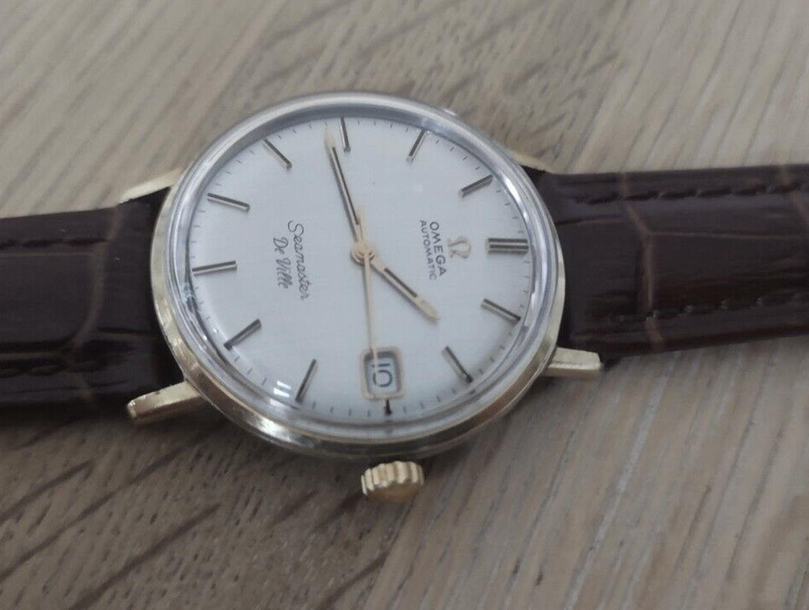
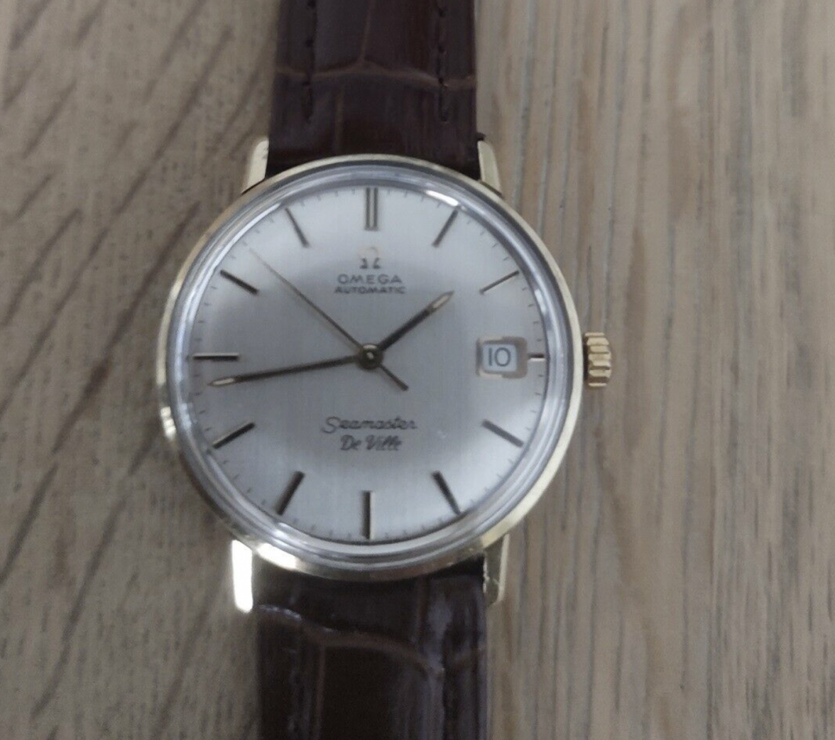
I've bought this Omega Seamaster De Ville from 1962. However, I see that the "De ville" on the dial is in cursive, and most de ville watches are with capitals. Do some of you know of this variation, and is my watch kind of unique or just some kind of copy?
Thank you.
Malthe
 
Posts
1,446
Likes
5,040
The original dial may not have been replaced per se, but it was refinished. The other example was probably refinished by the same dial refinisher.
 
Posts
11
Likes
0
Vanallard, thank you very much - Nepomuceno too. However, the watches are bought in Denmark (in 1962) and USA (the one for sale i.e) respectively, so that seems to be some coincidence if thats the case.
 
Posts
11
Likes
0
Can you help me with a bit of understanding: If the original dial is refinished, is it only a question of collectors (and $ ofc) value? I.e, this means that the watch is a genuine omega, however with post-birth moderations?
 
Posts
7,938
Likes
57,334
Not a coincidence, there are only a handful of dial refinishers, and this one example is very unappealing to me.

Hope you can return it, good luck

If you like it, wear it, only 100 people around the world would know or care.

Welcome
 
Posts
1,173
Likes
2,435
Can you help me with a bit of understanding: If the original dial is refinished, is it only a question of collectors (and $ ofc) value? I.e, this means that the watch is a genuine omega, however with post-birth moderations?
I agree with the above. If you have the chance to return it you should. The redial is not the greatest in terms of whoever did it chose a gaudy font. Stick around and start the journey here
 
Posts
21,074
Likes
48,127
It's nice to see Doogie Howser getting into watches. 👍 😉
Edited:
 
Posts
553
Likes
969
It's nice to see Doogie Howser getting into watches. 👍 😉
Ok, and this is by no means intended as being offensive to the op but man did I laugh hard at that.
Actually it’s a compliment, he’s a handsome bloke👍
Edited:
 
Posts
402
Likes
351
I am afraid you have a redial there. Not only is the "deville" a weird font, but the proportions of "Seamaster" look off to me as well. These are a great combination of a really good looking watch and not too expensive. Spend some time learning and then hunting for a nice example.