Opinion on two very similar photos

Posts
292
Likes
1,519
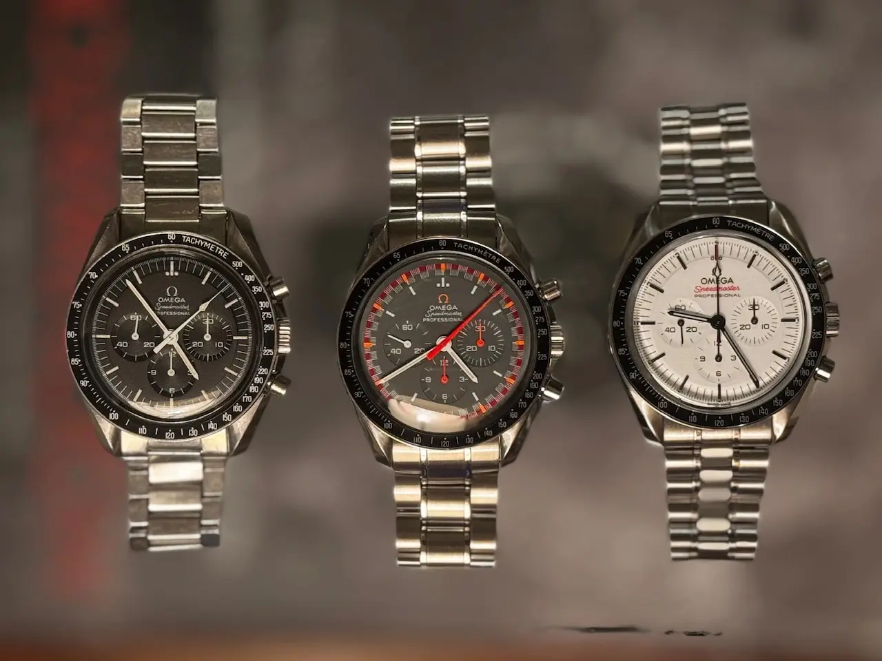
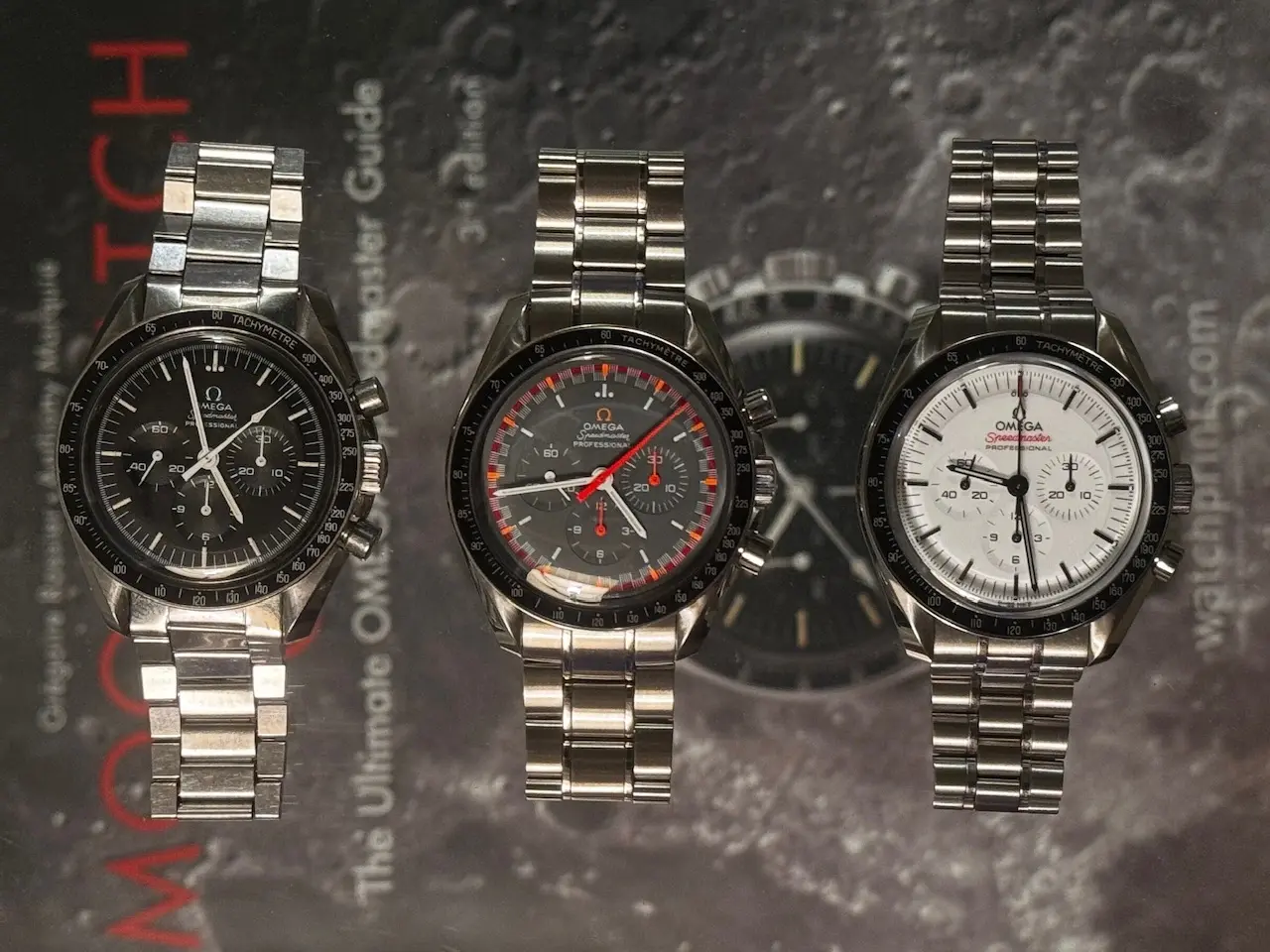
I’m a very [very!] inexperienced photographer but I have these photos from a night when the lamplight and a set of glass shelves inspired me.

I set my three Speedmasters on a middle shelf with a copy of MWO on the lower shelf. Then I placed the camera on the top shelf.

On the one hand I like having MWO more visually recognizable. On the other hand, I think the watches pop better in the foreground when the background is blurrier.

Would love opinions from more experienced photographers.
 
Posts
767
Likes
1,093
I like both, but the feeling is a tad strange as I suppose you have a glass in between and quite some distance between the book and the watches. So the blur on both feels slightly unnatural (as one would expect the watches to sit on the book, so the bokeh would be less pronounced).

I think I prefer the second one because the background with the book writing is a bit distracting and uneven. Putting three watches like this, you’re playing with symmetry and the book brakes it a bit. If the cover was only the crater, with some blur, but not as much as the second picture, maybe that would feel different.

Also the pictures look quite dark. Maybe you could try to boost the shadow and lower the highs a bit? The eye gets attracted straight to the high exposure parts - and the dials look a tad low light vs. the bracelets.

That my 2 cents having done a fair bit of amateur photography but not really watches, more people and landscapes.
 
Posts
616
Likes
1,876
The second photo looks photoshopped (I know it is not). Just because you can tell that the watches are laying somewhere and background separation can't physically be that pronounced.

@Risto does a lot of these suspended watch photos, where the watch is actually mid air and it creates a believable out of focus background. Not easy to pull off properly though.
 
Posts
292
Likes
1,519
I like both, but the feeling is a tad strange as I suppose you have a glass in between and quite some distance between the book and the watches. So the blur on both feels slightly unnatural (as one would expect the watches to sit on the book, so the bokeh would be less pronounced).

I think I prefer the second one because the background with the book writing is a bit distracting and uneven. Putting three watches like this, you’re playing with symmetry and the book brakes it a bit. If the cover was only the crater, with some blur, but not as much as the second picture, maybe that would feel different.

Also the pictures look quite dark. Maybe you could try to boost the shadow and lower the highs a bit? The eye gets attracted straight to the high exposure parts - and the dials look a tad low light vs. the bracelets.

That my 2 cents having done a fair bit of amateur photography but not really watches, more people and landscapes.
Great notes. Lighting and composition are two areas I’m still trying to unpack as a starting point in the process. I could probably do with a better lighting set up and more ability to control the placement of the subject matter. Cheers!
 
Posts
292
Likes
1,519
The second photo looks photoshopped (I know it is not). Just because you can tell that the watches are laying somewhere and background separation can't physically be that pronounced.

@Risto does a lot of these suspended watch photos, where the watch is actually mid air and it creates a believable out of focus background. Not easy to pull off properly though.
Yes, I found the effect strange but interesting. I’ve seen other suspended watch photos and will need to examine those more closely. Thanks!
 
Posts
1,084
Likes
1,635
I'd go with a second light source and try to reduce the glare on the crystals.