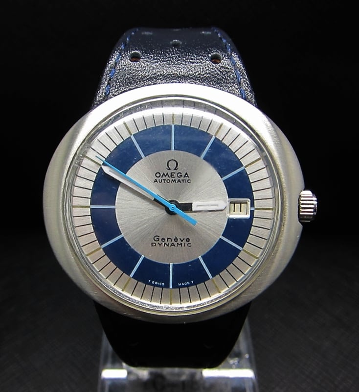
Omega Genève Dynamic With/without "swiss Made" On Dial?

Posts
27
Likes
4
Hey,

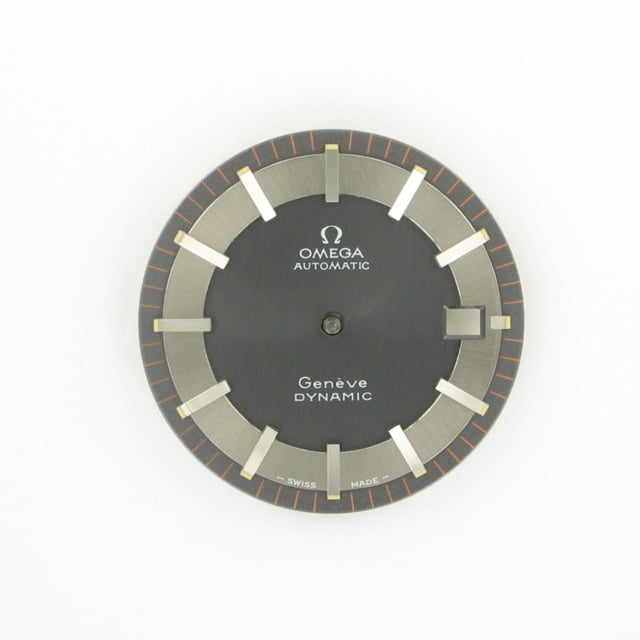
I recently discovered when comparing Dynamics that some of them doesn't seem to have the "Swiss Made" marking on the lower parts of the dial (under Genève Dynamic marking) . What's the difference between the one with the marking and the one without? Makes me curious because a friend of mine got the grey version of ST 165.0039 and there is no such text on the dial. Also there seem to be a lot of them with the missing marking on google pictures too.
I know the one with "T" in the beginning and the end means that the dial/hands are luminous with tritium but I'm curious about those missing "Swiss Made" marking.

😀
 
Posts
3,184
Likes
3,853
I thought I replied yesterday, but it looks like I forgot to press the post button 🤦

Some of the silver dial/bullseye dials used black paint for the "T Swiss Made T" printing, which makes it very hard to see in photos and not easy to see in the flesh. Can you post a picture of your friends watch ?

We also have a thread showing the dial variations: http://omegaforums.net/threads/geneve-dynamic-dial-variations-some-information.3599/

Does your friends watch have any of those dial types ?
 
Posts
27
Likes
4
Easy to forget when you're in a sleepy mood 😉

As far as I can tell there is no such text, seen a lot of Dynamics without the "Swiss Made". Maybe it was replaced somehow? Not sure if it is the ST 165.0039, maybe it is another version?
Here is a picture of the watch (woops missed the insert img but whatever 🤦)
http://i.imgur.com/lwchWOX.jpg

I belive it is the second grey one, you can compare with the image above.
 
Posts
3,184
Likes
3,853
That's a first generation non-date automatic, so it should be a 165.0039 with a cal 552 movement. The photo isn't high enough resolution to see clearly, but it looks like the printing might have been cleaned off. It's hard to tell if there is some faint residue of lettering or if it is just reflection/refraction in the picture.
 
Posts
27
Likes
4
Thanks for the information!
You're right the picture is indeed quite grainy. I guess that's a reflection of the cellphone camera (the shadow you see i the picture) and other reflections.
If the marking is cleaned off, is the value greatly decreased?
Is everything else as it should look when it was released?
The reason I ask is that I asked my friend to buy it and he wanted around 540$ for it. Which here in Sweden is just a bit more than normal price but it has got he bracelet and looks good except for the missing text.
Is it a bad deal? 😉
 
Posts
3,184
Likes
3,853
It's a fair price by English standards especially if it has the original bracelet. But if its above Swedish market price then I'm not sure about it.

I can't say I've really noticed Dynamics without the Swiss Made lettering. So if it was there but was cleaned off the dial then it reduces the value of the watch by some way.

There are lots of Dynamics around, so no need to rush to buy this one if you have a doubt over it.
 
Posts
27
Likes
4
To be honest it's probably a fair price here in säSweden too. Seen some on auctions for 500$ but they all had scratches and not original crystal. The one wih the strap goes for around 500$ too but the bracelet is quite rare, atleast with the grey dial.

I'm quite sure it's cleaned off then :/. Is the 552 movement good?

Yeah just thought about it because I've only seen 2 with braclet for 500$ in 3 months, most of hem cost around 620$ if it's not an auction. By the way, was there any difference in price between the grey and the blue dial back in the days when it was sold?
 
Posts
3,184
Likes
3,853
Cal 552 is a good movement. The question is whether the one in that watch is in good condition 😉

The original prices should have been the same for the different dial colours.

Try to look at the watch under magnification to see if the Swiss Made is there or not. It can be very hard to see in bad photos. I haven't seen this particular dial without the Swiss Made lettering before.
 
Posts
27
Likes
4
I'm pretty sure it's in a good contidtion, but who knows. He said he has never opened it but it doesn't go many seconds wrong each day.

I see, but i guess those with day or day-date did cost a bit more? I saw on a website that it did cost alot more if you chose to have "...rivetted hour markers" what does that mean? Any picture to see the difference? 😀

He lives a bit far away but maybe I can text him to see if he can check it out. Probably it's there but have been cleaned off or maybe a bit bleached I guess.
 
Posts
27
Likes
4
Oh I get it 👍 looks like brushed steel too me. Or maybe it's called riveted steel in english.. hmm.
However if everything is ok with the watch except for the "swiss made" marking, is 540$ too much or is it cheap for that one? I have not seen too many so I can't judge the price 😉
 
Posts
25,980
Likes
27,622
The markers are finished with a brush texture - but they're riveted to the dial.
 
Posts
27
Likes
4
Thanks!

Hm looked at the picture and saw that the "Omega-sign" looks a bit too wide, maybe it´s because of the angle the picture is taken through the glass? And the "è" in Genève looks like it is turning too much upwards. Maybe I'm being paranoid haha 🤦 but hmmm
 
Posts
27
Likes
4
P32mDpM.jpg

The one above is the one in the picture I linked earlier and the other one is from one I saw in the forums that seem 100% genuine.
And about the "Swiss Made" text, can it really be cleaned away so there isn't even a shadow left? Seems strange to me.

I'm sorry, I should let him send some more pictures but he has only got the camera on the phone. Hope to get some answers from you guys tomorrow.
 
Posts
3,184
Likes
3,853
The short answer is that you are you going to need much sharper photographs if you want to look at the fonts in detail.
 
Posts
27
Likes
4
Realized that after the post. Thank you for all the help😀
I will post again if I get any new information
 
Posts
3,184
Likes
3,853
Coming back to this again... this morning I received a cal 752 Dynamic (day/date). The "Swiss Made" was originally in black letters as normal. Usually, it can be hard to see unless you look carefully at the dial & may nor be visible in photo's.

On this one it is hardly visibile at all in the flesh. Under bright light I can see that there is text where it is supposed to be & the lettering can faintly be seen under bright light - but it's difficult without magnification (see photo below). I will try it under the loupe tonight to see if it is really there, or if the paint has drastically faded away.

[Edit: the Swiss Made is definitely there, but it took a torch and a 10x loupe for me to be sure.]

Do any of our watchmaker members have an explanation why this lettering would fade more than the printing in the centre of the dial ?

imageuploadedbytapatalk1364298264-164002-jpg.15132
 
Posts
27
Likes
4
Thanks!
I called the guy and asked him for some new photos and received a couple. Now I can see the text without any problem at all, he said that he took the other picture under a very bright light so that might have been the problem since the text was white.
Here is the new picture I recieved (still very low resolution but it is atleast visible)...
http://i.imgur.com/zIkSnVw.jpg

Hm I looked at the one you said was a redial, I can't really see what's different when compared to the original.Thought it was going to a bit more obvious which one that is real. The only thing I noticed is the polished case and the a bit odd looking crown. Is there any questions i always should ask myself when buying dynamics or another piece of Omega that tells me "This looks like it should but that doesn't look like something Omega does"?
 
Posts
3,184
Likes
3,853
Hm I looked at the one you said was a redial, I can't really see what's different when compared to the original.Thought it was going to a bit more obvious which one that is real. The only thing I noticed is the polished case and the a bit odd looking crown. Is there any questions i always should ask myself when buying dynamics or another piece of Omega that tells me "This looks like it should but that doesn't look like something Omega does"?

The best thing you can do is to read Desmond's article: https://docs.google.com/viewer?a=v&...m2UMv3&sig=AHIEtbQS2CjSemhzUG1v1QmsOXuh3h9YBQ

There are a lot of subtle pointers. The immediately obvious one on the one I posted is that the lettering is too thick - then you start to look at the details of the lettering.