- Posts
- 680
- Likes
- 755
w.finkenstaedt
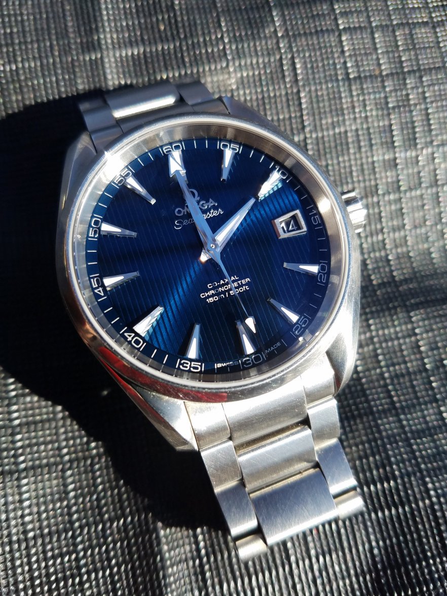
·I prefer the new ones, check the Green remarks as positive.
The horizontal grooves now alternate deep, two shallows, deep…nice IMO.
Just do not like the smile effect on the date window, red mark.
The new font is really good.
People always freak out at Baselworld because there aren't any good photos yet. The Globemaster is a perfect example of a great looking watch that people were apoplectic about during and post Basel until it hit stores.