Limited edition CK 2998....
ConElPueblo
·I think it is because of the lume, the letters are not printed but filled. They have to be of a certain width for the filling, so they appear unsharp from some distance.
Agree. It's not an even comparison, as the lumed tachy is a different animal all together. Had it not been made luminous, it would have been just as sharp as the other modern Speedmasters. And the modern, luminous tachymetres I've seen has all looked just fine when viewed in the flesh. Even better in the dark 😉
mozambique
·Yikes.......that blue abomination - quite possibly the ugliest Omega of all time.
Tritium
·Maybe this blue dial version could be Dennis first speedy...😗
BTW I love it🥰
BTW I love it🥰
italy1861
·Completely agree. The watch is a pleasant addition to a somewhere boring Basel 2016 roll-out. I'll be waiting for this one to hit the boutique.
davy26
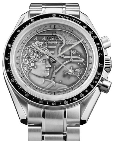
·Looks like another bit of over-exploitation to me. If you think about the real core Speedmaster characteristics - which surely something harking back to the second model should reflect - this dial seems irrelevant with its 'panda' appearance,
flyingout
·Unfortunate name choice, IMO, in that search results for the old ones will include these.
JohnSteed
·Unfortunate name choice, IMO, in that search results for the old ones will include these.
Try LE 2998 or this https://www.omegawatches.com/watches/baselworld2016/speedmaster-ck2998/
Taddyangle
·Coming July 2016
😀
😀
Psych
·It just looks cheap to me.
Can anyone see our successors aching to own this in 50 years? I can't.
Can anyone see our successors aching to own this in 50 years? I can't.
kpaxsg
·
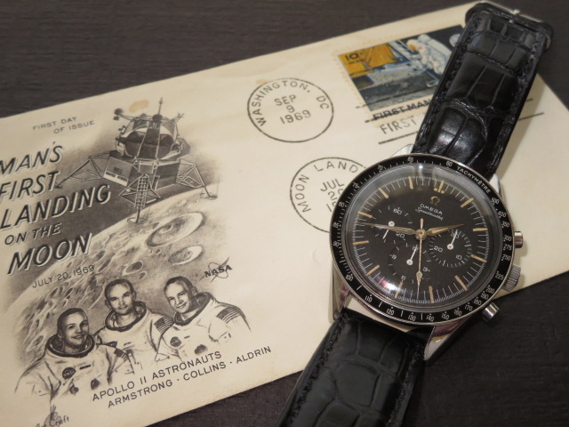
I'm glad to have started this thread just to see the last few photos of the ORIGINAL CLASSICS and I'm sure most would agree these oldies can never be matched! Takes some courage for some to say 'I like it' for the new, not sure if the design department will be reading all these comments but a good whopping $16.5m for the 2998 pieces in the making I am sure will still be a sell out...
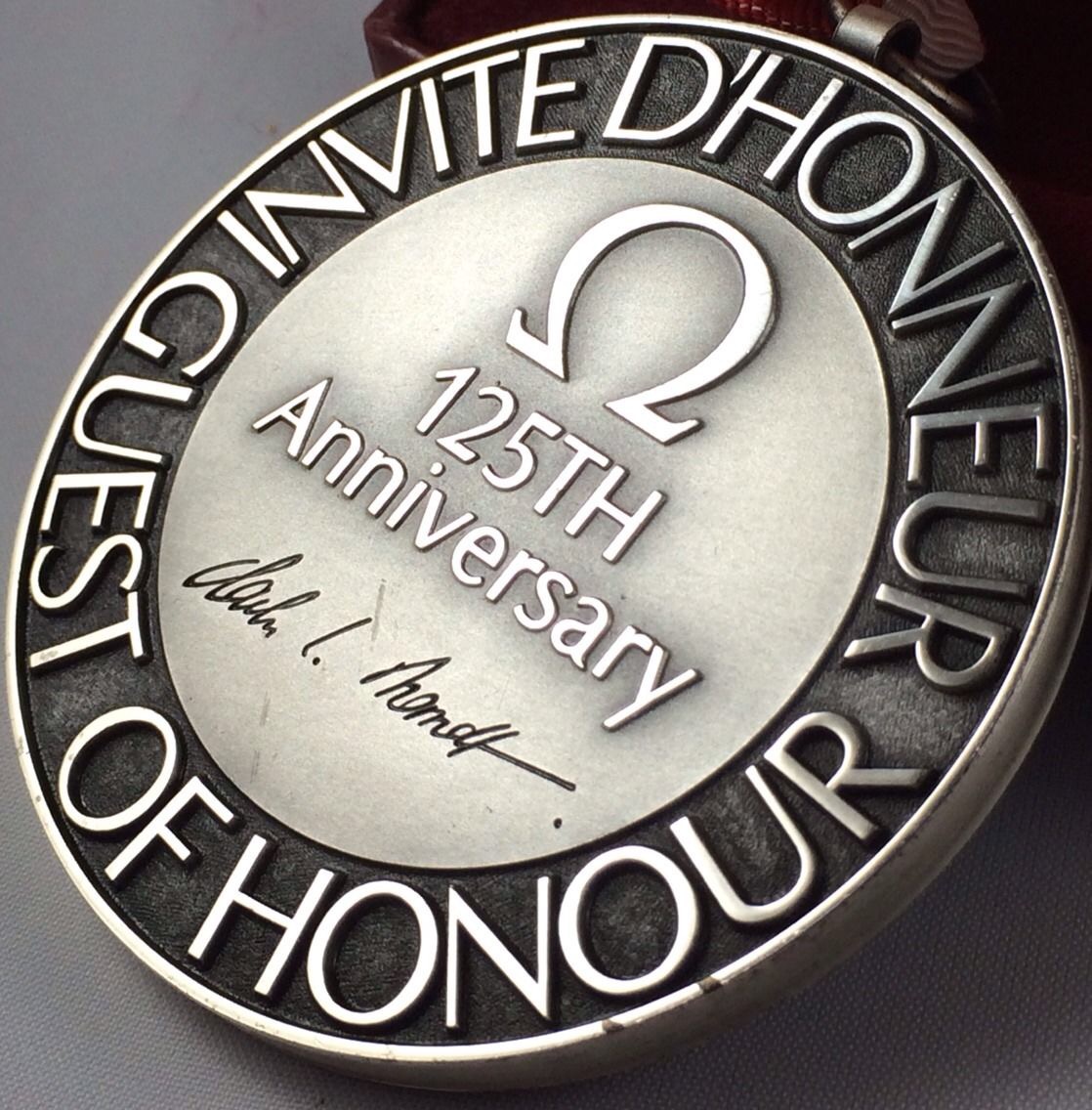
Just not sure how long it will take. Suppose the last numbered piece 2998 will be a sought after catch.... If they produced a medallion with a nice design to honor the 2998, I would love to have it...
Just not sure how long it will take. Suppose the last numbered piece 2998 will be a sought after catch.... If they produced a medallion with a nice design to honor the 2998, I would love to have it...
Taddyangle
·I mean it's not that great.. But "OF ALL TIME?" I'm sure plenty of forum members can provide examples of worse.
abrod520
·rbob99
·I need to see it in person to be sure, but I think it would have been better in black.
al128
·is the dial white or off-white/cream/ivory?
TimeForAnother
·I. Want. One.
TimeForAnother
·What will MSRP be? Snoopy was $7,350. Will this be similar?
oddboy
·Similar threads
- Posts
- 1
- Views
- 81
Various Omega Limited Edition Dials
Location: GB
TFA
FS
DLT222
Watch Parts and Accessories For Sale
£1
- Posts
- 0
- Views
- 333
Tissot Janeiro Z199 Limited Edition Chronograph
Location: US
SOLD
kaisiang098
Private Watch Sales
$2400USD
- Posts
- 16
- Views
- 4K


