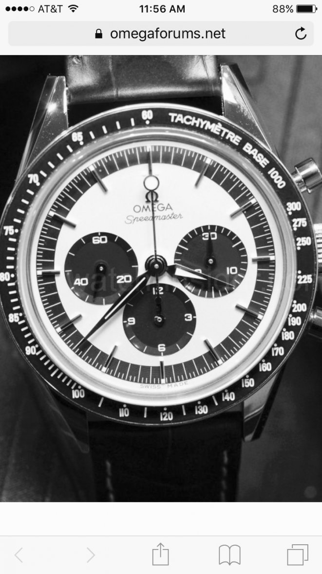
Limited edition CK 2998....

Posts
6,832
Likes
13,796
@gophishin But then someone could say " what's the point on re-hashing an old design rather than making a new interpretation of a classic? Like it happened with the golden panda.

To me they've come up with a well balanced new classic design. Yes they could and probably will make a black version but there is something fresh about this one.... And I like that it has no cartoons or gimmicks, just a watch
 
Posts
2,293
Likes
4,579
I've learned not to make snap judgements based on poor quality photo's... for me I have to see things in person in natural light to decide. What I look for at this stage of the game is potential. The LE Speedy has a lot of potential for me: size, its a moonwatch, limited edition, straight lugs, and a lollipop all check boxes for me. Price also pretty good for a retail boutique piece. As for the base 1000 bezel, I like the blue (a lot) even more than the dial, and the lack of crispness in the font I'll assume is superluminova like on the Silver Snoopy. To me, I prefer a lumed tachymeter over a non-lume sharper font. The ultimate question I will have on this piece will be: do I want to spend $5k on this LE, or one of the LE's from the past that I do not yet own (and yes, I know "both" is a better answer).

The PO with orange accents has potential, I love orange and the overall balance of the PO (I can't believe I don't own one yet). Can't want to see this one in person, definitely could be my first PO.

Meteorite GSOTM... wow, we've all been clambering for another meteorite dial, and Omega listened to us. Thank you Omega. Potential - yes, but I already own a Grey Side, so probably not for me. If I was in the market for a *Side, I would look at this this one first. Is the black date dial a problem? Maybe, gotta see it on the wrist in natural light to really know for sure.
 
Posts
493
Likes
1,066
@gophishin But then someone could say " what's the point on re-hashing an old design rather than making a new interpretation of a classic? Like it happened with the golden panda.

To me they've come up with a well balanced new classic design. Yes they could and probably will make a black version but there is something fresh about this one.... And I like that it has no cartoons or gimmicks, just a watch
It seems like the modern interpretation of a classic is already present in the form of the FOIS. Add this one to the FOIS models and make a true re-edition as a limited run, IMO.

To be honest, I would probably not buy it even if they nailed a re-edition, but I would strongly consider, and can see more potential, but it's just my $0.02
 
Posts
174
Likes
203
I do love me some blue.. but I personally don't think this matches the hotness that is Gemini Panda..
 
Posts
12,108
Likes
40,239
The blue minute track is too busy, but what really gets me is the lollipop hand being the same color as the dial. What good is that?

I do like the subdial hands matching though, and I like the effort the "Base 1000" represents.

Overall, I think if it weren't for the contrasting minute track, I'd be much more into it (photoshop anyone?)

So, I maintain, "Good effort, nice touches, don't like it"
 
Posts
493
Likes
1,066
don't they already have a black dial version of the FOIS?
Yeah, but it's more of a tribute, doesn't have the base 1000, lollipop, and all correct hands like this one. The FOIS is a strong modern interpretation, this one is supposed to be more specific to the 2998-1.
 
Posts
5,860
Likes
16,788
But weren't the lollipop hand an option on the only the 2998-2 and 2998-3??
 
Posts
493
Likes
1,066
But weren't the lollipop hand an option on the only the 2998-2 and 2998-3??
I couldn't remember, and didn't cross reference prior to my post, sorry if that's not correct. Although the Hodinkee article calls out the 2998-1 (but then goes to show a supposedly original 2998-1 with lollipop, but no base 1000).

1.jpg
 
Posts
5,860
Likes
16,788
I seem to recall MWO mentioning the lollipop starting on the 2
 
Posts
6,647
Likes
11,476
bet you wish your bezel was luminous and you had a lollipop hand though 😉

Just had to settle for chocolate for my other 2998-1:

9595159904_5b39e4b587.jpg
 
Posts
373
Likes
389
I agree. The font appears cheap, completely lacking in any style. In no way does this bezel resemble the flair of the original base 1000 lettering. This new version looks like it was printed of a lable machine.
I think it is because of the lume, the letters are not printed but filled. They have to be of a certain width for the filling, so they appear unsharp from some distance.
 
Posts
373
Likes
389
If that price quoted above is correct, I'm surprised they aren't trying to sell it for more, being a limited edition and all.
But this one doesn't have anything special like the caseback of the snoopy for example. I think it's already too much a premium over the standard FOiS just for the limitation alone...
 
Posts
2,720
Likes
5,550
A classic Omega design twist. That is what makes Omega special as a company, no fear. A little busy for my taste and don't you think the lollipop hand kind of disappears against the white dial?.
 
Posts
64
Likes
29
A little touch of class amongst an otherwise largely disappointing batch of new releases! Already asking myself whether I should trade in my 1957 Broad Arrow LE for this, as I'm loving it!
 
Posts
56
Likes
35
To be honest it's trying just a bit too hard, a bit too complicated with the 2 tone, not simple enough. I think the FOIS is simple, unfussy and plain elegant. It's not that it's a bad watch. I'm just saying