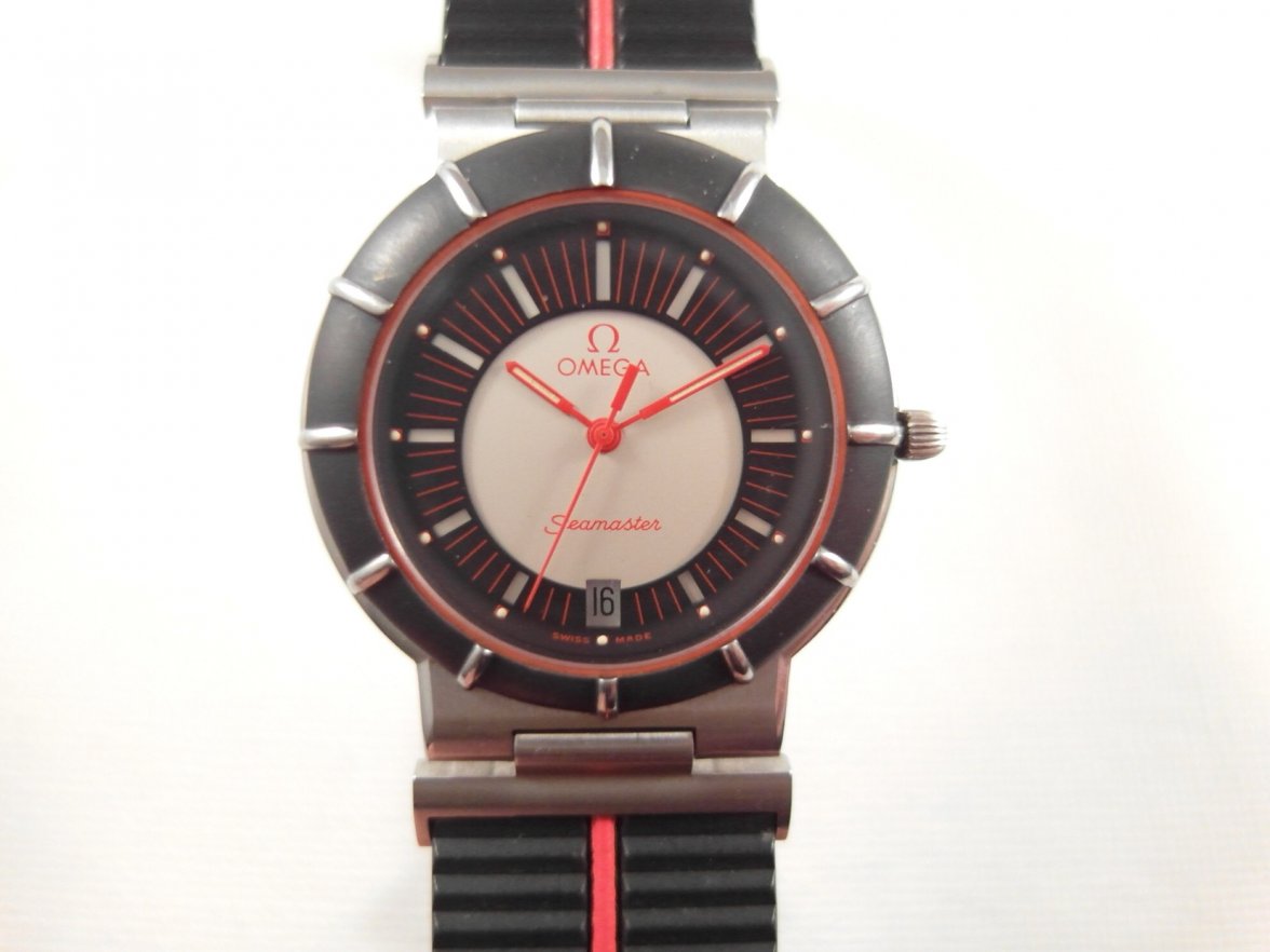
Lets see the most visually challenged Omega Models

Posts
17,681
Likes
26,772
After @Shailor felt the Mother of Pearl XL Railmaster was his least favorite Omega in this thread. I think a gauntlet has been thrown down. Lets find the most visually challenged model they have produced.

Lets see how many straight from the factory swing and a miss watches that Omega has produced. Watches that if you saw on ebay you would swear they are fakes, the unloved for various reason models that still languish unsold over a decade later...

These all apparently speak to someone so play nice.


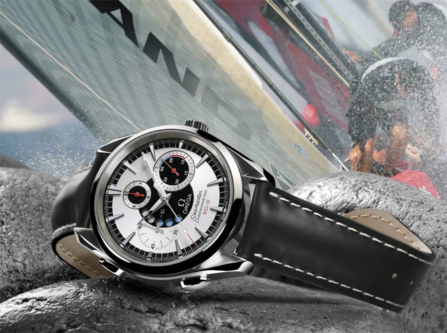
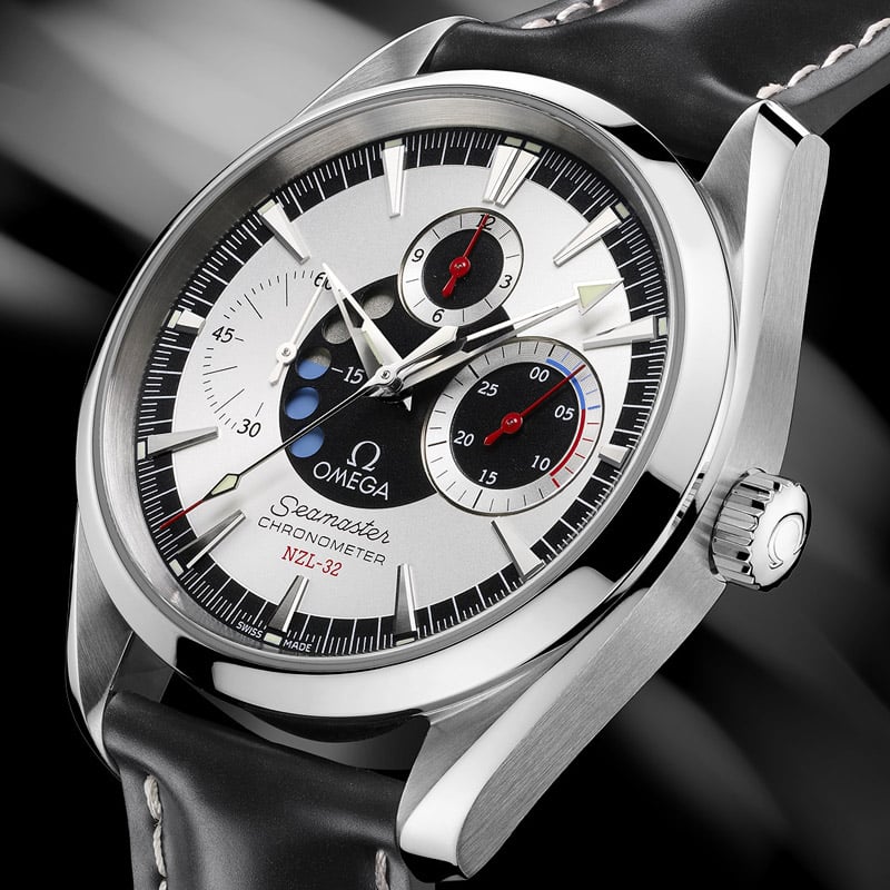
For your consideration I leave you the Omega NZL-32, a watch whose dial layout is so uniquely unharmonious, its amazing it exists. Released in 2006 it is still possible to easily source NIB watches.


Lets see them folks I know there are worse out there, lets avoid trashed and "patina" watches.
Edited:
 
Posts
1,813
Likes
9,385
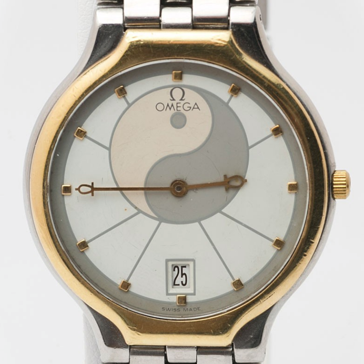
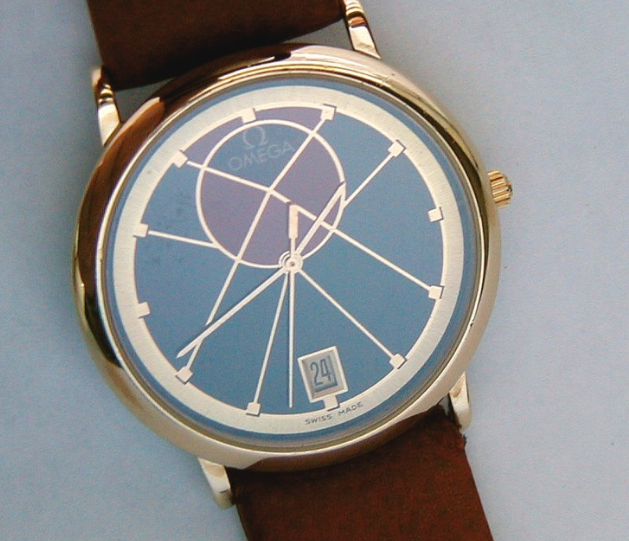
After that congealed blood Railmaster I find the Omega NZL-32 almost acceptable. So I think you need some proper candidates. Here's a couple more for Room 101.


Apparently there are still a few available for a bargain €43,100.
 
Posts
11,837
Likes
38,464
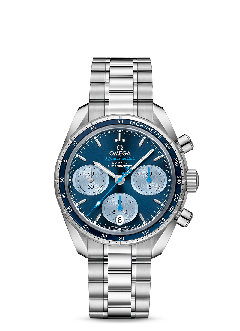
Quite apropos, today's new contestant:
452975-057399ce7e1c6490d46af8181d7c39fe.jpg

All-timers for me are these two though:

starter21.jpg

17331020_4_460.jpg

(Really any model of either of those lines, but those two are the most exemplary of their respective lines IMO)
 
Posts
11,837
Likes
38,464
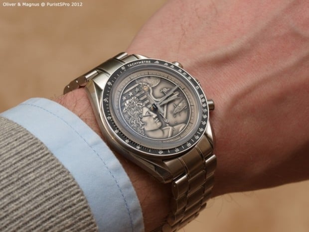
I never quite got the Apollo dial

I was gonna add that one later and forgot. Ugly + forgettable = a winning combination! They're still available brand new at many Boutiques.
 
Posts
17,681
Likes
26,772
Why deride a watch that someone else loves? Trolling.
No not trolling, we respect all view points, and very often some members love watches that others have issues with and we are all friends.

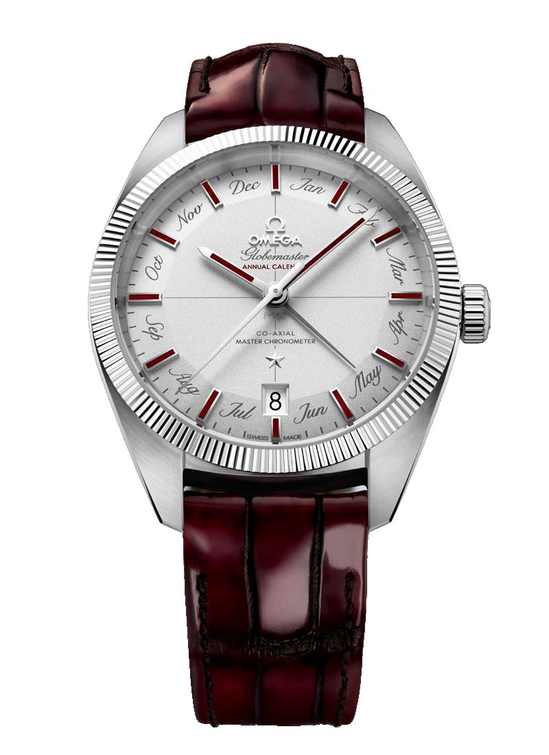
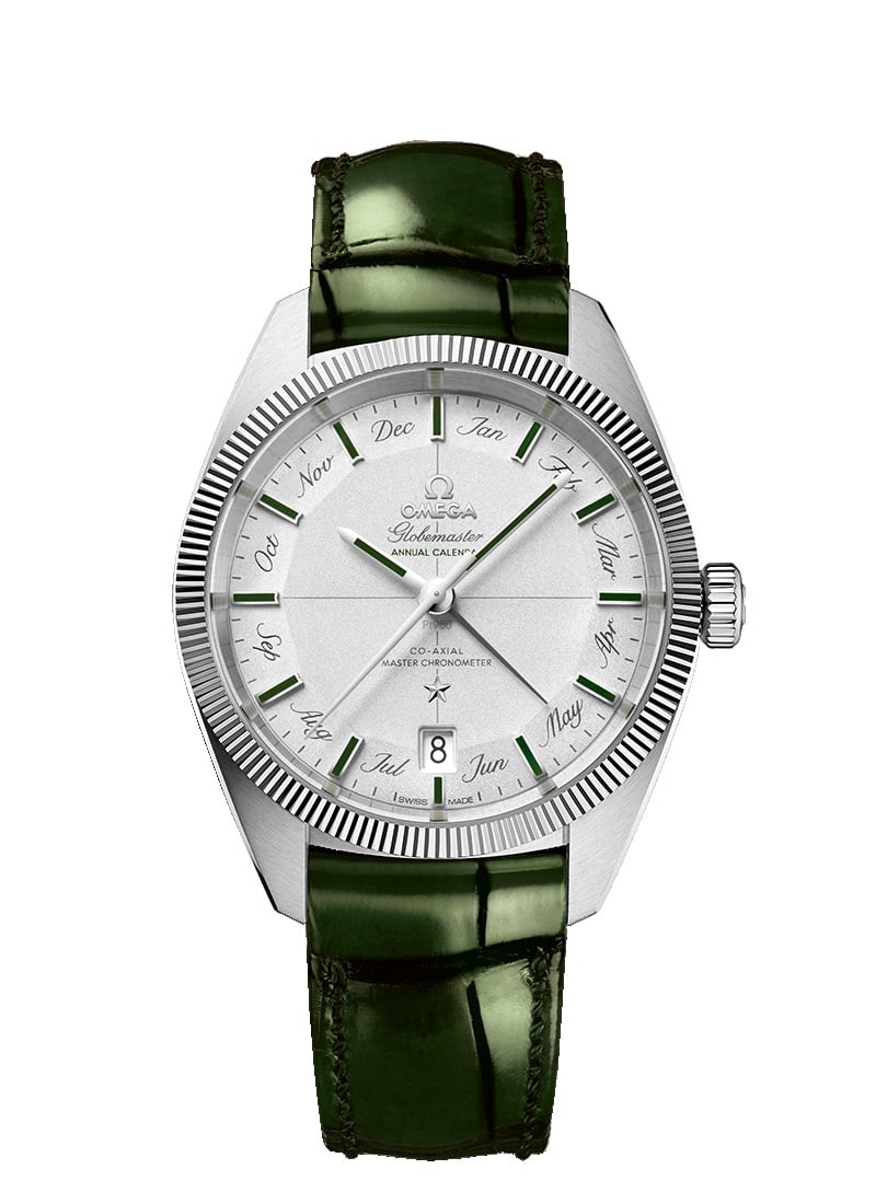
There definitely some Omega models that are unloved by the majority of Omega collectors, or have interesting stylistic choices. The NZL-32 and Apollo are examples that have been sitting on shelves unsold for years. One is not particularly attractive to most people and unreadable, the other is more then a bit off balanced and was later done with a much better layout.

While some deride the calendar Globemaster, I have seen them in person and they actually look much better... the font choice was bold to say it kindly...still not going to buy one...

Obviously each of these speak to someone, and that is cool!
 
Posts
1,790
Likes
2,001
Why deride a watch that someone else loves? Trolling.
You could easily ask " Why love a watch others hate?"
It ends up with the same conversation: some like it & some don't.
It's about the conversation, not love & hate.

I think trolling would be any attempt to stop the conversation.
 
Posts
415
Likes
489
Great thread! I have to admit there is some serious competition out there!
 
Posts
4,828
Likes
31,600
I will admit when I first saw the this one, I thought one of the guys here was messing with photo shop and playing a trick on fellow OF members.

gmacpt130-93-41-22-99-002-jpg.453108
 
Posts
16,744
Likes
47,383
All about ones taste 😗


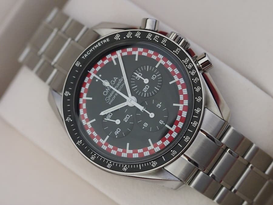
Picture curiosity of https://www.fratellowatches.com/speedy-tuesday-omega-speedmaster-pro-tintin/

Can't stand it, looks like the Ratatouille Speedmaster to me. The red and white look like a tablecloth or a poker chip. Dunno just me


Can't work it out same as multicoloured NATOs

( can I write NATO or does that guy on eBay own the word NATO now or still ? ! How would you pay this guy for everytime you wrote NATO ? )
 
Posts
298
Likes
906
This thing. Just awful.


Also, I had to laugh that this thread opened with the NZL-32. As a New Zealander I was quite excited to learn of the existence of a kiwi-themed Omega, that is until I saw the bloody thing.
 
Posts
924
Likes
1,776
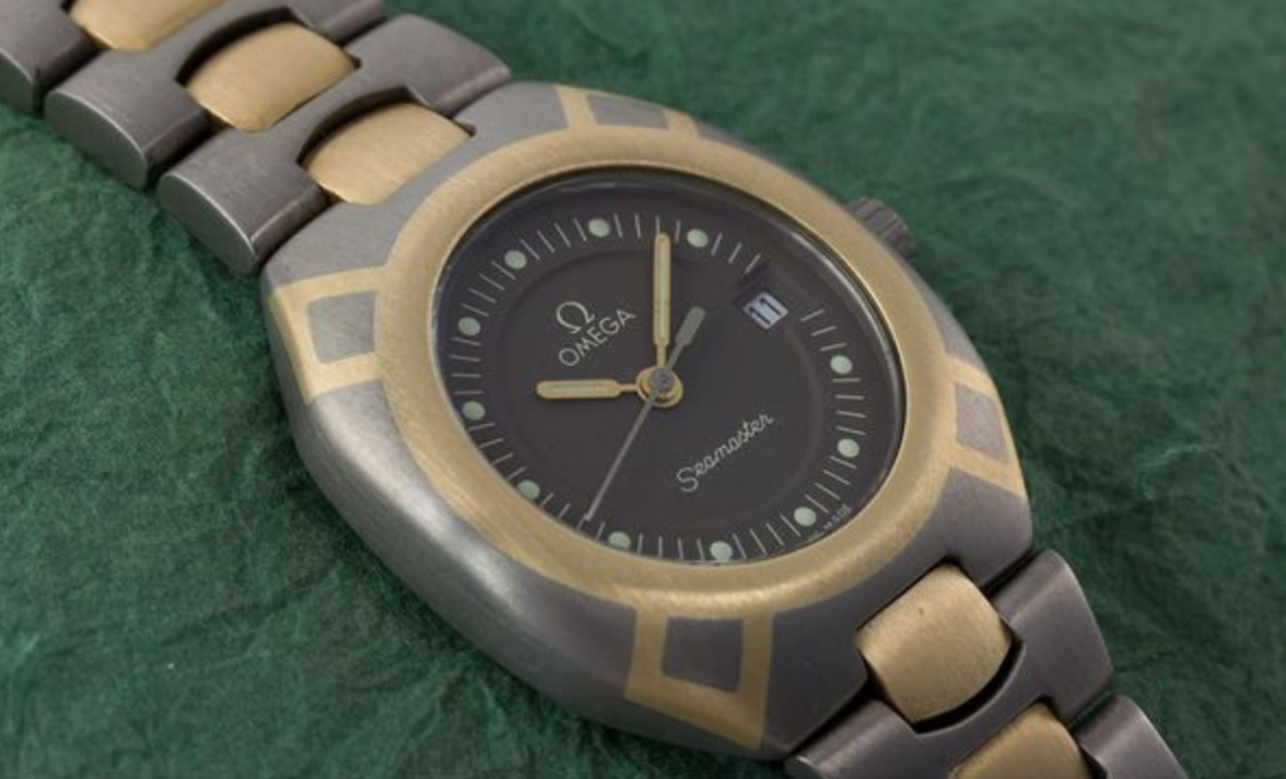
Hmm, I actually like the titanium/gold Polaris. Given that there are so many of them on the market, it must've been relatively popular back in the day.

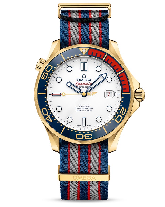
Personally, I dislike the gold Commander. I mean there's nothing wrong with the case obviously but the color scheme and the cheesy 007 logo on the seconds hand are just 🤮
Edited:
 
Posts
906
Likes
1,454
This thing. Just awful.


Also, I had to laugh that this thread opened with the NZL-32. As a New Zealander I was quite excited to learn of the existence of a kiwi-themed Omega, that is until I saw the bloody thing.
One of the greats in 80s Omega