Kindly Confirm, It's Refinished
kyle L
··GrasshopperI think it looks ok.
seamonster
·I think it looks ok.
Respectable Member kyle L
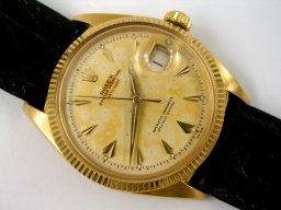
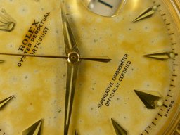
I have some people pointing out to me, the luminous dots at six o'clock and ten o'clock are not centered. On top of this, 'SWISS' is also off-center. Are these tell-tale signs of a refinished dial, or not?
Thank-you.
MyVintageOmega
·Seems to look like one of the lugs on its inside (on each side) was polished or filed down a wee bit to perhaps allow for a slightly wider strap or bracelet. Not sure about this but there seems to be clearly indentations........IMO
seamonster
·Seems to look like one of the lugs on its inside (on each side) was polished or filed down a wee bit to perhaps allow for a slightly wider strap or bracelet. Not sure about this but there seems to be clearly indentations........IMO
Respectable Member MyVintageOmega
I think I feel a little uncomfortable about the whole watch and I shall inform my friend to give it, a miss.
Thank-you.
MyVintageOmega
·Well that dial makes it nothing to write home about and the hands could be covering the worst of it.......bearing that in mind it seems like an original dial and please do not measure all the weight on just my opinion.......best regards/John
seamonster
·Well that dial makes it nothing to write home about and the hands could be covering the worst of it.......bearing that in mind it seems like an original dial and please do not measure all the weight on just my opinion.......best regards/John
Respectable Member MyVintageOmega
It appears very dicey. It is between a 'yes' and a 'no'.
Thank-you.
kyle L
··GrasshopperIt's called tritium creep, I've seen this on a bunch of Omegas as well.
http://www.network54.com/Forum/207593/thread/1335135608/lume+application+back+in+the+day...
I think dial is original too, looks like a 6305? Many of these dials aged this way, these were the very early Datejusts.


Case honestly doesn't look too bad, only the lower left lug on the inside. I would like to see more pictures though. I think it's a good watch to go after if the price is right.
http://www.network54.com/Forum/207593/thread/1335135608/lume+application+back+in+the+day...
I think dial is original too, looks like a 6305? Many of these dials aged this way, these were the very early Datejusts.


Case honestly doesn't look too bad, only the lower left lug on the inside. I would like to see more pictures though. I think it's a good watch to go after if the price is right.
gatorcpa
··ΩF InvestiGatorIt's called tritium creep, I've seen this on a bunch of Omegas as well.
Well, in this case you could call it "radium creep", as I'm pretty sure it's the real thing on something that old. But I concur with the cause. It's also possible that the dots were redone by a prior watchmaker. I think the dial is otherwise original.
Hope this helps,
gatorcpa
seamonster
·It's called tritium creep, I've seen this on a bunch of Omegas as well.
http://www.network54.com/Forum/207593/thread/1335135608/lume application back in the day...
I think dial is original too, looks like a 6305? Many of these dials aged this way, these were the very early Datejusts.


Case honestly doesn't look too bad, only the lower left lug on the inside. I would like to see more pictures though. I think it's a good watch to go after if the price is right.
Respectable Member kyle L
Your example is comes with the original and untouched dial, though nicely aged.
Yes, the luminous dots have deteriorated due to age but they do not shift a stroke away on the minute-track. The printings are uniform, throughout.
Lastly, 'Officially Certified Chronometer' is correct without the word 'Superlative', which came after 1957 usually and not before, I think.
Thank-you.
seamonster
·Well, in this case you could call it "radium creep", as I'm pretty sure it's the real thing on something that old. But I concur with the cause. It's also possible that the dots were redone by a prior watchmaker. I think the dial is otherwise original.
Hope this helps,
gatorcpa
Respectable Member gatorcpa
I fully support your opinion the dots were redone by a prior watchmaker. If we look closely at the dot on the 50th minute stroke, this dot sits in between the 50th and 51st strokes of the minute-track. The dot that sits on the 30th minute stroke sits squarely on the 30th minute stroke but it is out of alignment from the 6 o'clock arrow-head hour-marker.
In 'Oyster Perpetual', there are two Ts. The first T and the second T look different. Just look at their lateral and vertical strokes. One of the Ts' vertical stroke is off-center.
In 'Superlative' (which I think should not be there, at all), the S is falling backward and the two Es are not uniform. The three Cs there, all look different.
Of course, there are several other irregularities that can be picked up. In order to discover all the inconsistencies, kindly blow the picture up (a few times) and they will all show up.
Of course, this opinion is my friend's but I can see his point.
Please let me know what you think
Thank-you.
kyle L
··GrasshopperDo you have any more info? More pics, model number, caseback, etc...
seamonster
·Do you have any more info? More pics, model number, caseback, etc...
Respectable Member kyle L
I shall get it from this friend of mine. The moment I get the other information, I shall post it.
Thank-you.
gatorcpa
··ΩF InvestiGatorIn 'Oyster Perpetual', there are two Ts. The first T and the second T look different. Just look at their lateral and vertical strokes. One of the Ts' vertical stroke is off-center.
In 'Superlative' (which I think should not be there, at all), the S is falling backward and the two Es are not uniform. The three Cs there, all look different.
Of course, there are several other irregularities that can be picked up. In order to discover all the inconsistencies, kindly blow the picture up (a few times) and they will all show up.
Respectable Member Seamonster:
It was not unusual for Rolex to use several different fonts on the same dial. Don't know why they weren't more consistent, but they weren't.
The changeover to using the word "Superlative" occurred a little before the change to a more modern looking dial. The font here looks correct to my eye and matches other late 1950's watches. Please take a look at some of the Ref. 6605 watches on the Vintage Rolex Forum page linked below:
http://www.network54.com/Forum/539639/
Kyle is correct in that we would need to know more information before making any definitive judgments in either direction. But I lean to original, and some of the examples in the link above also have misaligned radium dots.
Also, please don't forget that minor crystal imperfections or camera angles can cause the optical illusion of different lettering when no irregularities exist.
Take care,
gatorcpa
kyle L
··Grasshopperadam78
··Adam @ ΩFThe dial looks original to me. Radium creep, too, probably.
I'd hold out for one with a dial in better condition, though!
I'd hold out for one with a dial in better condition, though!
adam78
··Adam @ ΩFseamonster
·Respectable Member Seamonster:
It was not unusual for Rolex to use several different fonts on the same dial. Don't know why they weren't more consistent, but they weren't.
The changeover to using the word "Superlative" occurred a little before the change to a more modern looking dial. The font here looks correct to my eye and matches other late 1950's watches. Please take a look at some of the Ref. 6605 watches on the Vintage Rolex Forum page linked below:
http://www.network54.com/Forum/539639/
Kyle is correct in that we would need to know more information before making any definitive judgments in either direction. But I lean to original, and some of the examples in the link above also have misaligned radium dots.
Also, please don't forget that minor crystal imperfections or camera angles can cause the optical illusion of different lettering when no irregularities exist.
Take care,
gatorcpa
Respectable Member gatorcpa
I have spoken to my friend and he said, he has no other information except that picture only, unfortunately. As a result, I have informed him it is not possible for us to be or more help to him.
Thank-you.
seamonster
·Do you have any more info? More pics, model number, caseback, etc...
Respectable Member kyle L
Unfortunately he does not have any other information. There is nothing much we can do, unfortunately. Hard luck.
Thank-you.
seamonster
·Respectable Member Adam78
This is a beautiful piece and looks pretty original, to me.
Thank-you.


