Fab. Suisse Roll Call
Canuck
·Fulton8or
·themattedial
·^^^Spectacular Movado, what's powering this beauty?
Modest_Proposal
·Do you know of other examples of this dial? I'm left with questions.
themattedial
·Do you know of other examples of this dial? I'm left with questions.
Edited:
themattedial
·Do you know of other examples of this dial? I'm left with questions.
Alpha
·Modest_Proposal
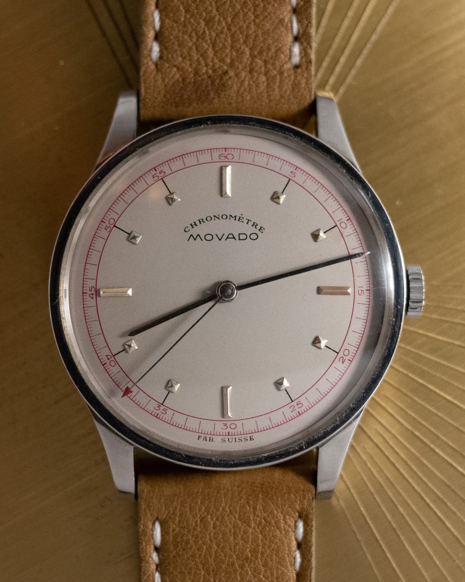
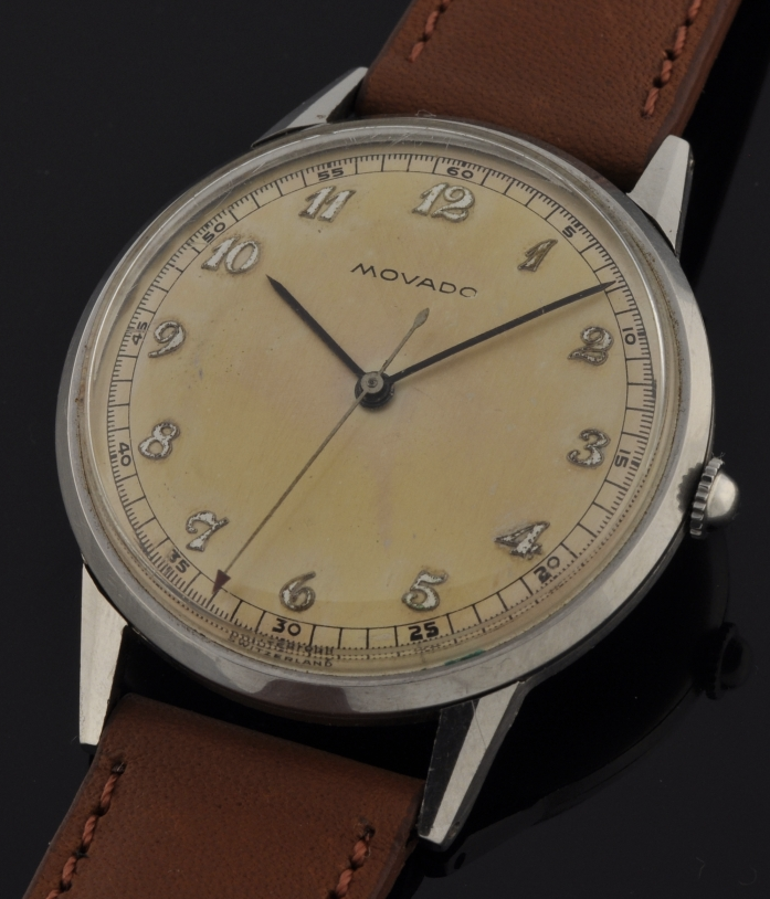
·I haven’t personally seen another example of this dial, but I can say the same for a lot of other Movado dials from the period. Years ago when I was evaluating the watch, I do remember finding a number of other examples with pyramid style markers, the same fonts, hands and case. I’m pretty happy with it, and would love to hear your questions if they are coming from a place of expertise in vintage Movado beyond that of my own.
I am not an expert on early Movado's. The style elements seem unusual to me as a cohesive whole, though.
The "pyramid" indices are normal for a dress watch of the era. Seeing them with the black ink lines going to a red minute track is unusual (though everything is possible and it does make sense to see the track with the red-arrow seconds hand).
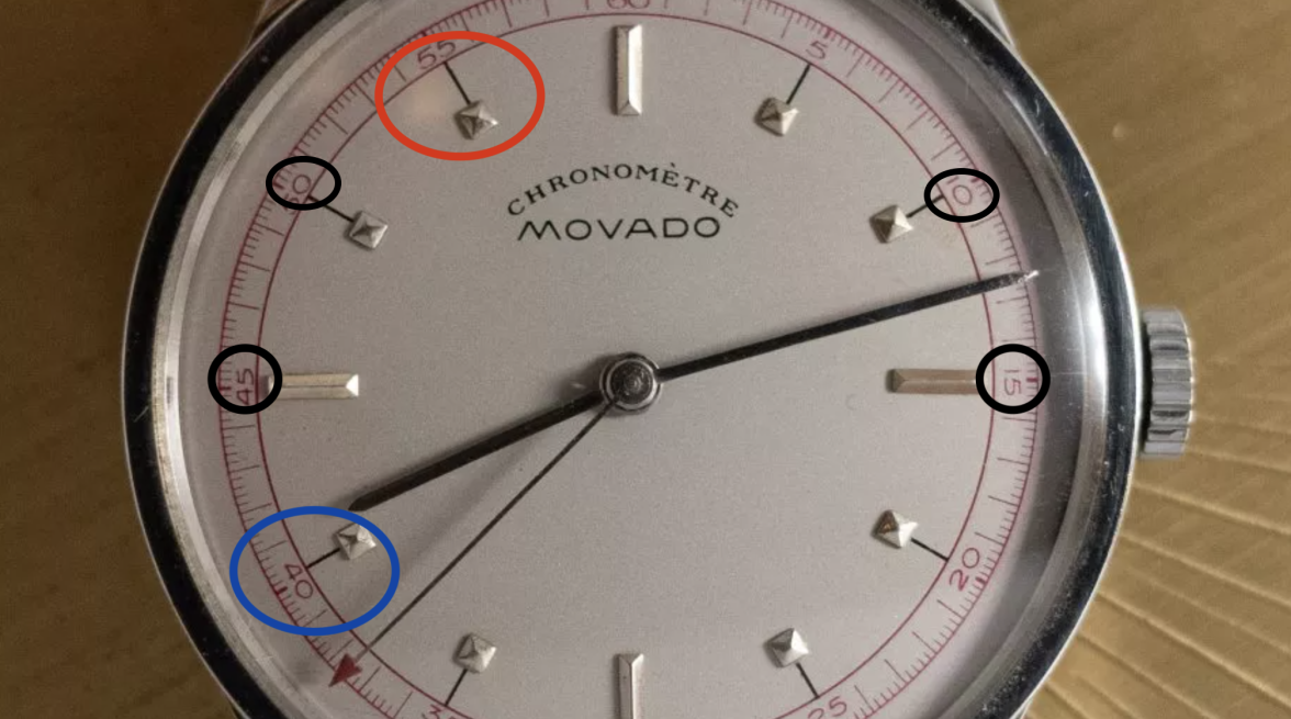
I also notice some alignment issues (blue circle shows bad alignment between the black line and red minute tick and the red circle shows bad alignment between the black line and the index). I'm not sure if these are due to crystal distortions or if they're actually there. Even if they do exist... they could potentially be explained by the factory tolerances of 1930's dial manufacturing. But it seems a bit on the generous side.
The red track also seems to be inconsistent in the girth of the ink (black circles). Again, this might be due to crystal distortion or a bad camera angle. So I don't even know if it's true. I'm only judging by what I see in the photo.
The signature is close to other examples I've seen - but not the same. But I'd have to do a wide search to have confidence either way. If you can find another identical signature, I would be happy to see it. I wouldn't be surprised to see one.
themattedial
·I am not an expert on early Movado's. The style elements seem unusual to me as a cohesive whole, though.
The "pyramid" indices are normal for a dress watch of the era. Seeing them with the black ink lines going to a red minute track is unusual (though everything is possible and it does make sense to see the track with the red-arrow seconds hand).
I also notice some alignment issues (blue circle shows bad alignment between the black line and red minute tick and the red circle shows bad alignment between the black line and the index). I'm not sure if these are due to crystal distortions or if they're actually there. Even if they do exist... they could potentially be explained by the factory tolerances of 1930's dial manufacturing. But it seems a bit on the generous side.
The red track also seems to be inconsistent in the girth of the ink (black circles). Again, this might be due to crystal distortion or a bad camera angle. So I don't even know if it's true. I'm only judging by what I see in the photo.
The signature is close to other examples I've seen - but not the same. But I'd have to do a wide search to have confidence either way. If you can find another identical signature, I would be happy to see it. I wouldn't be surprised to see one.
Great questions. Without a doubt there is some distortion from the glass and my awkward hovering, but next time I pull this out of the bank I’ll take some better photos to see if the alignment of the indices and printing is off
themattedial
·I am not an expert on early Movado's. The style elements seem unusual to me as a cohesive whole, though.
The "pyramid" indices are normal for a dress watch of the era. Seeing them with the black ink lines going to a red minute track is unusual (though everything is possible and it does make sense to see the track with the red-arrow seconds hand).
I also notice some alignment issues (blue circle shows bad alignment between the black line and red minute tick and the red circle shows bad alignment between the black line and the index). I'm not sure if these are due to crystal distortions or if they're actually there. Even if they do exist... they could potentially be explained by the factory tolerances of 1930's dial manufacturing. But it seems a bit on the generous side.
The red track also seems to be inconsistent in the girth of the ink (black circles). Again, this might be due to crystal distortion or a bad camera angle. So I don't even know if it's true. I'm only judging by what I see in the photo.
The signature is close to other examples I've seen - but not the same. But I'd have to do a wide search to have confidence either way. If you can find another identical signature, I would be happy to see it. I wouldn't be surprised to see one.
there are also examples of M95 chronos with pyramid markers as well that I’ve seen. Will dig up some photos
DirtyDozen12
·@Modest_Proposal The dial looks strange, to me, as well. However, I am not a Movado expert and I have been surprised by Movado dials before. A couple of things that jump out at me are the soft-looking embossed markers, and the outer track, which has an unusual(?) font and design. With regard to the design, I am specifically intrigued by the long markers that do not quite touch the inner circle. Also, the lack of a counterpoise on the second hand seems strange. Finally, after an admittedly quick look at Movado's with "Fab. Suisse" dials, I notice that the printing is usually under "Movado", rather than at 6 o'clock. It would be nice to see others with "Fab. Suisse" at 6 o'clock to compare the fonts, in addition to confirming the location as possible/typical.
Xtof
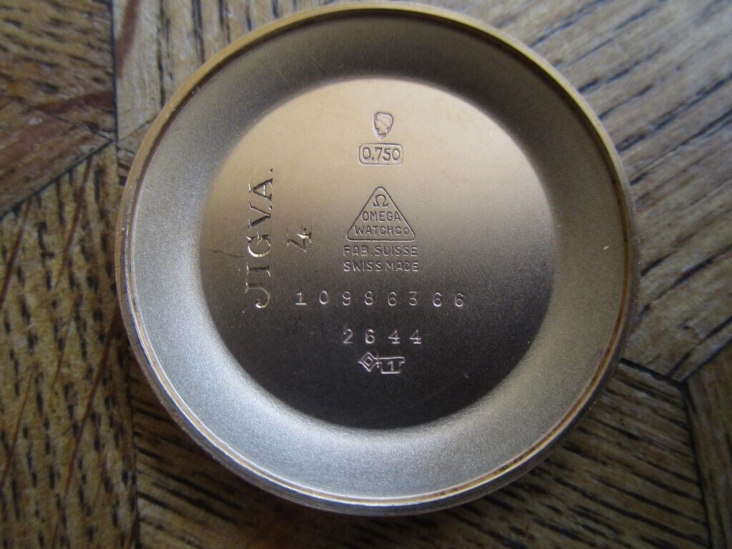
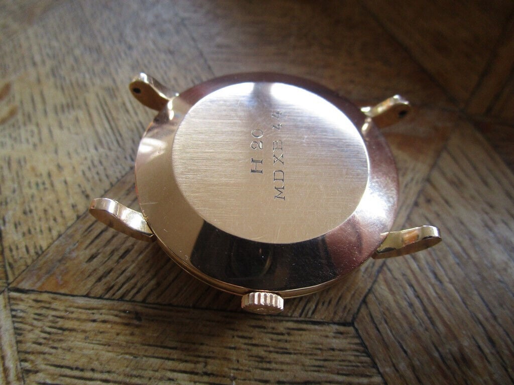
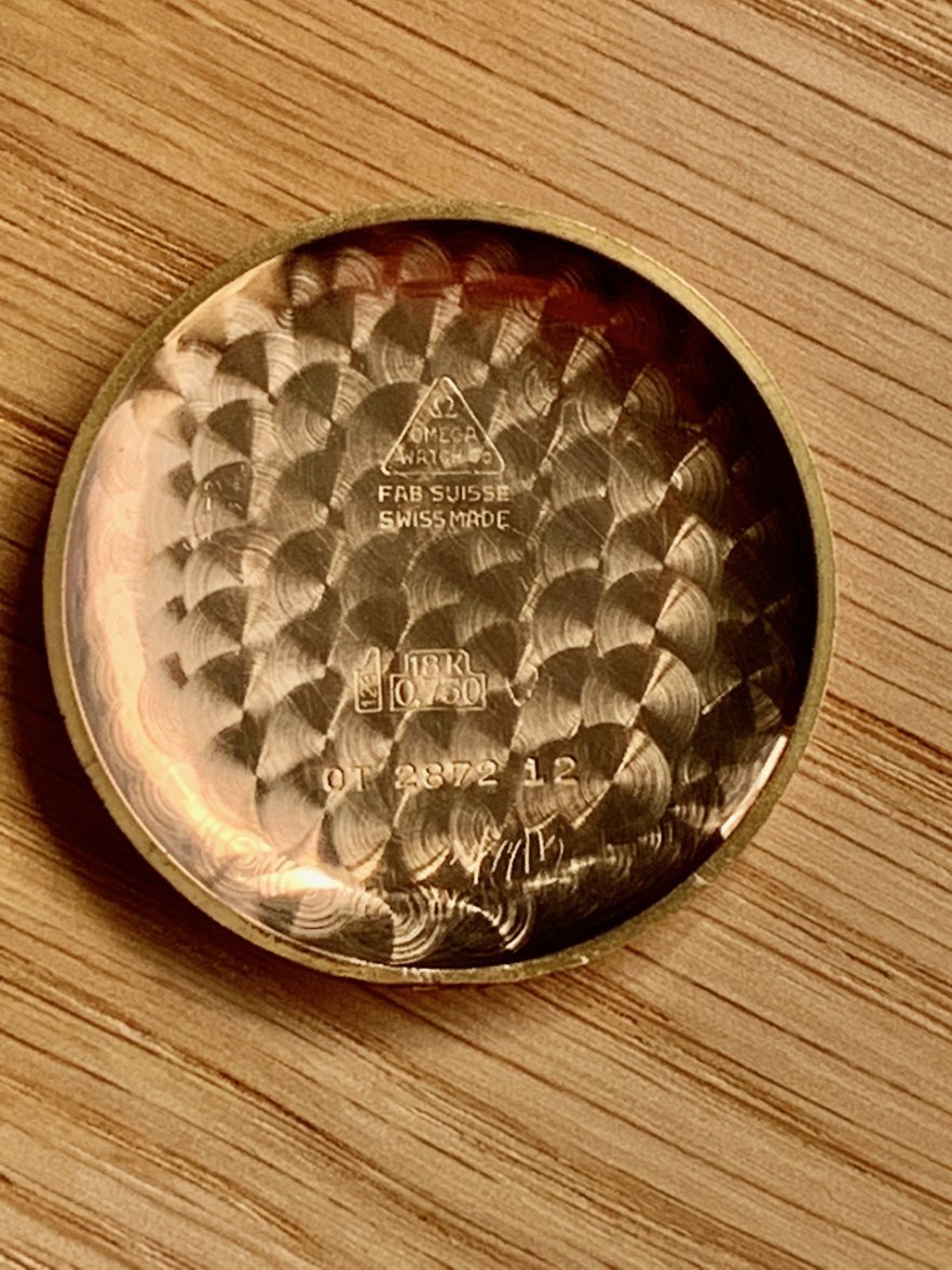
·Does this count? Inside caseback of newly acquired and still in transit 18k Rose Gold 332 bumper auto.
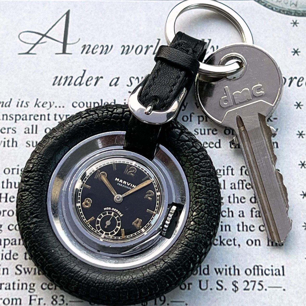
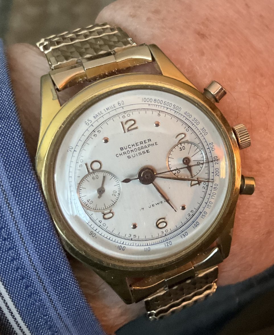
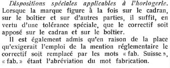
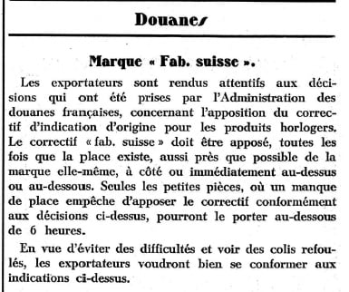
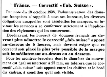
From my understanding, the purpose of this Roll Call is to present a diverty of watches that have in common a specificity of swiss watches that were distributed in France from the mid 30s to the mid 50s: as required by the French Customs Authority, on the dial and on the case, ideally very close to the brand name, should be written "Importé de Suisse" or "Fabriqué en Suisse", shortened in "Fab. Suisse".
Here are 3 extracts from newspapers all published in 1936 commenting this law.
Modest_Proposal
·@Modest_Proposal The dial looks strange, to me, as well. However, I am not a Movado expert and I have been surprised by Movado dials before. A couple of things that jump out at me are the soft-looking embossed markers, and the outer track, which has an unusual(?) font and design. With regard to the design, I am specifically intrigued by the long markers that do not quite touch the inner circle. Also, the lack of a counterpoise on the second hand seems strange. Finally, after an admittedly quick look at Movado's with "Fab. Suisse" dials, I notice that the printing is usually under "Movado", rather than at 6 o'clock. It would be nice to see others with "Fab. Suisse" at 6 o'clock to compare the fonts, in addition to confirming the location as possible/typical.
I didn't mention the "missing" counterpoise - but it I did notice it. Hands like that were made back then, but it was less common (as you know). I was silent because I am not intimately familiar with Movado handsets. On that point, the minute hand appears to extend past the minutes track - but that is not a deal-breaker. The hands also seem a bit on the thin side for the style.
I agree that the outer track is odd in a few ways. It doesn't seem cohesive. But not all dial were.
By the markers not touching the inner circle - do you mean the minute track? I don't find that super suspicious - but the black lines leading to the minute track are just an odd choice - especially with the contrasting black lines and red minute track.
DirtyDozen12
·By the markers not touching the inner circle - do you mean the minute track? I don't find that super suspicious - but the black lines leading to the minute track are just an odd choice - especially with the contrasting black lines and red minute track.
https://watchestobuy.com/images/Movado1940b.JPG
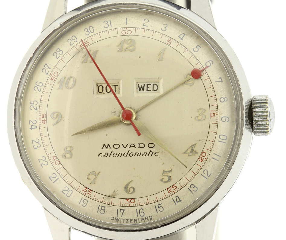
https://www.etsy.com/ca/listing/855128792/1940s-vintage-movado-calendomatic-wrist
Modest_Proposal
·Yes, I meant the minute track. I am more accustomed to seeing minute tracks like the one immediately below. However, I just found an image of a Calendomatic that has a similar design (see image further below). I know what you mean about the black lines connecting the hour markers to the minute track.
https://watchestobuy.com/images/Movado1940b.JPG
https://www.etsy.com/ca/listing/855128792/1940s-vintage-movado-calendomatic-wrist
It is similar! Though the font on that one seems to have a more uniform girth (and is different). I'd love a wider shot of the OP's watch. I want to see the proportions better.
DirtyDozen12
·It is similar! Though the font on that one seems to have a more uniform girth (and is different). I'd love a wider shot of the OP's watch. I want to see the proportions better.
