Poday
·I’ll be the first to admit I’m no expert on these, but I’ve always been a fan.
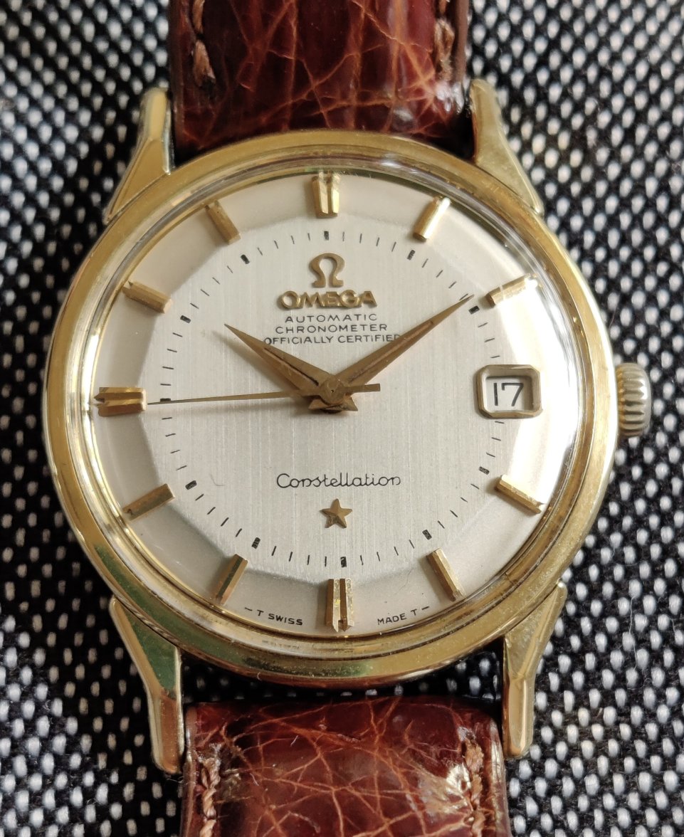
The text below the logo looks to be redone to my eyes (second “O” in Chronometer too far right, overall text looks thin), but the Constellation script at the bottom looks good (again, to my eyes).
The minute hashes along the dial look a bit inconsistent as well, especially the 5 minute marks (specifically 4:00).
Okay, I guess I know the answer. Possibly just wishful thinking that I was being too critical.


