Forums Latest Members
  1. Spacefruit Prolific Speedmaster Hoarder Aug 24, 2019

    Posts
    5,201
    Likes
    23,016
    I have been playing around with backgrounds.

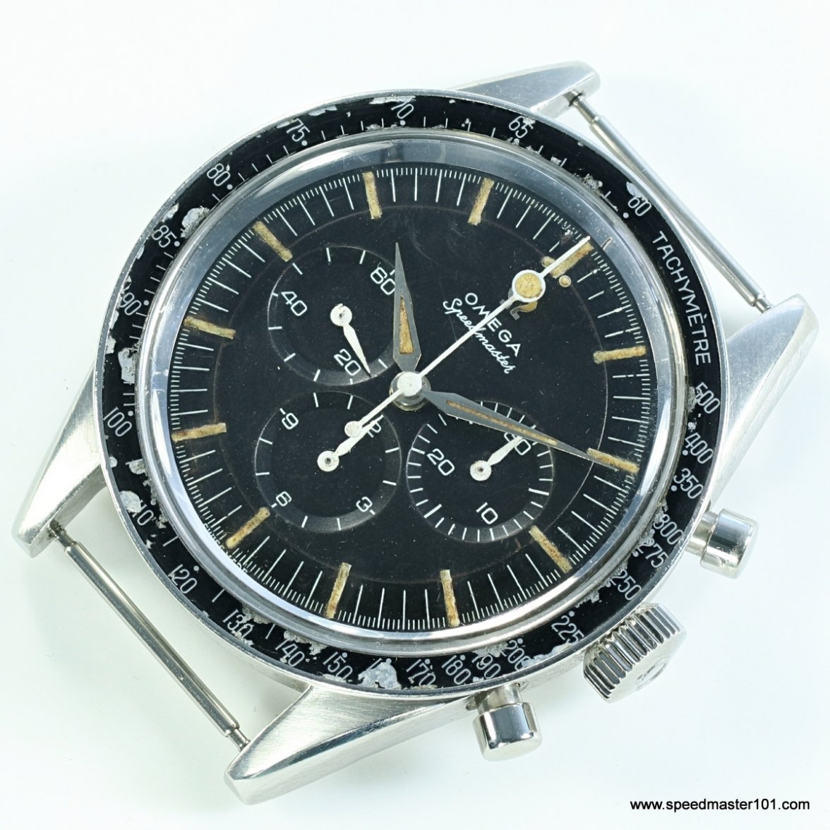
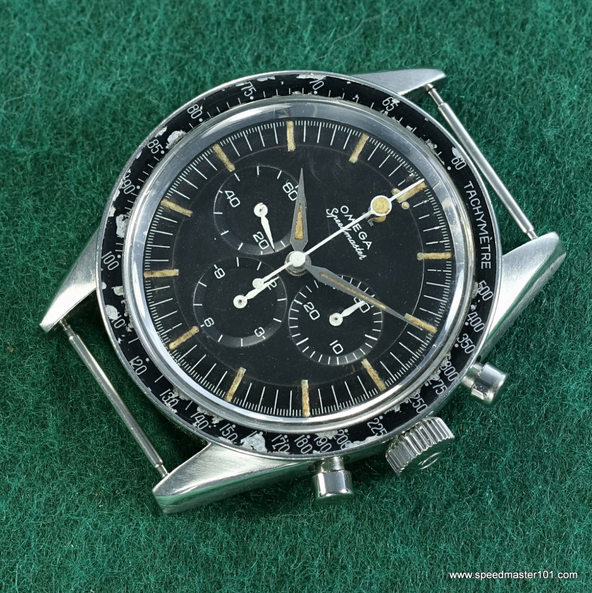
    This is a 2998-4 with a meteor bezel and lollipop. Dial has some issues, that I would want to be easy to see in a photo.

    I am trying to decide which background is most appealing - in the past I have used each of them, and keep changing my mind/.

    So I thought I would ask you, what do you think?
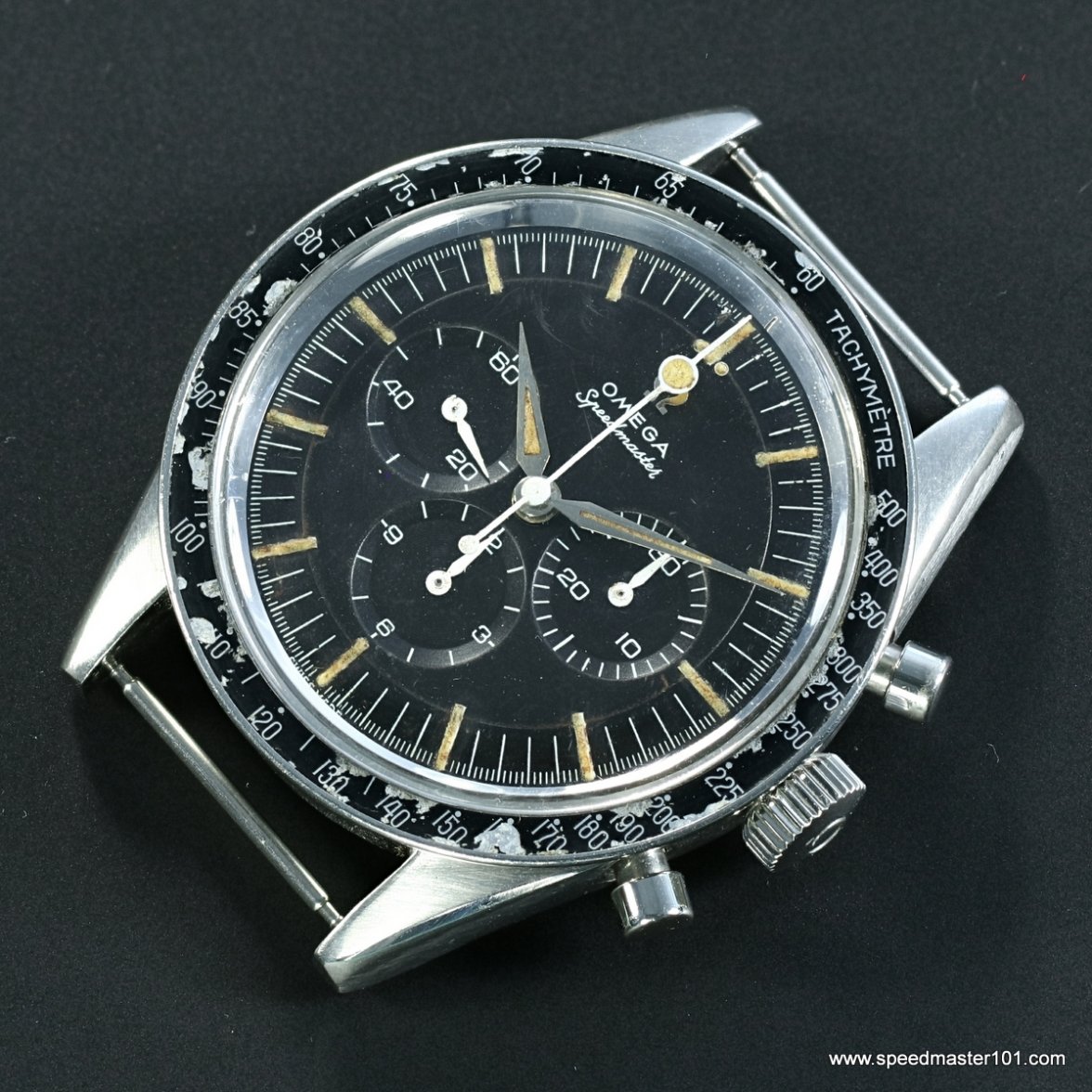


    2019-08-24 15-17-40 (C).jpg 2019-08-24 15-18-40 (C).jpg 2019-08-24 15-19-10 (C).jpg
     
    mydeafcat likes this.
  2. joe band Aug 24, 2019

    Posts
    520
    Likes
    398
    IMO black is easiest to see the bezel and less distracting to dial. if you want to send it to me, i'll try to replicate your results.
     
  3. MSNWatch Vintage Omega Aficionado Staff Member Aug 24, 2019

    Posts
    6,533
    Likes
    10,836
    #2 for me. Makes the dark hued watch pop.
     
    Rman, earth38 and tamura like this.
  4. marco Aug 24, 2019

    Posts
    1,252
    Likes
    2,991
    The black background gives a great contrast to the case and draws attention to the case finish.
     
  5. mydeafcat Aug 24, 2019

    Posts
    1,308
    Likes
    6,172
    Great concept! To me, the black background really enhances all details; lugs, case, bezel, pushers (they seem to shine brighter), dial...the works.
     
    marco likes this.
  6. Cad290 Aug 24, 2019

    Posts
    676
    Likes
    1,042
    Getting ready to sell?? I always liked the green background you use, makes everything less harsh looking
     
  7. STANDY schizophrenic pizza orderer and watch collector Aug 24, 2019

    Posts
    16,355
    Likes
    44,937
    DaveK likes this.
  8. AAAKK First listing in the ΩF B2B phone book Aug 24, 2019

    Posts
    866
    Likes
    2,867
    I like the black background. It's a good standard to use to see how true black the dial remains or if it's faded or transitioning to a different hue
     
    watchyouwant, apsm100 and Archer like this.
  9. kingsrider Thank you Sir! May I have another? Aug 24, 2019

    Posts
    2,689
    Likes
    5,431
    black
     
  10. Darlinboy Pratts! Will I B******S!!! Aug 24, 2019

    Posts
    8,736
    Likes
    69,169
    1.White
    2. Black
    3. WTF are you thinking?
     
    DaveK, watchyouwant, kov and 2 others like this.
  11. ahsposo Most fun screen name at ΩF Aug 24, 2019

    Posts
    3,745
    Likes
    19,993
    3 ball in the corner pocket...
     
    Taddyangle and MikiJ like this.
  12. wristpirate Aug 24, 2019

    Posts
    1,231
    Likes
    3,724
    I’m probably in the minority, I’ve always been a fan of your green fuzz background. Compared to the others the green has a more natural and less prepared feel to it. Perhaps you can source some black/white fuzz and try photos on those?

    Out of the other two I would choose black. White seems too washed looking
     
  13. izydor Aug 24, 2019

    Posts
    90
    Likes
    343
    Any color as long as it’s black.
     
    watchyouwant likes this.
  14. S.H. Aug 24, 2019

    Posts
    1,518
    Likes
    3,538
    Gray or dark gray (even pitch black in some cases) is nice, I prefer your 1st picture. One of mine I like:

    DSCF0569-.JPG

    Beware of the small dust particles that "pop" against dark backgrounds though.
     
    Cad290, sdre and DaveK like this.
  15. Aludic @SpeedyBirthYear Aug 24, 2019

    Posts
    1,061
    Likes
    4,871
    I'd go with either the recognisable, good old green, or with black. Main reason for picking black over white is that it contrasts better with the case and gives a better view on the how sharp its edges still seem to be. Also, it looks a bit more luxurious, if that makes sense.

    By the way; a meteor bezel is a perfectly euphemistic way of saying it's quite seriously damaged. We should add it to a list of vintage watch lingo that's being kept in another thread as we speak... ;)
     
    marco, Cad290, DaveK and 1 other person like this.
  16. Basset Hound Aug 24, 2019

    Posts
    233
    Likes
    392
    I like the green but don’t ask me why!
    Actually I think it looks more natural. The black and white backgrounds seem to distort some of the colours.
     
    AdamS likes this.
  17. ICONO Aug 24, 2019

    Posts
    1,589
    Likes
    5,635
    As light absorbs, ( and reflects), the colour, it strikes…( think of a buttercup, under the chin )

    The most distorting of the backgrounds is actually the green one…I can see the green ‘colour cast’ evident in the image…just look at the ‘green’ sheen on the lugs ?

    The most neutral background would be a dark / mid grey…

    Incidentally, this issue with reflected light, caused part of the confusion, in the recent Sotheby’s sale…using a blue background, and then not colour balancing accurately
     
  18. Basset Hound Aug 24, 2019

    Posts
    233
    Likes
    392
    Interesting. I know you have expertise in this field and that is helpful to know.

    I think if the colour is a deal breaker then you really need to see a watch in the hand
     
  19. FREDMAYCOIN Aug 24, 2019

    Posts
    1,076
    Likes
    1,718
    Black, you know what they say.
     
  20. ICONO Aug 24, 2019

    Posts
    1,589
    Likes
    5,635
    We have not even grazed the surface, of the different factors, that affect the way colour is recorded, & reproduced

    Indisputably…holding the watch in your hand, ( in normal daylight, around Noon…seriously ! ) … is the best option