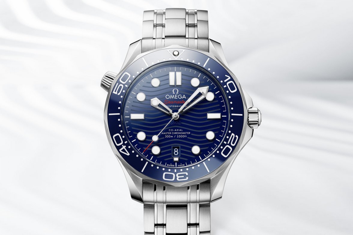
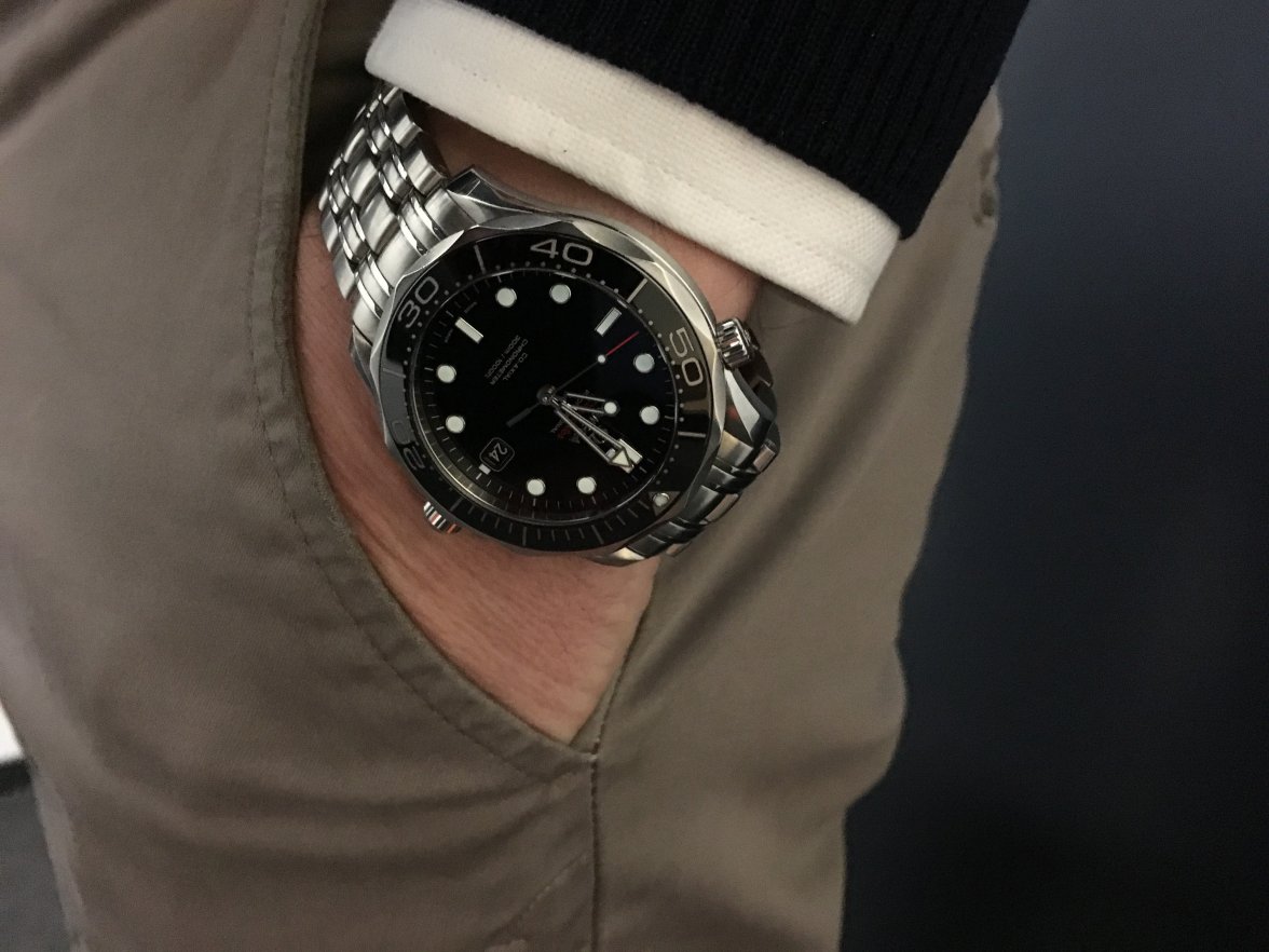
BaselWorld 2018: Introducing The New Omega Seamaster Diver 300M

Posts
25,980
Likes
27,692
At this point, not seeing a lot of reason why one would pick this over a Planet Ocean 39.5, which has the same movement but is a step up, and can be bought LNIB used for around $4K.

I'm on that bus too. The 39.5 PO is a sweet watch. 👍
 
Posts
637
Likes
1,597
a classic. will stay in my collection for ever. i may buy the new one though.😉
 
Posts
2,293
Likes
4,579
I'm not a Seamaster guy... but I love the blue w/ gold accents edition, and 42mm size.
 
Posts
368
Likes
452
A day later, I dislike the new wave pattern even more. The more I look at its flattened-W appearance, the less the pattern even reminds me of ocean waves. It is starting to make me think more of the squiggly lines you'll see drawn in scribbles of the sun than it does water. Hmmmm ... Omega Sunmaster. Yeah, I'm just not connecting with this dial at all. I don't hate the watch, I'm just indifferent to it and don't see that changing.
 
Posts
99
Likes
114
really makes me want to pickup a 2254.50 again

When I was looking to buy my first every mechanical watch I spent a really long time agonizing and researching every available option in my price point before I picked up a 2254.50 new from Tourneau. The 'bond' style sm300 never did it for me because of the round indices, skeleton hands and bracelet, the 2254.50 was so clearly superior in every way for me that it was never a contest between those two particular models.

Sadly my 2254.50 was lost at sea during my Bachelor party a few years back now 🙁 though insurance did pay out more than I paid for it 😀

That little trip down memory lane aside, I don't mind the date at 6 and the think the waves could look cool in person, but would love to see it executed on on a sword hand model
 
Posts
82
Likes
104
Count me in for the grey dial. I don't love the larger helium escape valve, but everything else about it looks amazing.
 
Posts
2,808
Likes
8,339
RE: new SMP. I like the new hour hand better, but not enough to counter my dislike for the peanut butter cup HeV. The old waves with the newer Ceramic bezel could have been a winner, so until I see one in person I still place the old glossy dial over the new waves.

So it's a mixed bag for me.
 
Posts
4,853
Likes
31,762
I think it looks attractive and it's the first time I seriously would consider a SM300. But honestly, at this point, the watches I own (except a few) are ones I really enjoy wearing, and some of those get little to know wrist time, so I can't justify buying another watch that only gets worn every other month for a day or so.

I was just thinking about storing some of these in the safe for a long period of time so I can enjoy the ones that get no wrist time.
 
Posts
430
Likes
398
I was going to ask what the hell hes wearing, for a second I thought older AT, with the rio swim lane strap.

But it’s a two tone NATO, and no idea with the face yet. Probably the Rail like you said.


*edit, picture attached of the RM he’s wearing.
Thanks for sharing! I got this info from an OB:
The requested Railmaster with the reference number 220.12.40.20.03.001 should be available approximately from July/August 2018 on.
The cost of this model is CHF 4'850.-.
Edited:
 
Posts
1,296
Likes
1,810
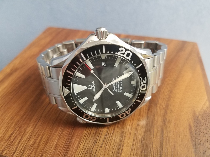
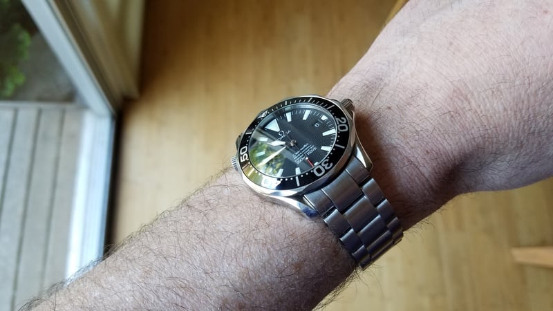
The only SM 300 Diver I've ever liked was the 2254.50 and I had one for years and it was my one and only watch. I thought of it as my "Submariner killer" as it was a "better bang for the buck" dive watch, which is indisputable.
However, some of the little things just started to bug me and I finally sold it and got what I consider for me personally is the perfect diver (no-date pre-ceramic Sub) and it's now my one and only Rolex in my humble collection of mostly Omegas.

I was worried that with the new 300 Diver, they would fix many of things that bugged me about It (He valve is one of them, the bracelet design another), but fortunately for my wallet, they didn't.

**I often wonder how impactful it would have been to substitute the Sword Minute hand with a baton hand😉
Edited:
 
Posts
1,296
Likes
1,810
I still don’t understand why omega didn’t put an applied logo on this. I didn’t notice that it didn’t have it at first, but now it just sours it for me every time I look at it. And the way the bracelet connects to the Watch should have been implemented better in my opinion.
I disagree...the applied logo and markers were one of the few things I really liked about my 2254.50...one of the few things that made it more bold and less bling. I still don't get the fascination of the "non-AC dial mod"🤨
Edited:
 
Posts
1,296
Likes
1,810
If the intention of the new shape of the helium valve is to up the watch' diver's credentials, how about ditching the scalloped bezel? That thing is downright impossible to turn when wet or when wearing gloves. Looks great though 😉
For me, the scalloped bezel was one of the pluses, granted I never tried turning it with wet gloves. The design is the flattest rotating bezel and is responsible for the wonderful low-profile case shape. Compare that to the towering coin-edge bezel of the other Seamasters past and present
 
Posts
8
Likes
9
I still don’t understand why omega didn’t put an applied logo on this. I didn’t notice that it didn’t have it at first, but now it just sours it for me every time I look at it. And the way the bracelet connects to the Watch should have been implemented better in my opinion.

I prefer the applied logo as well, and i used to be really hung up on that when considering the different seamaster models. However, nowadays, I find that the pronounced difference between applied and printed is really mostly only noticeable in pictures. Day to day life you can hardly tell. Just my opinion of course.
 
Posts
535
Likes
854
I disagree...the applied logo and markers were one of the few things I really liked about my 2254.50...one of the few things that made it more told and less bling. I still don't get the fascination of the "non-AC dial mod"🤨

I don’t think the new SMP is trying very hard to be “under the radar.” just saying.
 
Posts
535
Likes
854
I prefer the applied logo as well, and i used to be really hung up on that when considering the different seamaster models. However, nowadays, I find that the pronounced difference between applied and printed is really mostly only noticeable in pictures. Day to day life you can hardly tell. Just my opinion of course.

I’m still enjoy looking for the applied logo on my PO. It hasn’t gotten old and I suspect it never will for me, but you make a good point.
 
Posts
8
Likes
9
The final decision for me with this new seamaster will be made after seeing it in the flesh. However, after considering all of the pros and cons of new versus old, I have concluded that the pros for the new outweigh the cons, and that this will likely be my next purchase.

I really love the price minimal price increase as well. I do think this will allow for me to make my very first brand new watch purchase, as opposed to buying pre-owned, or a super discounted online buy. I am excited to get the foot massage and wine and cheese treatment at my local boutique lol.

My only trepidation is on the wave design. I do need this to be a beach and board room watch and I am hoping that the toolish look in the pictures will be diminished in real life. And i know that the increase in size won't help in the boardroom arena but I must say that at the christmas party i attended this last year, there were tons of Rolexes being worn in the room that night and i did feel like like a seamaster on my arm that night would have felt like having a small organ amongst large organs at a nudist party. Not that the rolexes were overly sized, it's just seemed like they had more presence on the wrist than the now older version seamaster would have had. I'm thinking this new size might be perfect. I understand the trend of watches going smaller these days but seriously, we are talking about a 42" watch. That could never be too big in my eyes as long as the thickness isn't crazy like with the seamaster chronos.
 
Posts
9,596
Likes
27,692
For me, the scalloped bezel was one of the pluses, granted I never tried turning it with wet gloves. The design is the flattest rotating bezel and is responsible for the wonderful low-profile case shape. Compare that to the towering coin-edge bezel of the other Seamasters past and present

It's one of my favourite parts about the design, too. A shame the bezel was made taller in the previous iteration in order to make room for the ceramic "inlay" that is thicker than the aluminium one. Compare the two side by side and the one with ceramic inlay looks rather clumsy - low-profile it is hardly 🙁
My comment was meant to highlight that Omega chose the strengthen the diving credentials by improving the least practical feature of the watch, completely overlooking major design flaws that render the watch pretty useless at that particular activity 😀
 
Posts
1,296
Likes
1,810
Multiple people have used the term "toolish" in describing this new SMP. Either we disagree in opinion or have different definitions for "toolish", i.e. "tool watch"...
For me, a tool watch is more about function and less about fashion and glamour. Of course, it will still have style, but that is perceived and interpreted after the fact (ahem, Sub). I feel that the bond bracelet (old or new) is about the farthest you can get from "toolish". Same with skeltonized hands, applied logos, and lume surrounds. As for the previous generation SMP's I feel like the date window frame and glossy dial also fall into the "glam/showy" category.
Again, that's where the 2254 excelled: it lacked all these things and was a very functional tool watch. It would have been just a little better if they would have gotten ride of the polished center link accents and just made it like this: