1950s Constellation Pie Pan... Originality check?

Posts
10
Likes
0
Hello fellow members,

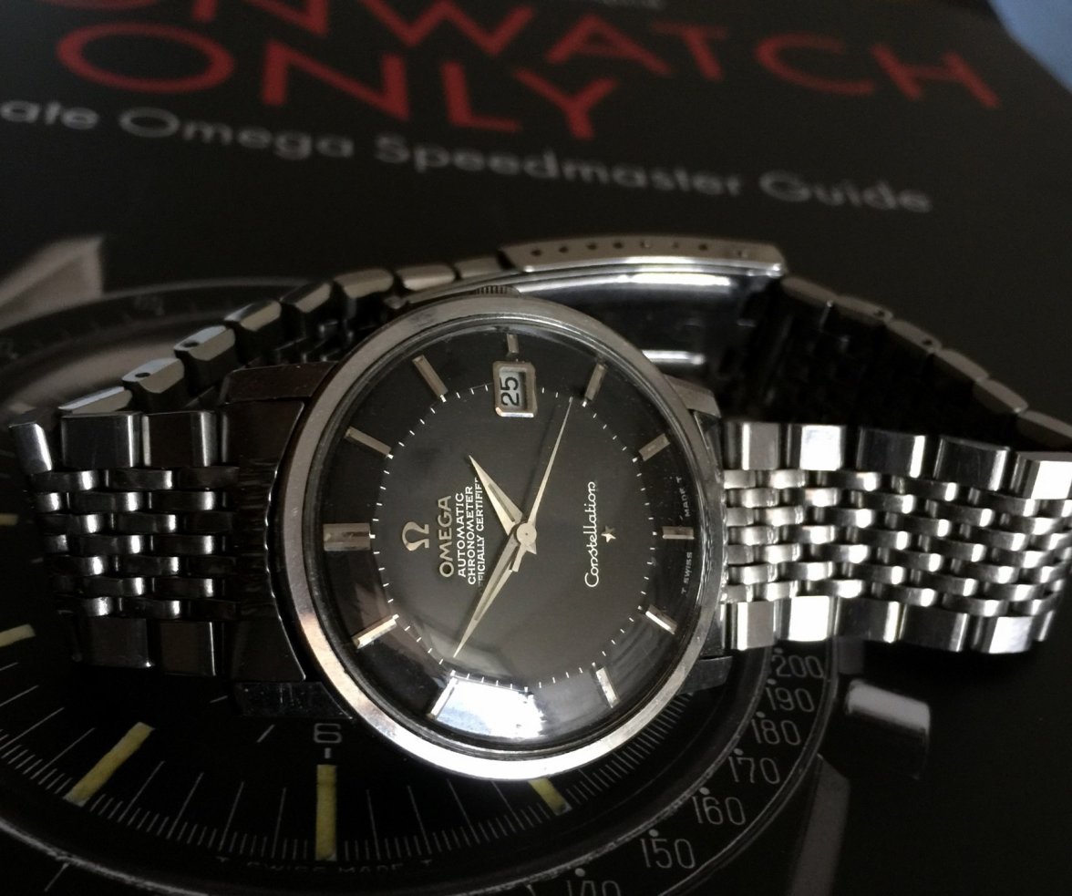
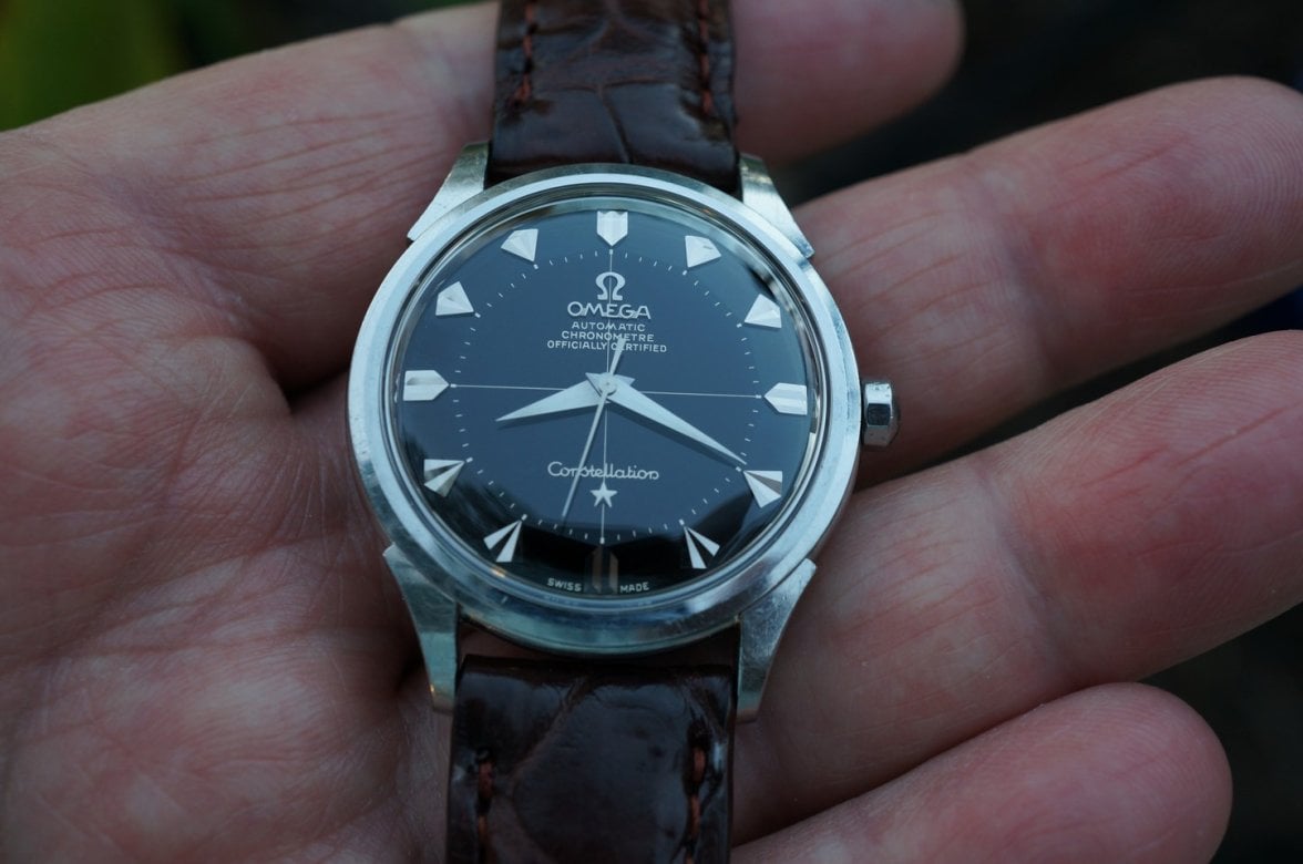
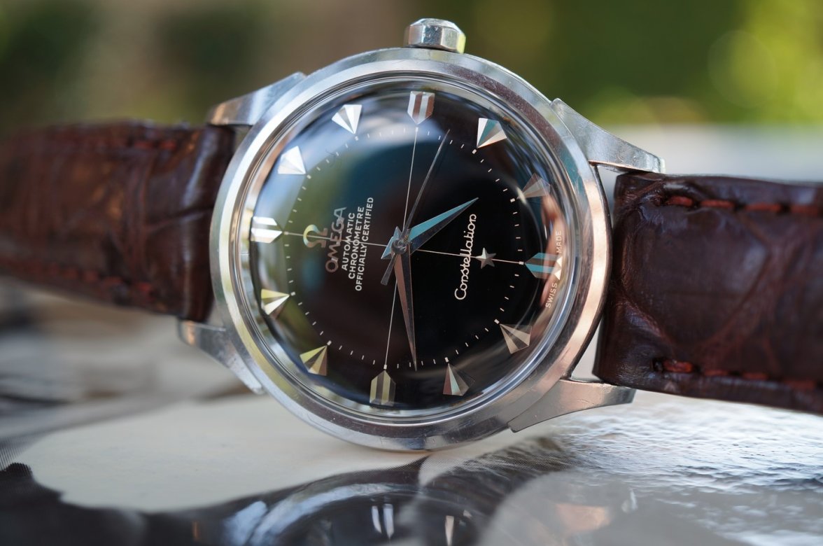
I have recently acquired this constellation pie pan and would like your advice on its originality...
I am new to the vintage watches department and after studying almost all the info thread, I think the watch is real. But I learned that there are a lot of redials for cross-hair pie pans and I couldn't seem to find the exact same one elsewhere online.

Please advice and feel free to share your thoughts, I am ready to learn. Much appreciated.

s-l1600.jpg s-l1600.jpg s-l1600.jpg s-l1600.jpg s-l1600.jpg s-l1600.jpg s-l1600.jpg s-l1600.jpg s-l1600.jpg s-l1600.jpg
 
Posts
10,440
Likes
16,324
What is the serial number? At face value it looks good, genuine certainly. The case has seen a fair bit of polishing but there is something about the dial that makes me want to check the date.
 
Posts
966
Likes
3,956
You mentioned that “after studying almost all the info thread”, Could you please provide a list of some of the information threads you mentioned studying?😀
 
Posts
10,440
Likes
16,324
The LLs in Constellation look rather short don't they? I've not seen that before on a 2852. Certified looks a bit cramped vs Officially also. Never say never with Omega as there are so many variations but there are questions here certainly.
 
Posts
10
Likes
0
Posts
10
Likes
0
The LLs in Constellation look rather short don't they? I've not seen that before on a 2852. Certified looks a bit cramped vs Officially also. Never say never with Omega as there are so many variations but there are questions here certainly.
That's a very good point, I was focusing too much on the font type and didn't see the LLs. Thank you!
 
Posts
2,927
Likes
6,102
There are other things, I doubt. EG all the "endings" of the letters ( s in Constellation) should have a serif-but wait for the *****Star-Pro´s
 
Posts
6,498
Likes
10,176
I would say redial so wrong font (and not passing MOY test)
 
Posts
966
Likes
3,956
I am not sure is the ‘e’ in the word ‘Constellation’ inspired by Pac-Man? 😁

 
Posts
8,485
Likes
60,615
Spacing and fonts are off up-top

And the "n's" are wrong down bottom
 
Posts
371
Likes
260
I'd seen this one before. 100% redial. Other than the fonts/ serifs that have been mentioned by other, just the spotlessness of this dial marked this as a suspect candidate to me. Even the best of NOS preserved examples have flaking/ graining/ etc. when seen through a 10x loupe - and even without it shows up as - for lack of a better word - 'character' even in 1x pics. So there's my 2c.
 
Posts
8,485
Likes
60,615
I'd seen this one before. 100% redial. Other than the fonts/ serifs that have been mentioned by other, just the spotlessness of this dial marked this as a suspect candidate to me. Even the best of NOS preserved examples have flaking/ graining/ etc. when seen through a 10x loupe - and even without it shows up as - for lack of a better word - 'character' even in 1x pics. So there's my 2c.


whoa that hoss, podn'r😁

Let's have a bit of humility in those bold statements

Carry on