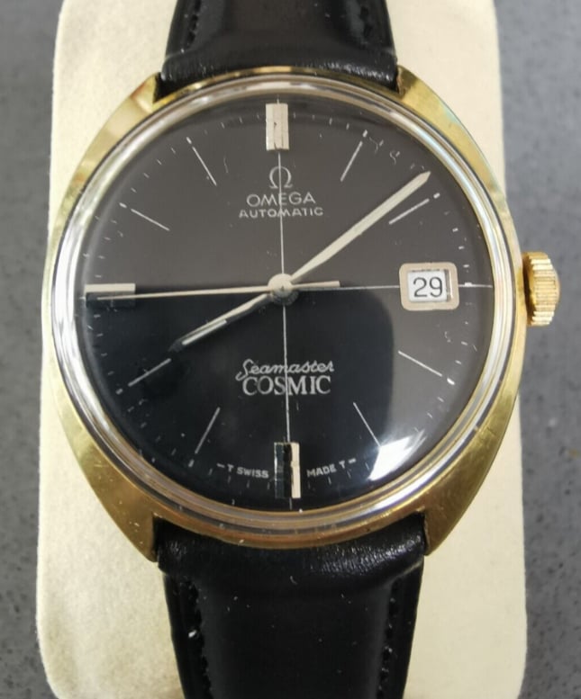
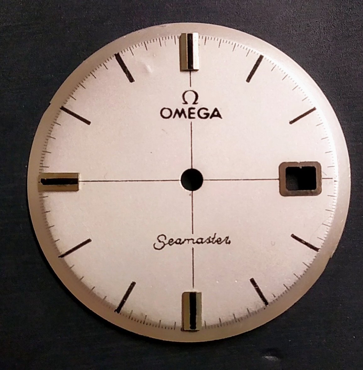
I’m gonna go out on a limb and say it’s not too bad. But I think the font is slightly too thick. Minute markers all nice and even and most lume plots apart from 6. Almost want to say it’s a potential service dial…? Someone please correct me if this is wrong.
EDIT just had another look and actually whilst the Omega text is okay, the Seamaster isn’t great. The S is a bit weird, and the text doesn’t all seem level.