Posts 4,669 Likes 17,673 Omegafanman ·May 7, 2019 Left... but hard with only one picture …. the camera (and lighting) does lie sometimes :0)
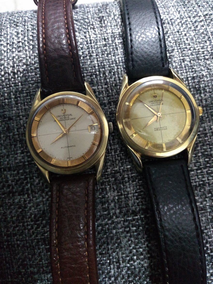
Posts 81 Likes 130 AdInfinitum ·May 7, 2019 Left ☑Contrasting copper tone creates visual interest ☑More apparent case sharpness like CJ said above ☑Date window, for people who like the extra complication (or people of a certain 'vintage' who actually use it) ☑Patina looks more even ☑"Swiss" sign Right: ☑More unified overall colour scheme ☑Dial symmetry (no date window) ☑Doesn't have those weird black markings on dial ☑I actually prefer the right 'shield' logo ☑Hands free of tarnish Not sure if any of the above is due to camera artifact, lighting etc. 55:45 Left... are you buying or deciding which one to sell? Cheers
Posts 13,156 Likes 52,282 Larry S ·May 9, 2019·Color Commentator for the Hyperbole. Both have merit but I like the left one slightly better.