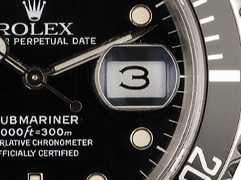
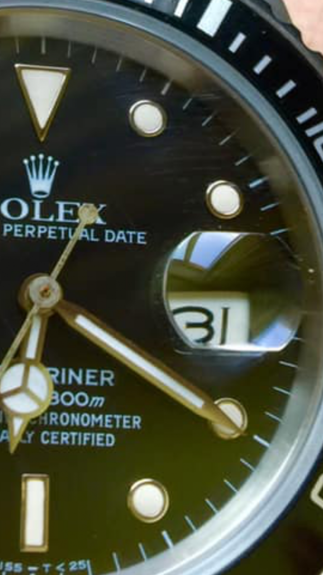
unrecognized date wheel font
Togri v. 2.0
··Wow! Custom title... coolPlease excuse as I am by no means a Sub expert but I have seen photos of a couple of early 16610s from 1989 or perhaps even from 1990 with open “6” and “9” identical to my 16800 from 1985 and mine has the same “3”. So I presume that the very early 16610s used the same date wheel as the 16800/168000.
Nobel Prize
·That’s what I’m thinking as well, just haven’t notice it on a 16610 before. But probably the L series got it. It’s cool
Togri v. 2.0
··Wow! Custom title... coolNobel Prize
·It is.
So here’s what I’m wondering. The pool of 16610 is massive, the tritium 16610 slightly smaller but still quite generous, but I have never seen any literature that separates the 88/89 16610 as retaining the 16800 date wheel font. If the 16610 is considered the first modern sub would this small first batch be considered a transitional? ( yet another transitional?). I’m just surprised that a market that creates a premium over any differentiator hasn’t capitalized on this.... (yet?)
So here’s what I’m wondering. The pool of 16610 is massive, the tritium 16610 slightly smaller but still quite generous, but I have never seen any literature that separates the 88/89 16610 as retaining the 16800 date wheel font. If the 16610 is considered the first modern sub would this small first batch be considered a transitional? ( yet another transitional?). I’m just surprised that a market that creates a premium over any differentiator hasn’t capitalized on this.... (yet?)
Togri v. 2.0
··Wow! Custom title... coolI have never heard this “transitionel” mentioned either even though I agree that there must be several of the early R and L-series 16610 that have the datewheel of the 16800/168000 series. But someone has to be the frist to strike gold as they say (don’t know if that is a saying). It makes sense with all the detail madness surrounding the 5513 and the other older models.
Perhaps it is due to the fact that the early 16610s hasn’t gained momentum yet. Even the later 16800 with white gold hour markers and glossy dial can still be had for “reasonable” money even though everybody keep saying that they will take off soon. I dunno. But if they continue to climb in value a transitional is bound to become attractive compared to the normal 16610 if the vintage Rolex world continues its current mode of operation.
Perhaps it is due to the fact that the early 16610s hasn’t gained momentum yet. Even the later 16800 with white gold hour markers and glossy dial can still be had for “reasonable” money even though everybody keep saying that they will take off soon. I dunno. But if they continue to climb in value a transitional is bound to become attractive compared to the normal 16610 if the vintage Rolex world continues its current mode of operation.
Nobel Prize
·Yep, it would make sense if it did. Value aside I love that font
Togri v. 2.0
··Wow! Custom title... coolI know what you mean. Compared to the font on my 16710, which is from 1993, the date font on my 16800 is much more charming in a way. It seems more detailed when examined up close. I especially like the “11”, where the numbers is wide apart. Somehow it seems very elegant 😀

