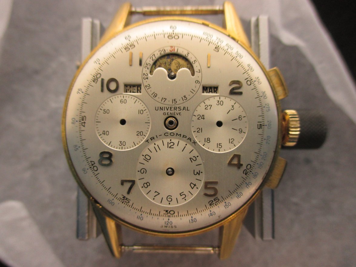
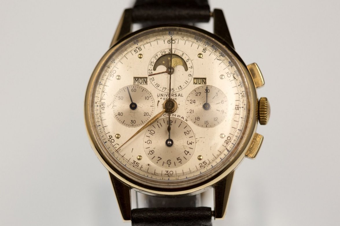
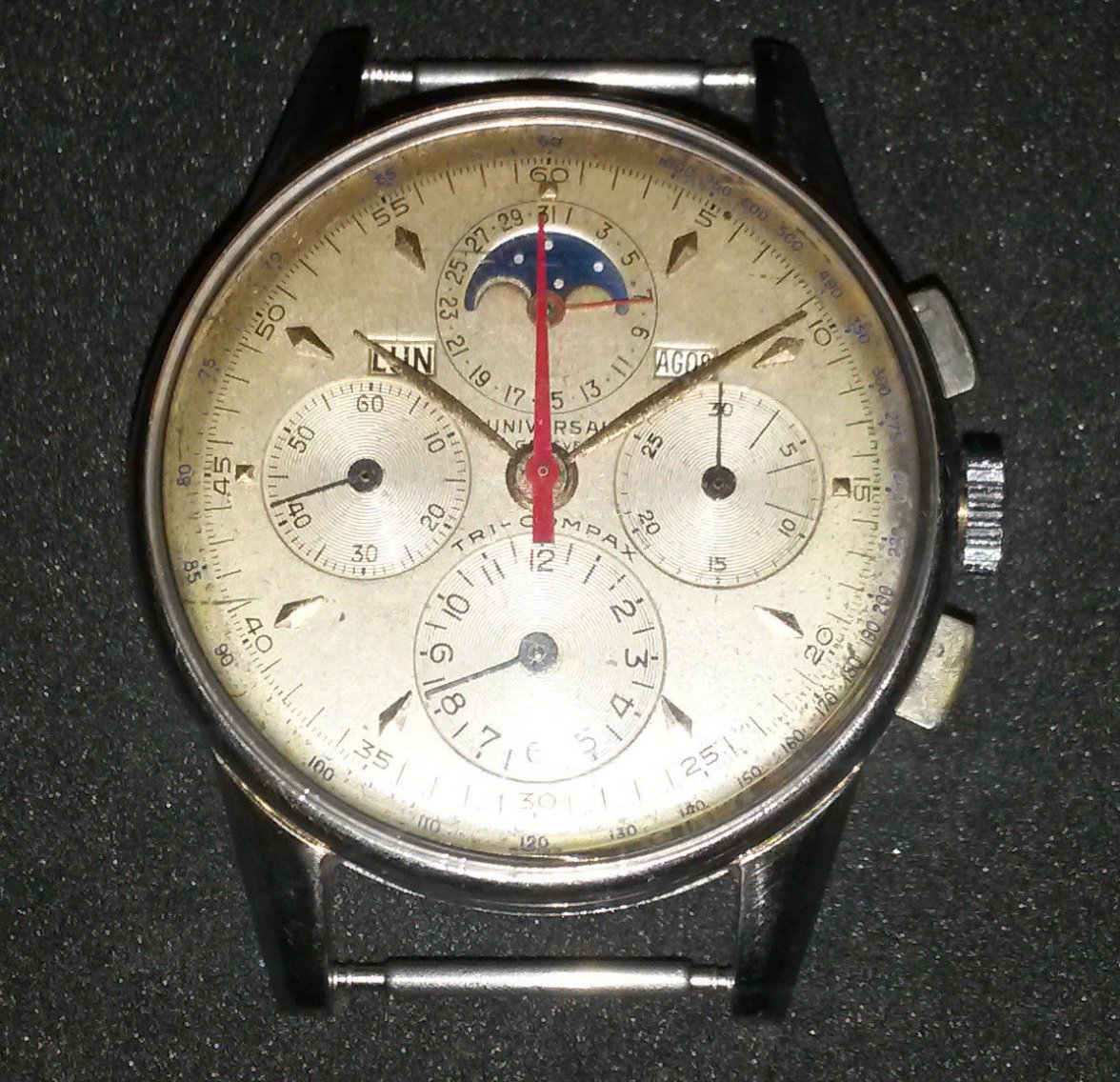
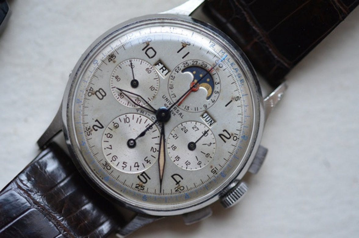
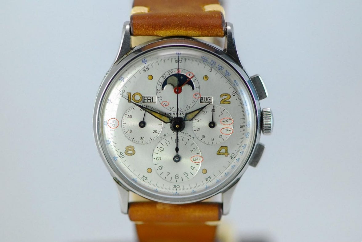
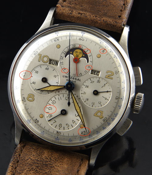
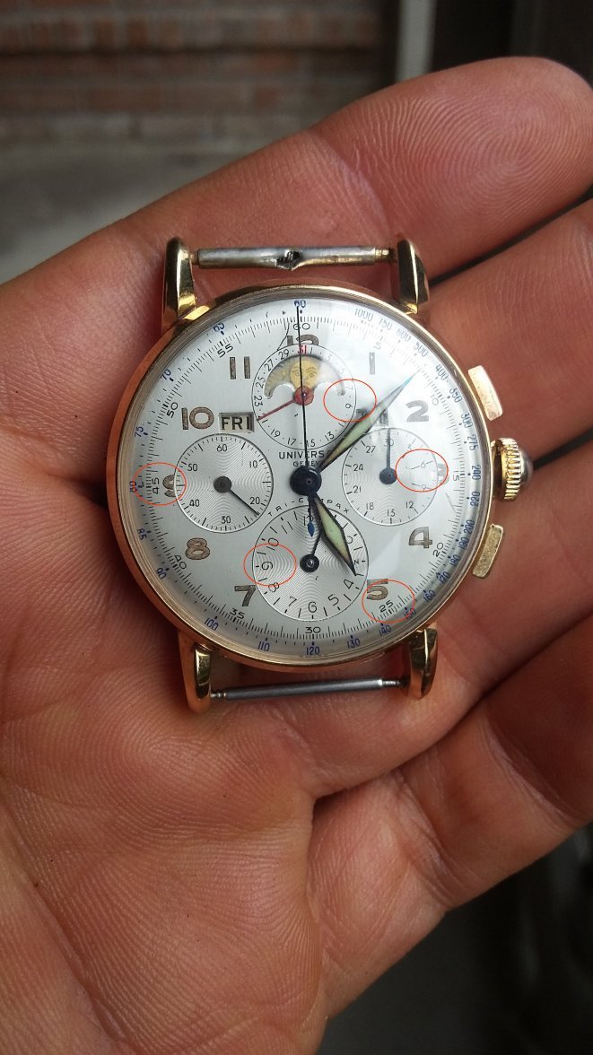
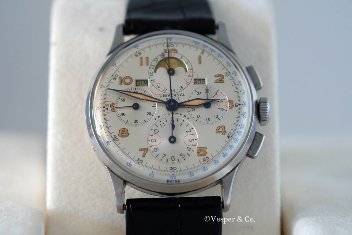
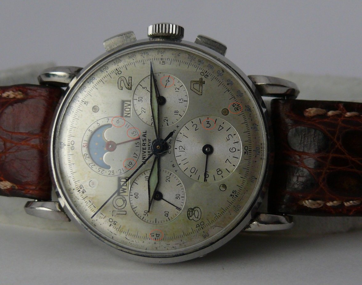
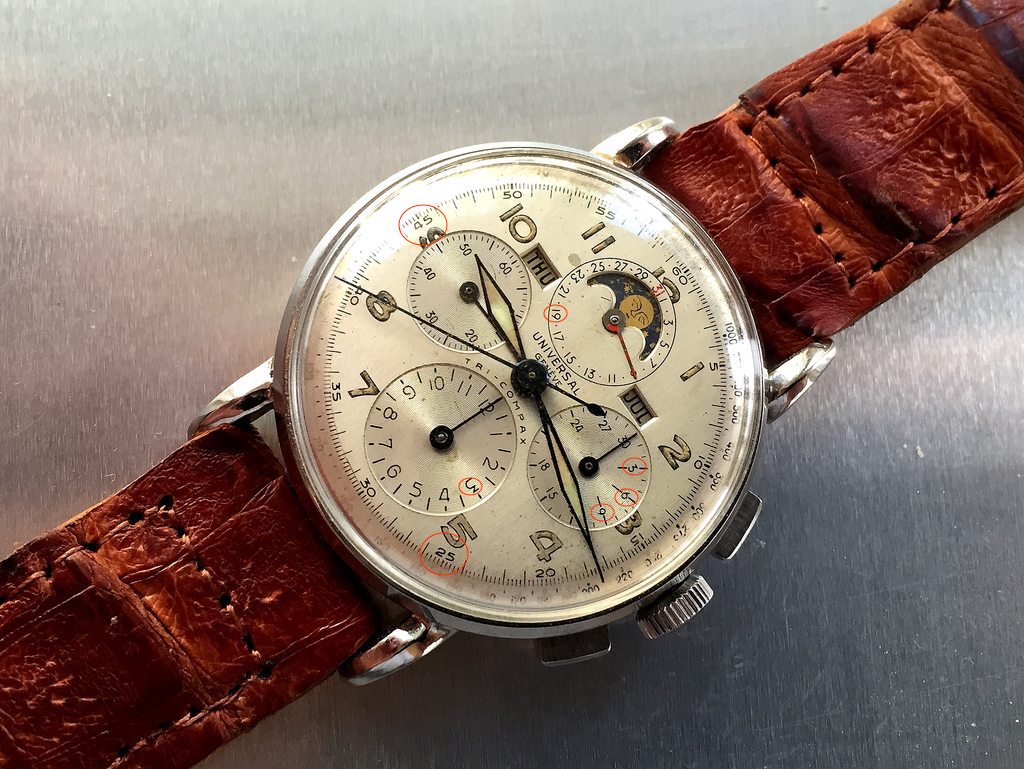
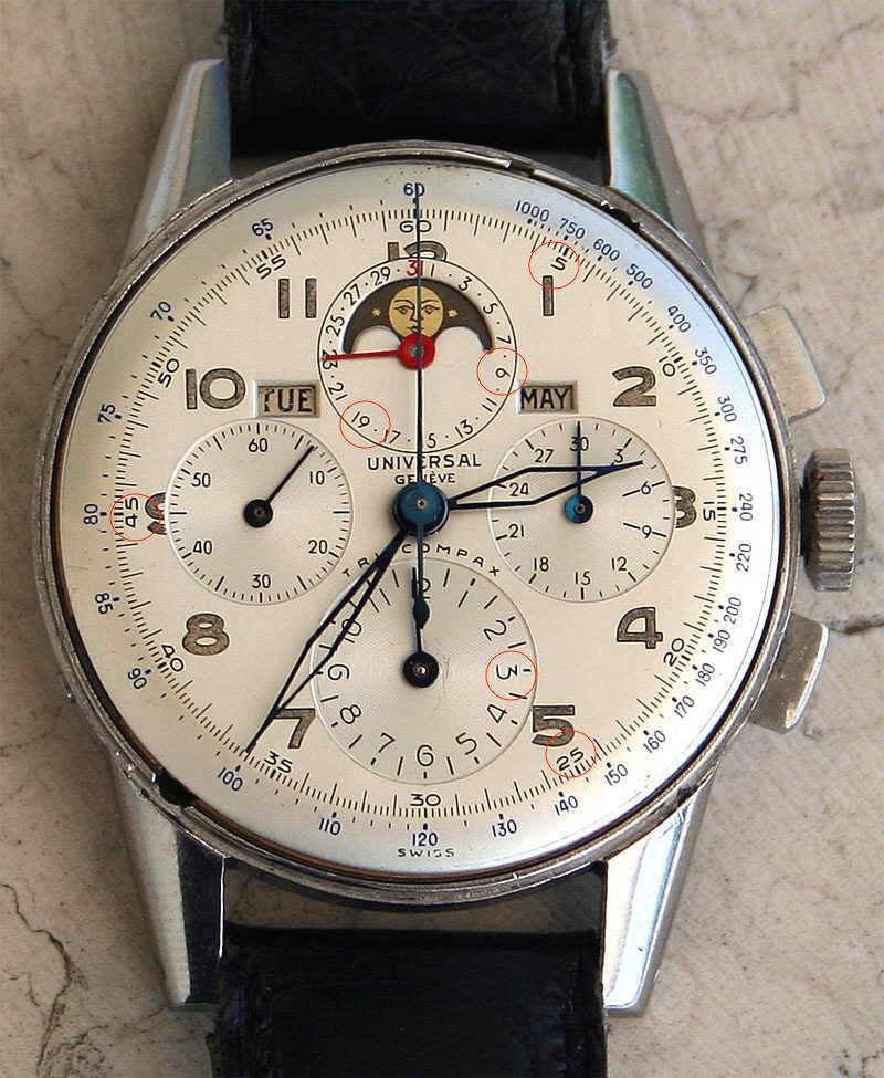
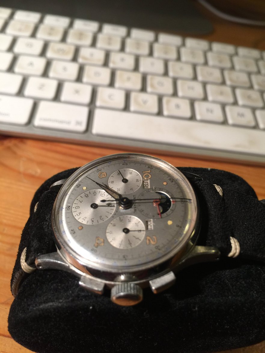
UG Tri-compax Dial " evolution, varience, service dial & redial referece guide " READ ENTIRE THREAD
rolokr
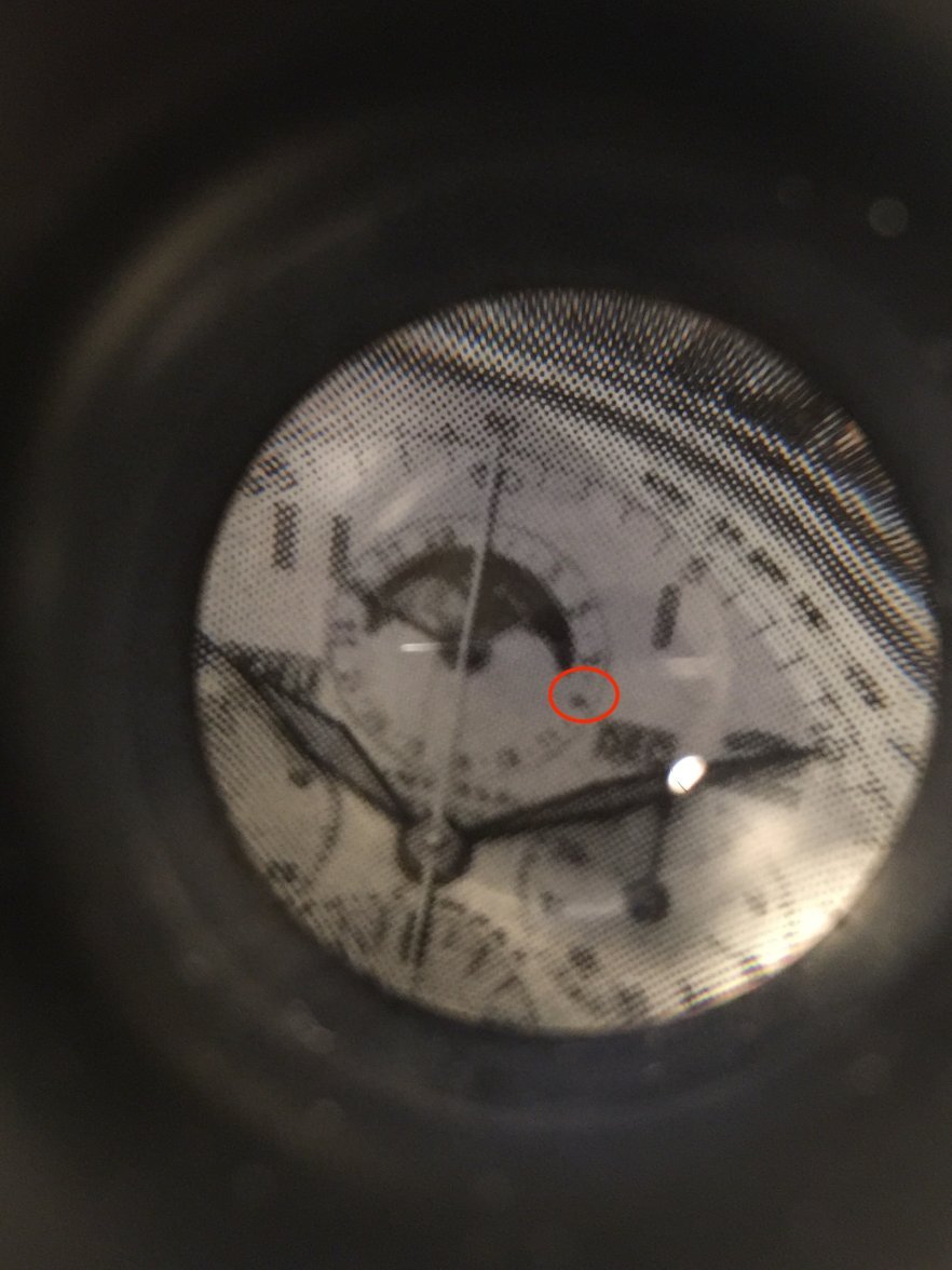
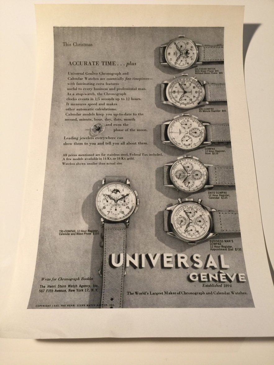
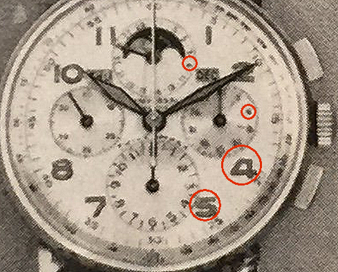
·The ad 6s and 9s look to be curly, no straight 6s and 9s ? It would be compelling to see an ad with straight 6s and 9s ! Thanks for posting the ads !
rolokr
·Good work Vitezi !
Dre
·I'm reading along with interest. Providing reliable data here will take a little time however
+1
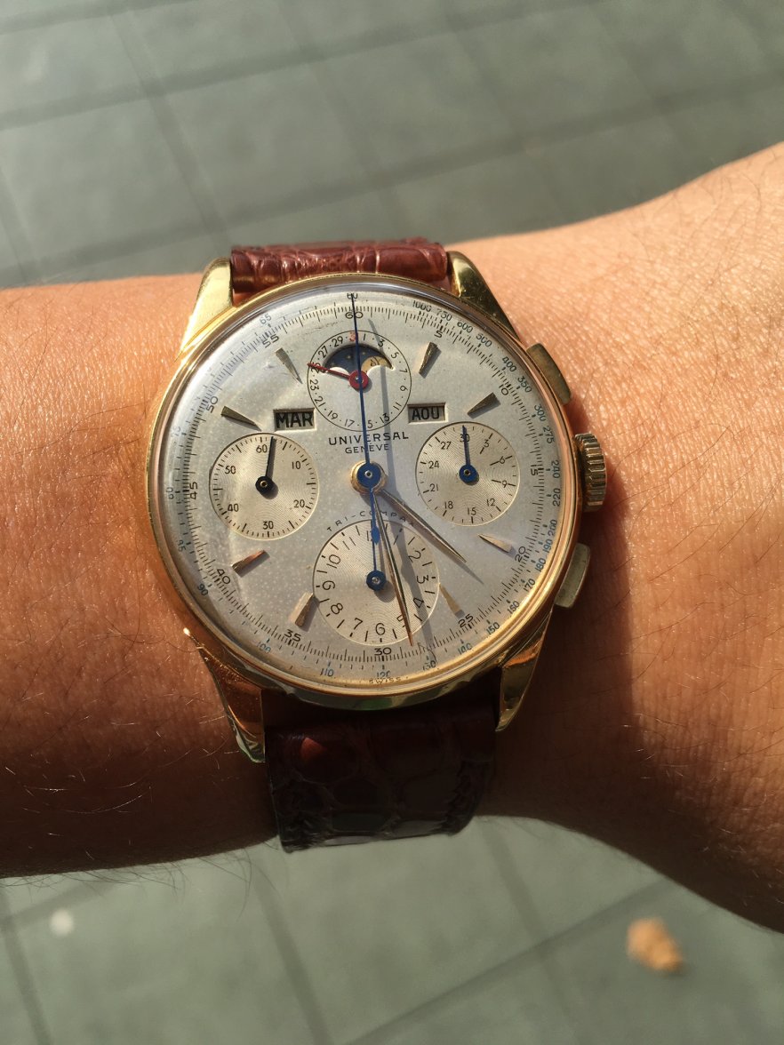
I can see where Diabolik came from with these dials that has curly 6s and 9s, the font is very crisp and the numbers are consistent. This is what I like to find on 1940s tri-compax watches as well.
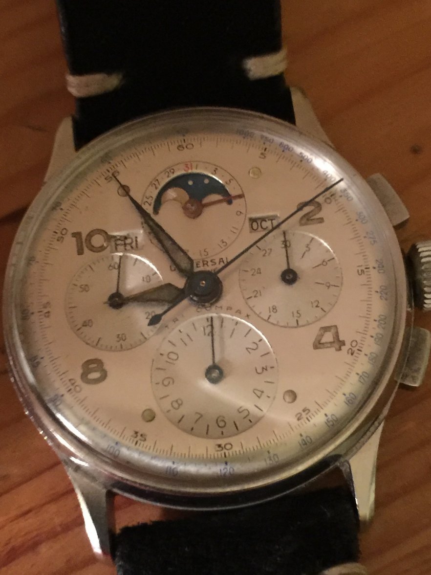
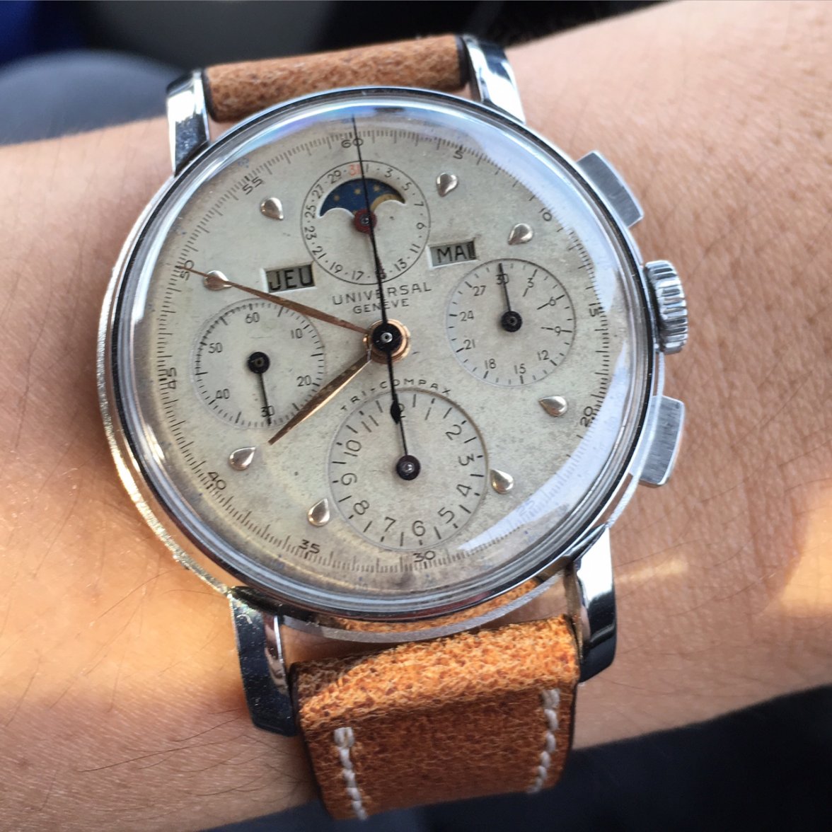
That said, I'm finding it hard to believe that these dials below have been repainted. All of them to be very consistent to each other, though some of them has no "-" on the "tri-compax". Still within UG inconsistencies?
It is also worth noting that Rolokr said that he bought the dial on his 14k watch separately around 8 years ago, when not many people knew UG. If these dials did not come like this from the factory, I think it would be a service dials at worst, made by different dial maker? Unless someone had foreseen the future of UG and repainted these dials with an old dial printer years and years ago 😜
Vitezi
·Never have seen a business mans compax, has a momento register like the Aero-Compax, interesting !
https://omegaforums.net/threads/1950s-universal-geneve-bingo.38910/
Larry S
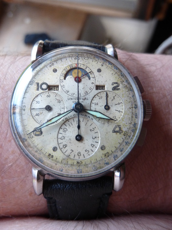
··Color Commentator for the Hyperbole.Well guys I'm afraid I'm caught in this web. This watch has passed through UG forum members, been featured on Watchville, validated as authentic by Crown and Caliber and again validated on the forum when I bought it. Lots of curly 9 and 6 except on the top 3 sub dials and no hyphen. Checked my other watches and forgot about this one. Love the watch. Struggling to believe it's a redial.
zr4484
·rolokr
·Wow, those even have applied markers, straight 6s and 9s, they are both amazing looking ! I feel like its like rare art and now there is a lot surfacing, maybe a bunch of fakes, I see so many now IM CONFUSED !
Do the markers look funny ?
Do the markers look funny ?
Edited:
jban
·I have nothing to add to this discussion but want to mention that it is causing psychological problems.
Diabolik
·This is going a bit like brexit as there does not seem to be any thought out exit plan. We are so far down the hole now that we owe it to ourselves to find a way out ! 

Edited:
Dre
·Diabolik
·Mlafra
·I am not sure how many more need to be posted before we can all conclude that straight sizes and nines are indeed an acceptable and perfectly legitimate (though less frequent) font style on 1940s Tri-Compaxes. In fact, at least on reference 22250, they seem to be the majority. I would also like to add that while looking at period ads it is indeed important and useful, it is not at all completely conclusive either way, as ads are known for sometimes not being pictures but drawings and for sometimes representing watches that didn't even exist, or early prototypes, etc...
gop76
·What a great discussion is going on here...
On an ancient thread: https://omegaforums.net/threads/thoughts-on-a-1950s-uni-compax.10443/ , woodwkr2 pointed out that UG was a redialer itself and i quote:
"I have a definitive original service manual and parts inventory/catalog from Universal. I quote from page 2:
"Dials: When ordering a dial, the latter must not only be fully described in appearance but both numbers engraved on the case, serial and consecutive, must also be indicated together with the caliber number. May we, however, point out that renovating an old dial is much less costly and much faster than the supplying of a new one. Dials sent to us for replacing or renovating must be packed very carefully to avoid any damage by the dial pins whilst in transit."
So this could be a possible explanation for the less frequency of those dials: the watches were for service to UG and dials were there refinished.
Other possible explanation was raised by gatorcpa in the same thread: UG exported the watches to USA without dials (others companies did it) and a local contractor made the dials there with different dies from those used on switzerland (this explanation only will be valid if we can establish that the watches with straight "6"s and "9"s were originally sold on US).
Anyway, never a dull moment with UG...
Vitezi
·it is not at all completely conclusive either way
Mlafra
·I would also like to point out, that whenever (in all the cases) we see straight 6s and 9s, the 7s are also without serif, the 5s have the vertical line not "perpendicular" but slightly sloped to the right and the 2s are also kind of less "curvey/snakey" (for the lack of better adjectives!). To me this is also a hint towards originality as the consistency is just too much. I think the explanation is as simple as UG was sourcing dials from more than one manufacturer and they must have had slightly different fonts.


