- Posts
- 97
- Likes
- 144
Please consider donating to help offset our high running costs.
I'm not an owner (yet, at least!) but it's the one thing that irkes me about the Rising Sun. I've seen/heard people change the hands but I'm not sure that's really the way I want to go on a brand new (or close to it) watch.
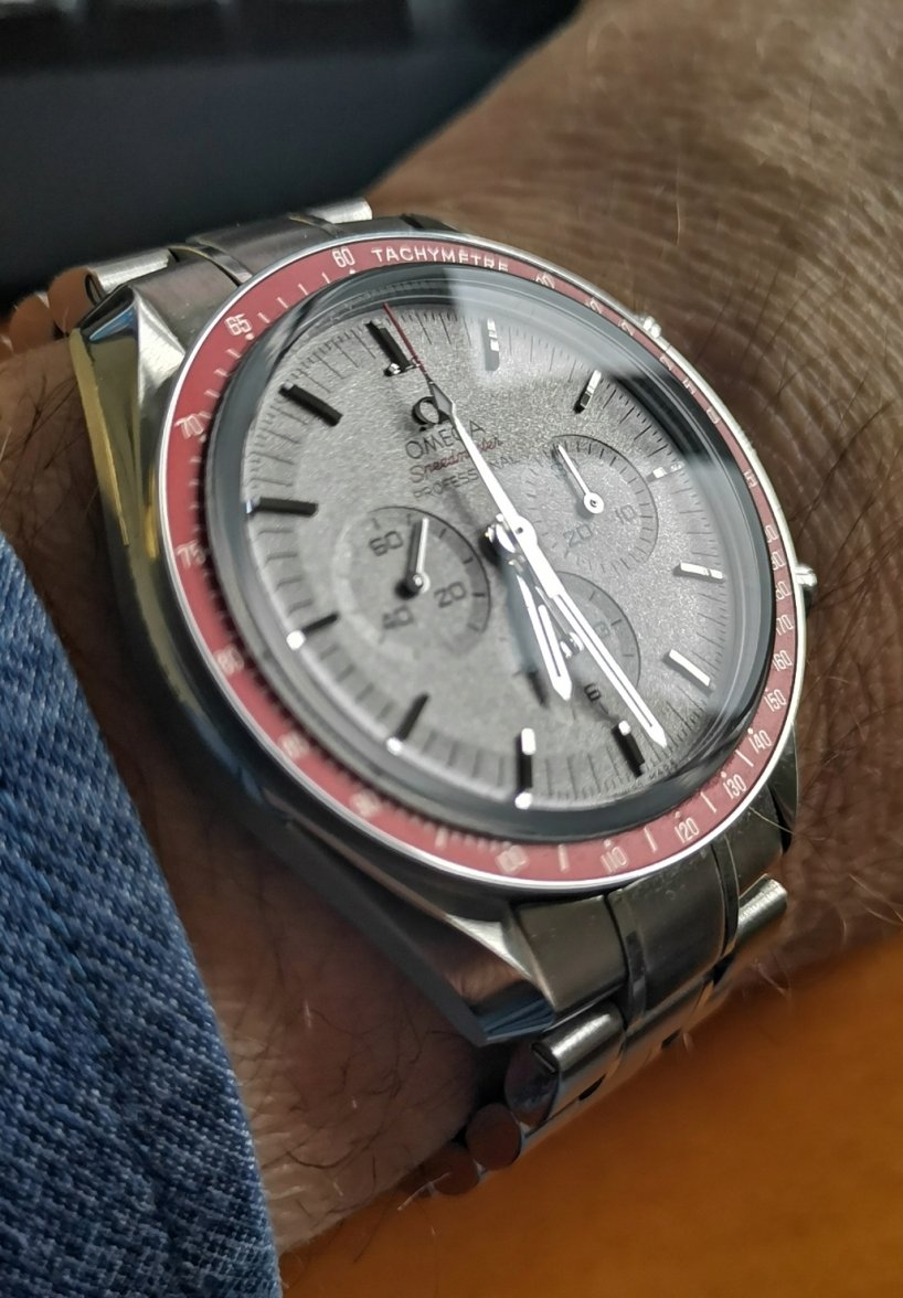
There are a lot of lovely watches that prioritize aesthetics over legibility, and that’s fine. After-all, watches are primarily jewelry (anymore). So it’s not to disparage the Panda or Rising Sun, but instead only to clarify they are that type of watch. Prospective buyers may or may not value a high degree of legibility.
Also, some folks will disagree and be nonplussed and say that they can read it fine, or that a slight twist of the wrist let’s light highlight the hands more visibly.
But at the end of the day, the standard speedy can be read from across the room, or I imagine during a wildly vibrating liftoff, while these Tokyo examples with white-ish dial and silver handset are another matter.
You make a good point but ultimately the point in wearing a watch is to tell the time. I had a beautiful Mitsukoshi mod but I couldn't tell the time so it had to go. Whenever looking at a new watch the first thing I look at is whether I can actually tell the time on the thing!!
The white on black scheme of the basic Speedmaster is obviously the easiest to read at a glance, that's true of every black dial, white hand watch. But I don't quite understand the seeming inability for some people to read some watches with lighter dials. I've owned over 200 watches over the years but never had one that was so challenging to read that I couldn't use it, or was even a factor for selling it. Right now I have an Apollo 35th dial, a Rising Sun and an Apollo 8, three watches that seem to get mentioned a lot for their supposed poor readability. I've never had any issue reading any of these watches, none, and my eyes are older than almost all people on this forum. Perhaps people are too impatient and just won't spend more than a fleeting glance at their watch to tell the time.
Perhaps people are too impatient and just won't spend more than a fleeting glance at their watch to tell the time.
The white on black scheme of the basic Speedmaster is obviously the easiest to read at a glance, that's true of every black dial, white hand watch. But I don't quite understand the seeming inability for some people to read some watches with lighter dials. I've owned over 200 watches over the years but never had one that was so challenging to read that I couldn't use it, or was even a factor for selling it. Right now I have an Apollo 35th dial, a Rising Sun and an Apollo 8, three watches that seem to get mentioned a lot for their supposed poor readability. I've never had any issue reading any of these watches, none, and my eyes are older than almost all people on this forum. Perhaps people are too impatient and just won't spend more than a fleeting glance at their watch to tell the time.
Well, at least we all agree there is a legibility delta between the standard white-hand-on-black-dial vs the silver-hand-on-whiteish-dial, and there’s only disagreement only over whether one should care about that delta.
Surprisingly, I did/do.
And that is your right to do so. For me it's a non issue, but everybody is different. It is only a 'flaw' to the wearer who has trouble reading a particular dial, a non issue to those who can easily read it.
Agree, long term the Rising Sun will prove to be a winner. I got mine in a trade and I'm probably a bit underwater at this point, no big deal. Prices go up, down, sideways, it's just part of the hobby. They aren't investments.
I've seen a few Rising Suns where the owner put on blued hands instead of the silver, that would improve readability for those that have difficulties.