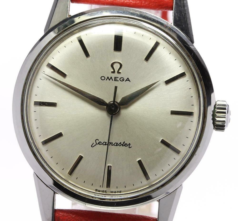
Posts 30 Likes 21 phcollard ·Mar 1, 2020 Tell me I am making progress in detecting a redial 😀 I found the dial too nice to be true, and I looked at other pictures I found for this reference, the font is a bit too bold on this one. Right? Right? Have a great Sunday y'all! Edited: Mar 1, 2020
Posts 2,326 Likes 1,884 VetPsychWars ·Mar 1, 2020 If it is, it's one of the best I've ever seen. Yes, the printing looks heavier than usual but there's nothing obviously wrong with it. Tom
Posts 2,086 Likes 2,897 OMEGuy ·Mar 1, 2020 Hi! I remember your first posts here. 😀 Yep. Redial. What else?
Posts 13,426 Likes 18,635 gatorcpa ·Mar 1, 2020·ΩF InvestiGator VetPsychWars Possibly a service dial? Doubtful. gatorcpa
Posts 30 Likes 21 phcollard ·Mar 1, 2020 vicsdca Cracked bezel too. Is it supposed to be a Seamaster 30 ? I missed that! Caseback says 14390-4SC
Posts 30 Likes 21 phcollard ·Mar 1, 2020 OMEGuy Hi! I remember your first posts here. 😀 Yep. Redial. What else? Hi. Still here 😀 Learning from the best. Next time I'll try to spot a cracked bezel.
Posts 201 Likes 624 vicsdca ·Mar 1, 2020 phcollard Caseback says 14390-4SC It's a pre-Seamaster 30. Great reference. Hope you find an original example.
Posts 215 Likes 188 kev1976t ·Mar 1, 2020 Always find these threads so interesting and educational !!
Posts 8,821 Likes 73,239 Spruce ·Mar 1, 2020·Sunburst dial fan Still, it’s nice looking. What’s the asking price?
Posts 30 Likes 21 phcollard ·Mar 2, 2020 Spruce Still, it’s nice looking. What’s the asking price? Thanks all! It's on eBay for US$ 598.
Posts 733 Likes 1,457 WatchCor ·Mar 2, 2020 Well spotted @phcollard. I have trained myself to spot easier ones. This one I probably would have missed. Are the 4 & 5 hour markers also everso slightly not-centered between the minute track marks?