- Posts
- 838
- Likes
- 3,269
KstateSkier
·OK so I'm still learning the nuances of real and fake Omega's but just spotted this 300 on the bay and thought I'd try my hand and calling out its issues, in an effort to learn.
So. what am I missing? http://www.ebay.com/itm/VINTAGE-OMEGA-SEAMASTER-300-DATE-565-24-JEWELS-LUMINOUS-DIAL-WATCH-MENS-1960s/291722757202?_trksid=p2047675.c100005.m1851&_trkparms=aid=222007&algo=SIC.MBE&ao=1&asc=20131003132420&meid=cd128e3bc41644608322554fc6d0c5cb&pid=100005&rk=3&rkt=6&sd=172149115251
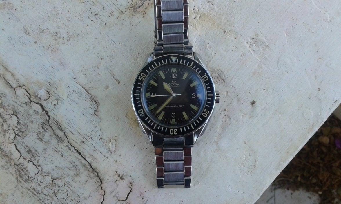
The indices at 6 and 9 look incorrect, shouldn't they be squared off triangles on the inner part of the dial.
The date window seems to be missing the white trim.
Missing serif numerals at 12 - 6 - 9.
The Triangle at 12 on the bezel appears hand painted and not sharp at all. Not to mention the funny "1" at the 10 spot should have a small line on top rather than a straight vertical 1 (right?)
"Seamaster 300" should all be on a single line rather than stacked, and "300" is in the wrong font, should match "Seamaster".
Omega Logo looks too far down on the dial

On the bezel it appears as if the black portion doesn't fill into the coin edge but is rather crisp, however the font used on numerals appear funny, the "1" in the "10" doesnt match the original 1's used.
Movement should be a 552 I think rather than a 565. Scratch that it seems some came in 565 movement.

Caseback looks legit with the flat topped "A" in wAterproof.

What am I missing?
So. what am I missing? http://www.ebay.com/itm/VINTAGE-OMEGA-SEAMASTER-300-DATE-565-24-JEWELS-LUMINOUS-DIAL-WATCH-MENS-1960s/291722757202?_trksid=p2047675.c100005.m1851&_trkparms=aid=222007&algo=SIC.MBE&ao=1&asc=20131003132420&meid=cd128e3bc41644608322554fc6d0c5cb&pid=100005&rk=3&rkt=6&sd=172149115251
The indices at 6 and 9 look incorrect, shouldn't they be squared off triangles on the inner part of the dial.
The date window seems to be missing the white trim.
Missing serif numerals at 12 - 6 - 9.
The Triangle at 12 on the bezel appears hand painted and not sharp at all. Not to mention the funny "1" at the 10 spot should have a small line on top rather than a straight vertical 1 (right?)
"Seamaster 300" should all be on a single line rather than stacked, and "300" is in the wrong font, should match "Seamaster".
Omega Logo looks too far down on the dial
On the bezel it appears as if the black portion doesn't fill into the coin edge but is rather crisp, however the font used on numerals appear funny, the "1" in the "10" doesnt match the original 1's used.
Movement should be a 552 I think rather than a 565. Scratch that it seems some came in 565 movement.
Caseback looks legit with the flat topped "A" in wAterproof.
What am I missing?
This website may earn commission from Ebay sales.