- Posts
- 3,487
- Likes
- 13,339
MtV
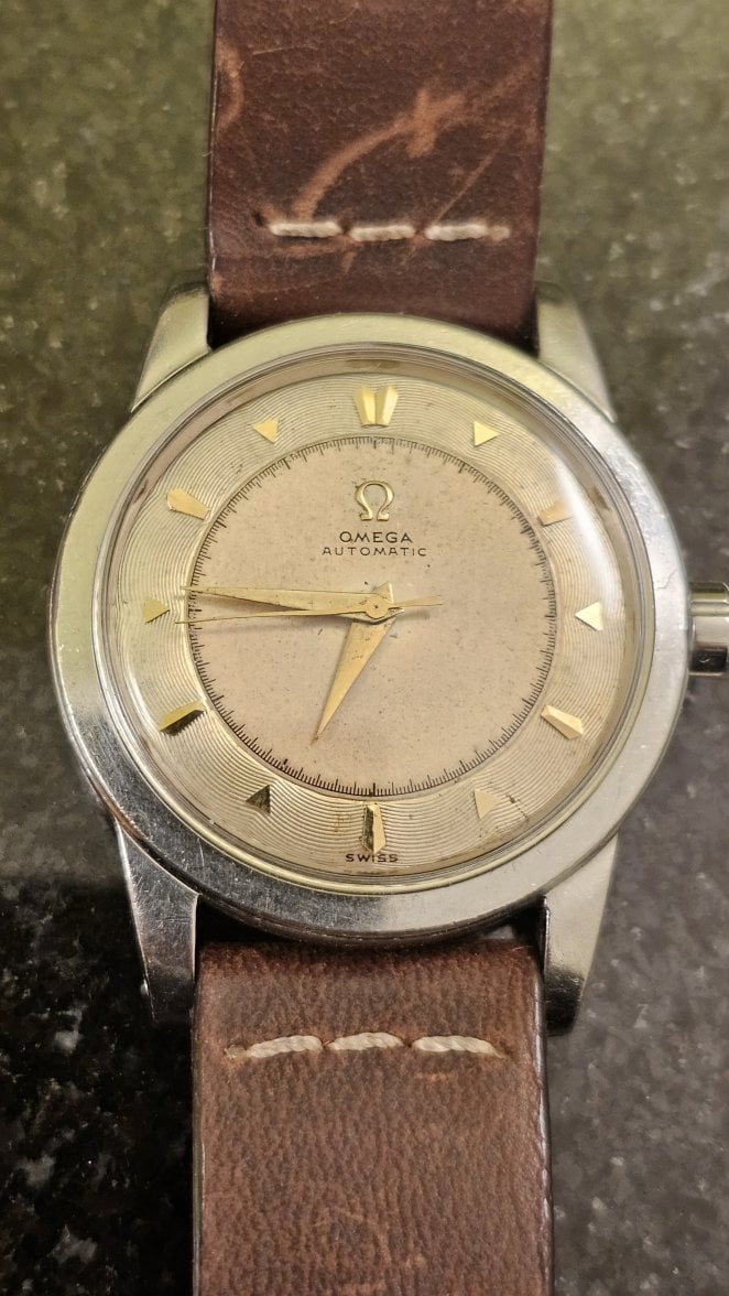
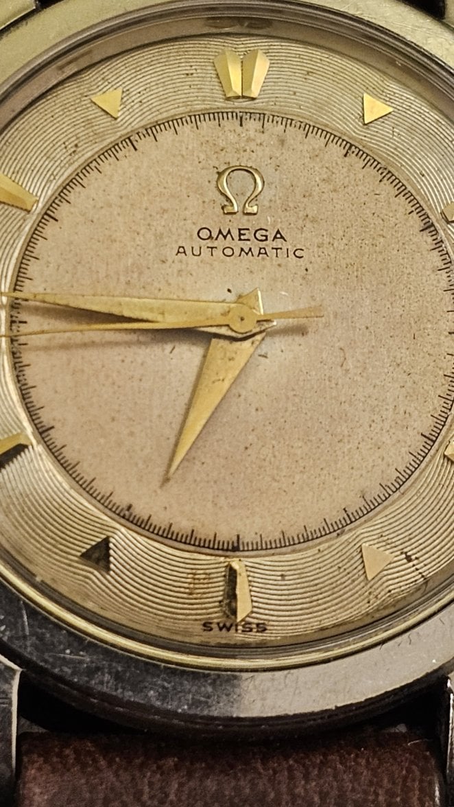
·Meant to add this one to the thread, a cal 352 chronometer certified example with a style of indices that’s rather uncommon. I’d give them a descriptive name, but I’m afraid all I can come up with sounds rather, uhm, childish.
Anyway. I like it. Will need a clover crown, of course, but it’s not like I’m complaining about a thick decagonal flat feet crown for my parts drawer, so that didn’t really stop me purchasing it. 😀

Anyway. I like it. Will need a clover crown, of course, but it’s not like I’m complaining about a thick decagonal flat feet crown for my parts drawer, so that didn’t really stop me purchasing it. 😀