Epictetus
·
Hi fellow watch lovers,
As I mentioned in a post from a couple of days ago, I have my mind set on a vintage Omega 18ct solid gold. I have saved up and am ready to pull the trigger, should the right watch arrives (budget is 4500 euros). I have been checking out the listings and research various constellation references from the 50's.
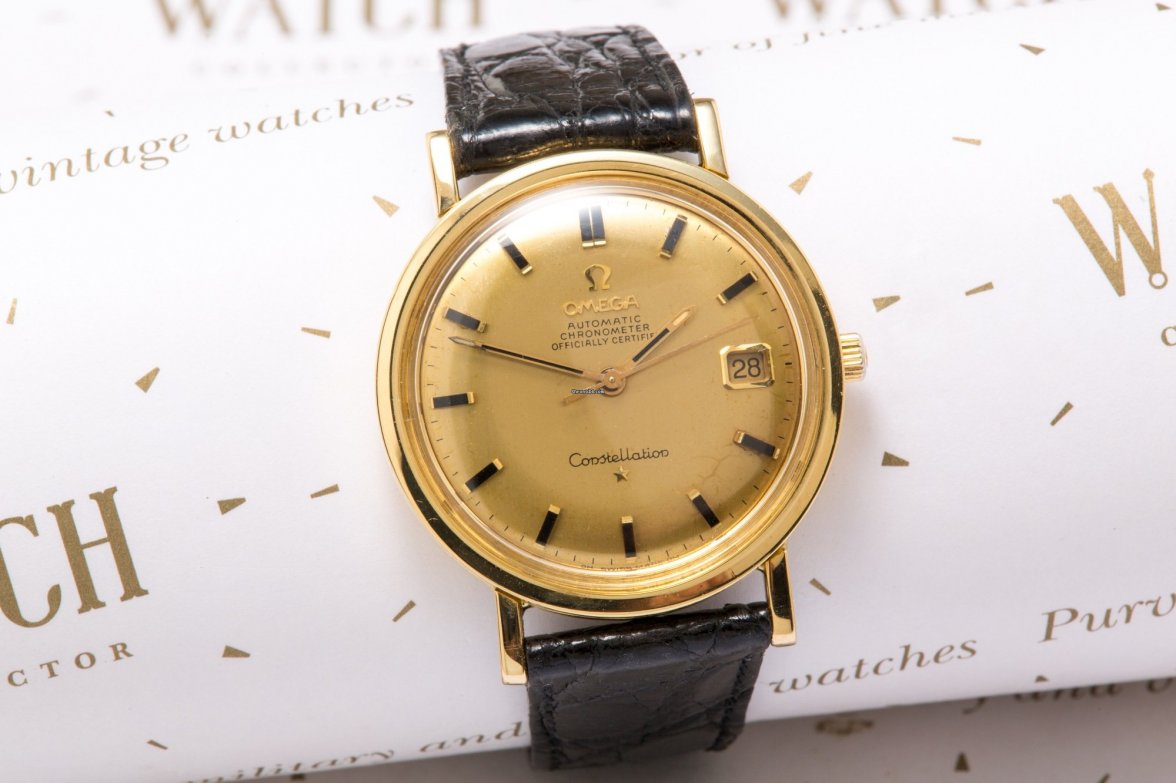
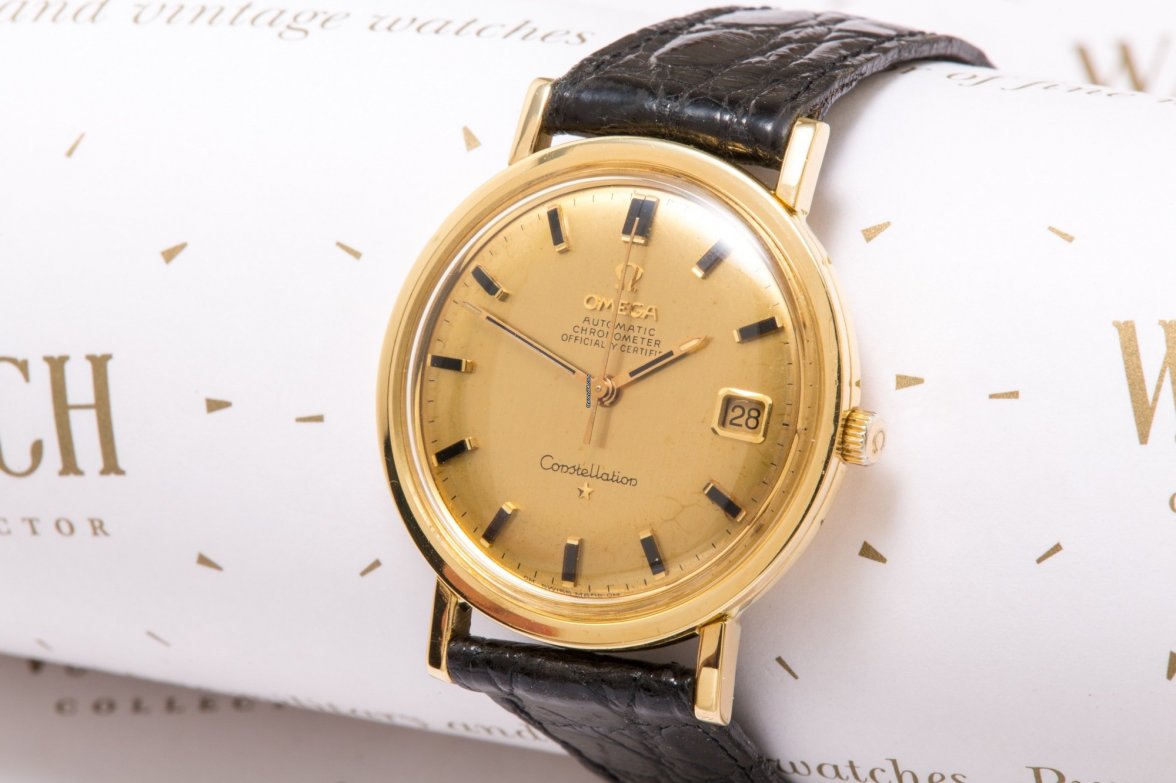
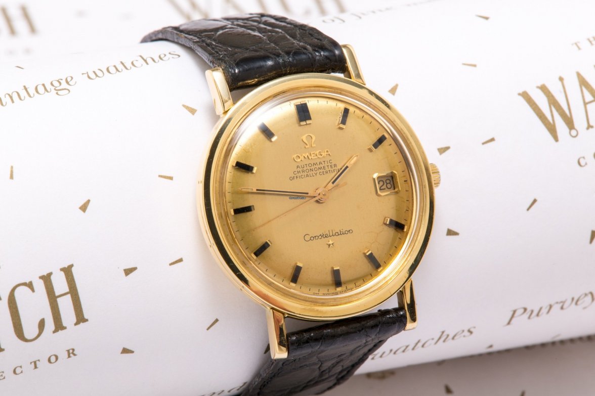
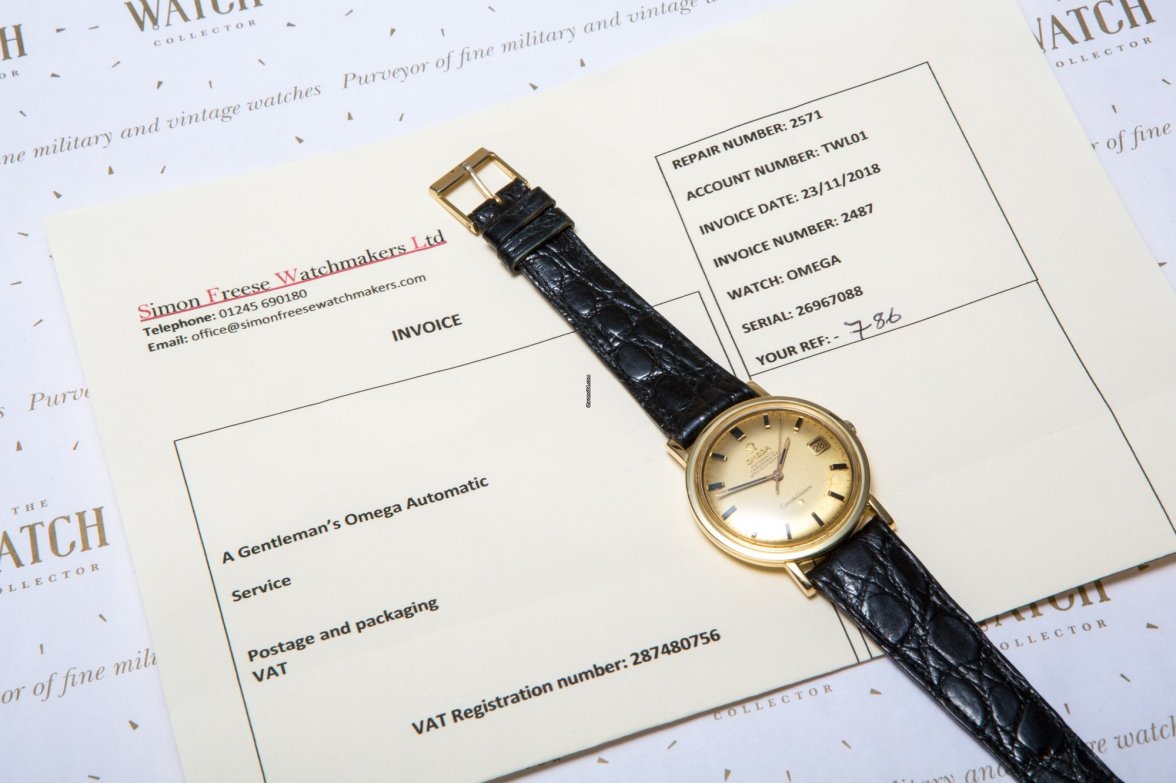
Today, I came across the following listing.
https://www.chrono24.com/omega/constellation-deluxe-18-ct-gold--id9941835.htm
I am not considering it since I envisage my first luxury watch would have the arrow head markers but I inspected the dial and the finish of the case out of interest.
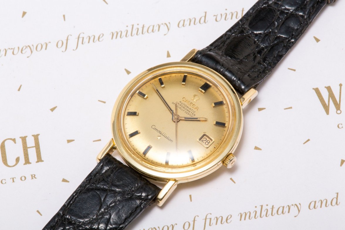
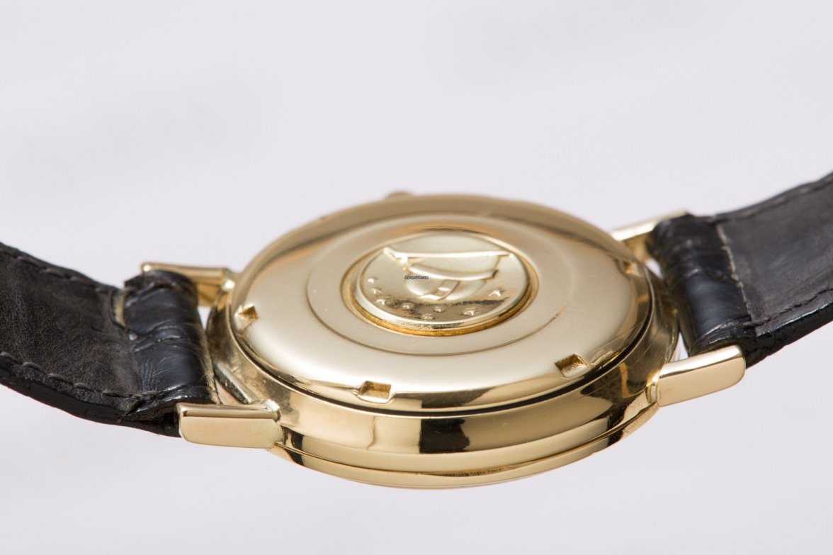
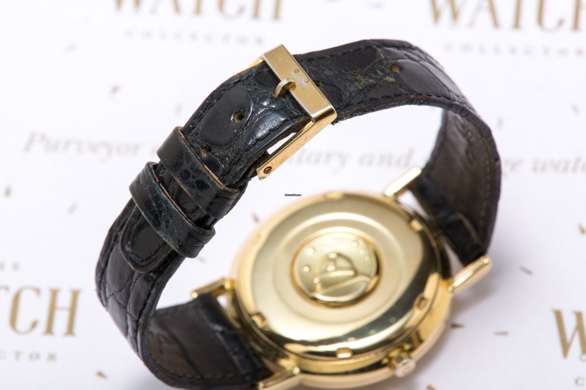
To my untrained eye, it looks like the case has not been polished to death, the lugs not so much as there are practically no sharp edges left, but what I found most striking was the dial. It seems like it has been repainted, as the font does not match the one found on other Constellations.
The seller has a very good rating on Chrono and claims in the ad that the dial has been untouched, but my intuition is tell me otherwise.
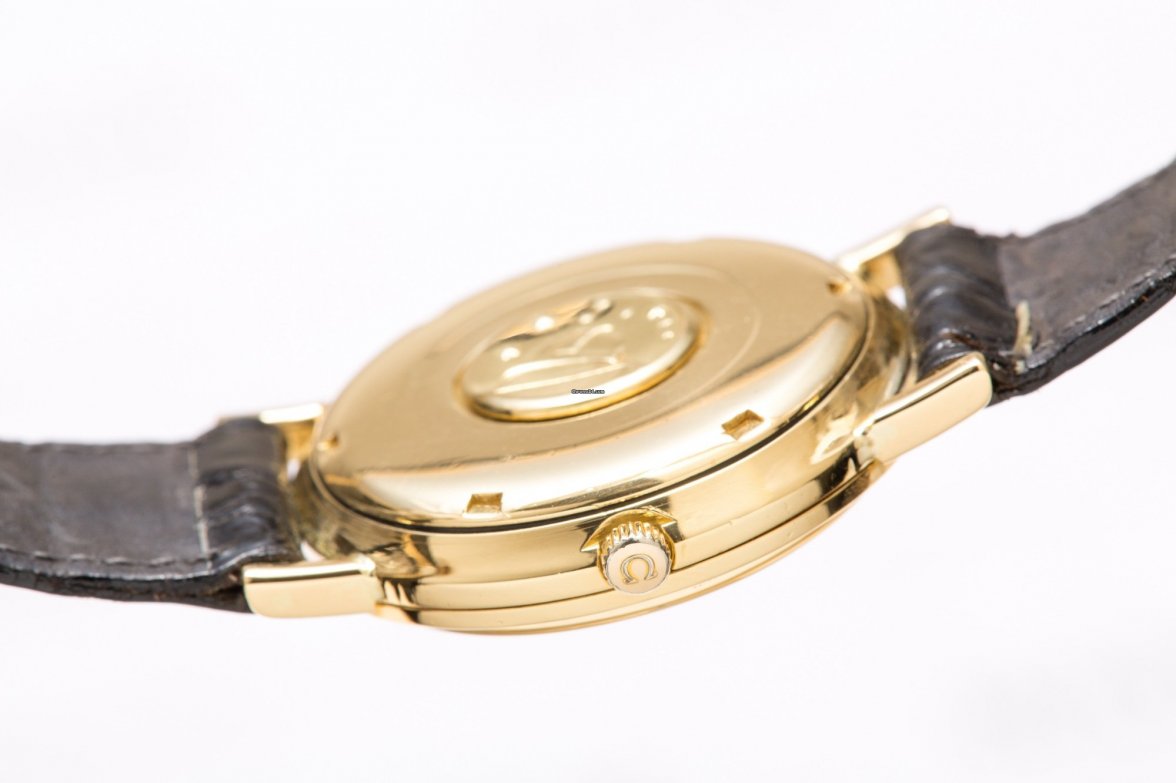
On another note, the crown is not even the scalloped one which appeared on some Constellations. This looks like the run of the mill SeaMaster crowns.
Could you please chime in and give your 2c? It would really help me sharpen my skills and knowledge when inspecting watches.
Edited:
