- Posts
- 76
- Likes
- 113
Airbus
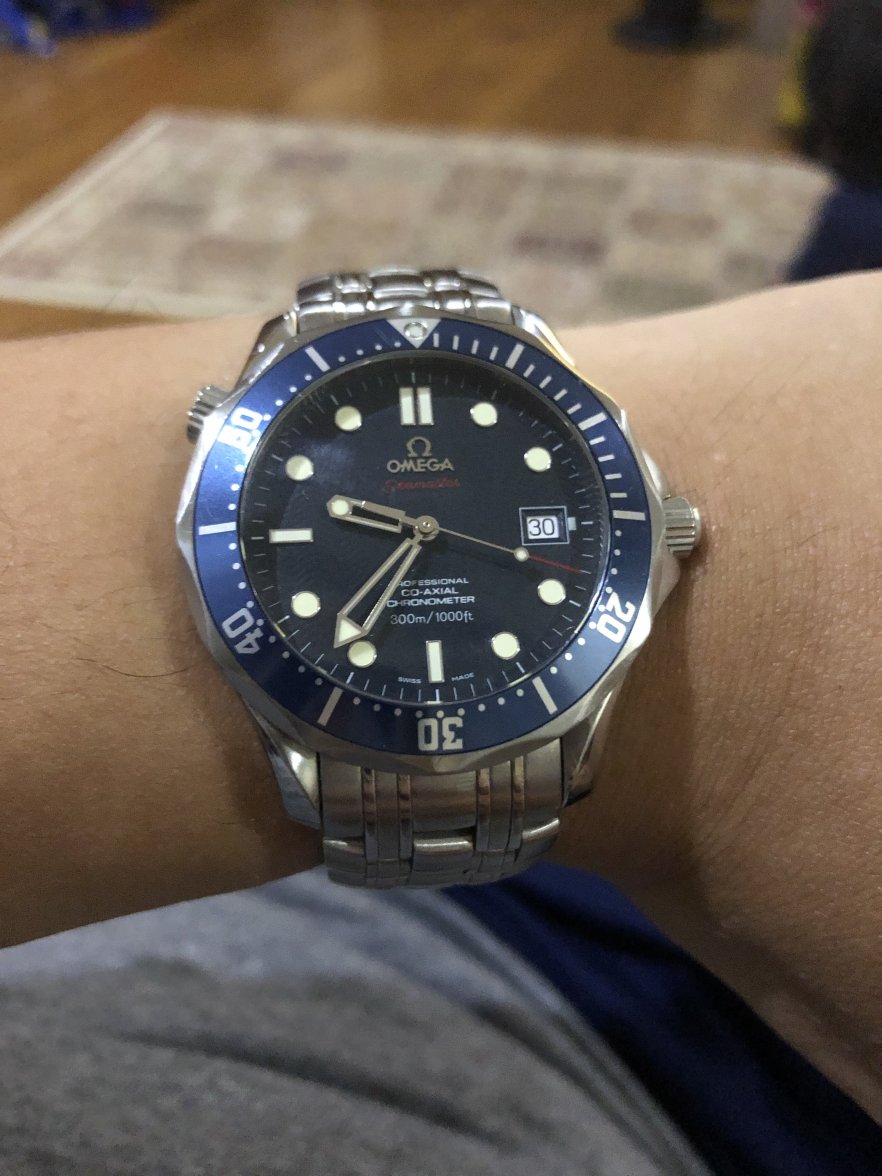
·Going through the SMP history from 1993 - it seems like the Seamaster gets an update every 6 year or so;
1993 - introduction
2006 - 2500 movement, new dial
2012 - Ceramic bezel, new dial
2018 - current generation
Given that it now have all the modern stuff - what will happen to the model next you think? It is hard to see potential improvements at this point. Smaller maybe?
Very early speculations of course...
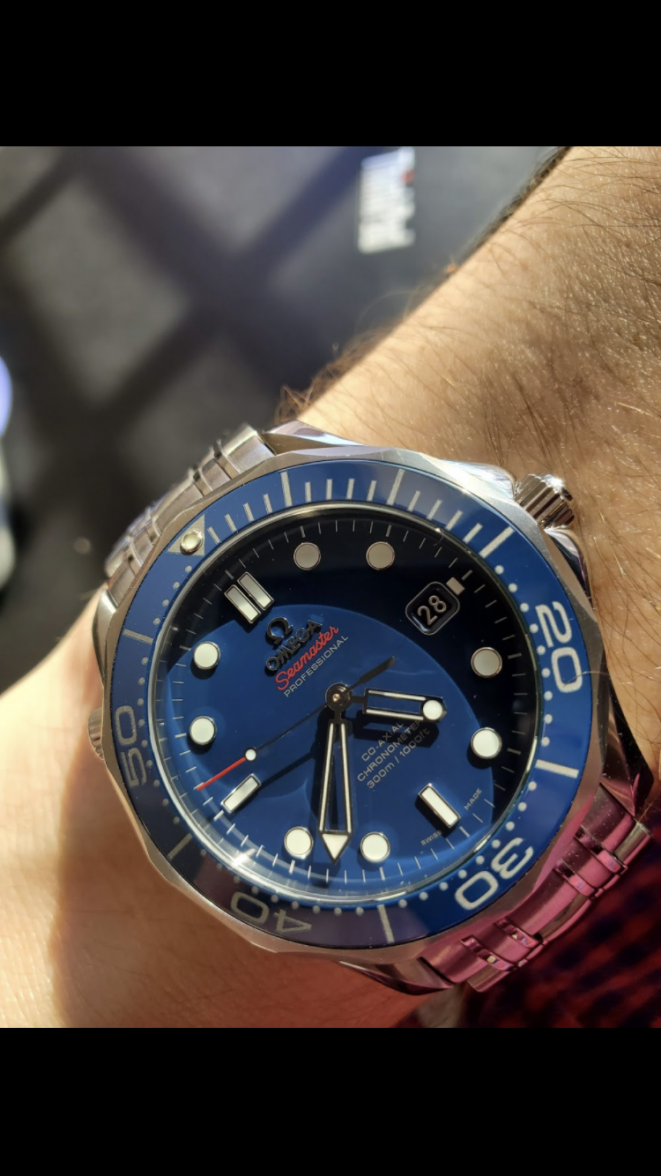