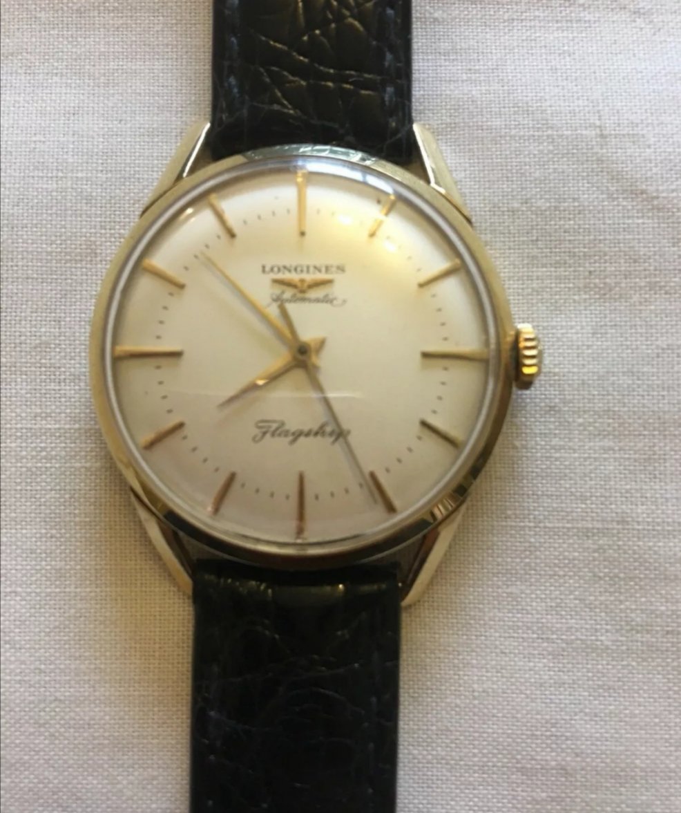
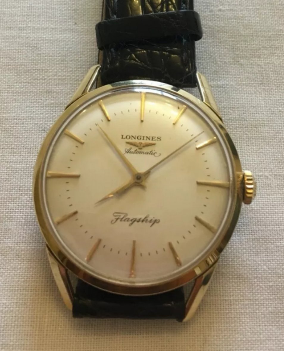
The automatic in that location is unusual, but I don’t have any doubts about the originality of the dial. The quality of the font looks too good to be a re-dial IMHO. And I think @Vitezi’s concerns about the location of aromatic on the dial are because the photo isn’t taken straight on; the watch is slightly turned to the left.
It looks like there is a Swiss at 6 that is just obscured by the crystal.
Is this solid gold and do you know the movement? Knowing the caliber in particular would help narrow down a time frame/originality.