Redial or Franken?: Vintage 5 Star Admiral

Posts
17
Likes
6
Hi all,

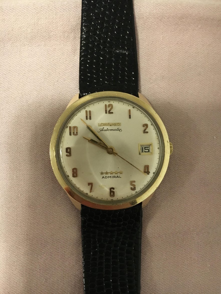
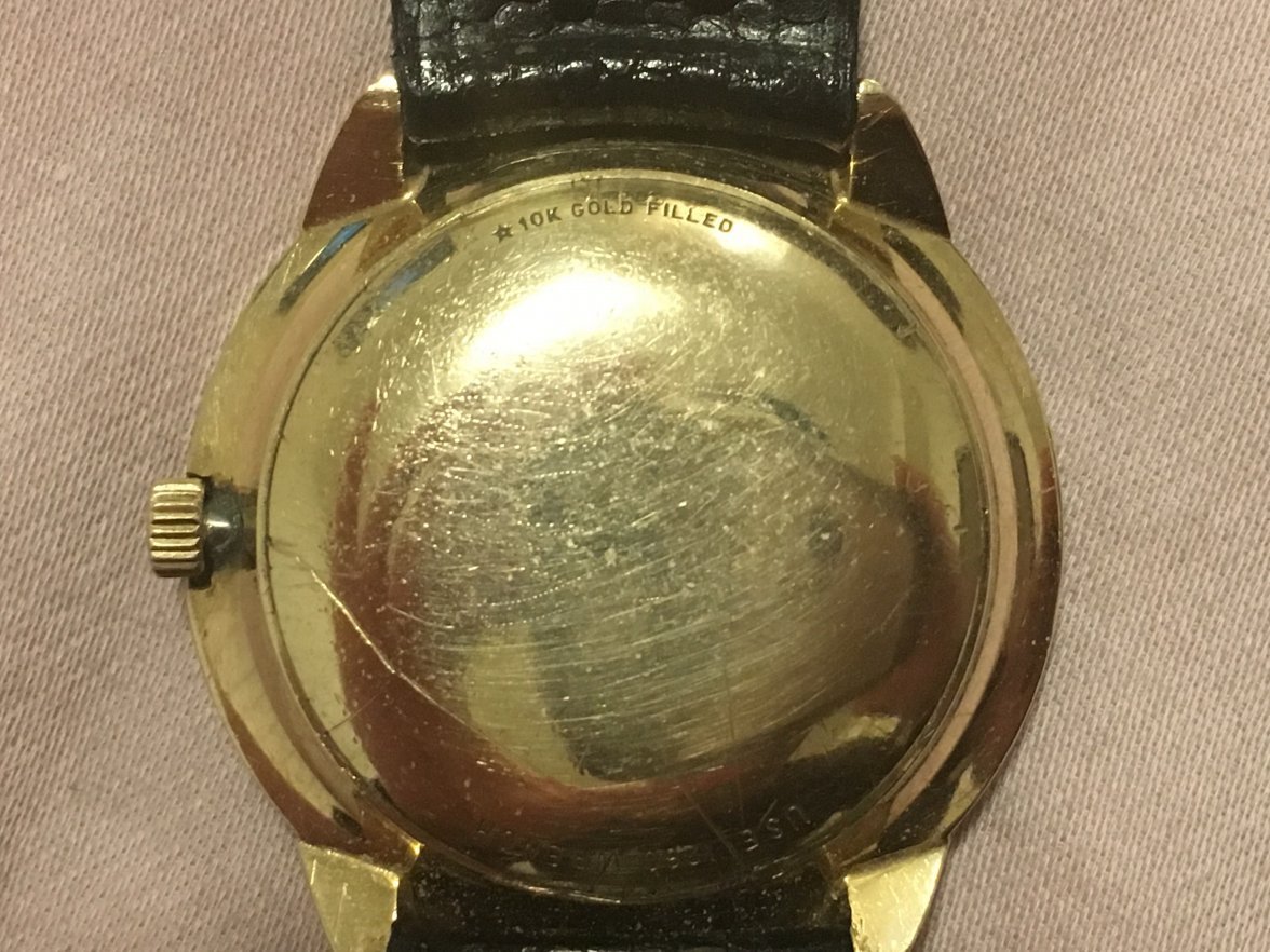
I picked up a vintage 5 star admiral which is supposedly from 1968 - prior to purchase I was told that the timepiece was all original with the exception of the strap.
The movement was checked out by a watchmaker and it shows calibre 501.
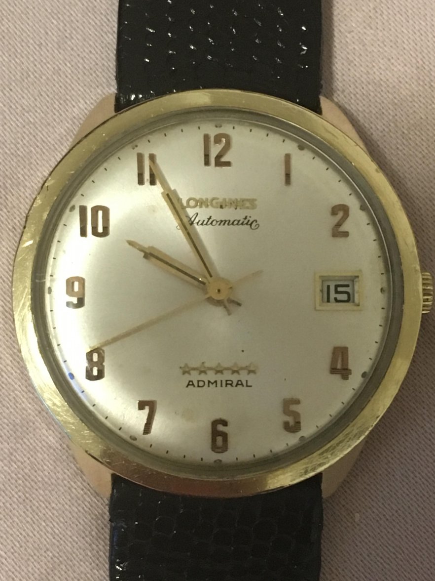
The dial though is something I'd like to get some help on as there may be signs that it is a redial or franken.
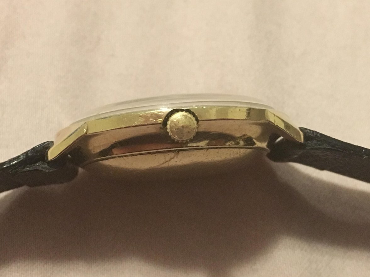
Can anyone please help or provide your thoughts on the following photos?

Thanks in advance everyone.
 
Posts
3,772
Likes
20,184
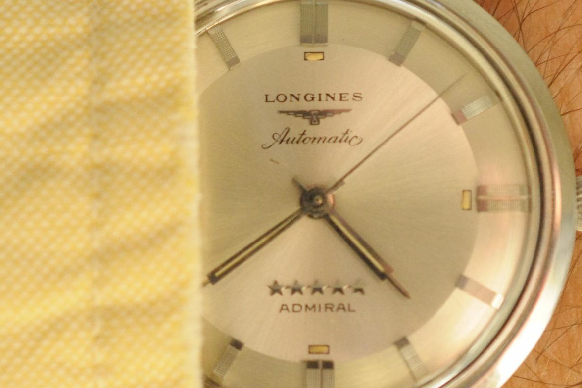
The hands, maybe. I think the "Automatic" looks funky.

Compare to this one of mine:


514485-cfd33257334e51dc8fd1d0f942bb3115.jpg
 
Posts
17
Likes
6
My vote is on original. Rest easy, friend. What makes you suspect it's a redial?

Thanks for the feedback guys. That is very reassuring.
I guess the concerns stemmed from people saying that the dial should look basically perfect in terms of markings and symmetry. The dial on this admiral makes it look like some of the numbers are spaced out inconsistently with the hour markers (Numbers 1, 2 and 5 seem to stand out). Also, I heard that the colour of the hands should match that of the markers on the dial. In this case there is a slight variation in colour.

This is all of course subjective so maybe I'm just crazy. If so, that works for me 😉
 
Posts
17
Likes
6
The hands, maybe. I think the "Automatic" looks funky.

Compare to this one of mine:


514485-cfd33257334e51dc8fd1d0f942bb3115.jpg
Good call on that. They do look a bit different. Thoughts on 1,2 and 4 placement by their hour markers? Seems like the spacing is off.
 
Posts
3,772
Likes
20,184
C clift
Good call on that. They do look a bit different. Thoughts on 1,2 and 4 placement by their hour markers? Seems like the spacing is off.
I'm not sure about that, I wonder if some of that isn't distortion from the crystal. The 1 and 2 of the 12 look higher and lower, too.

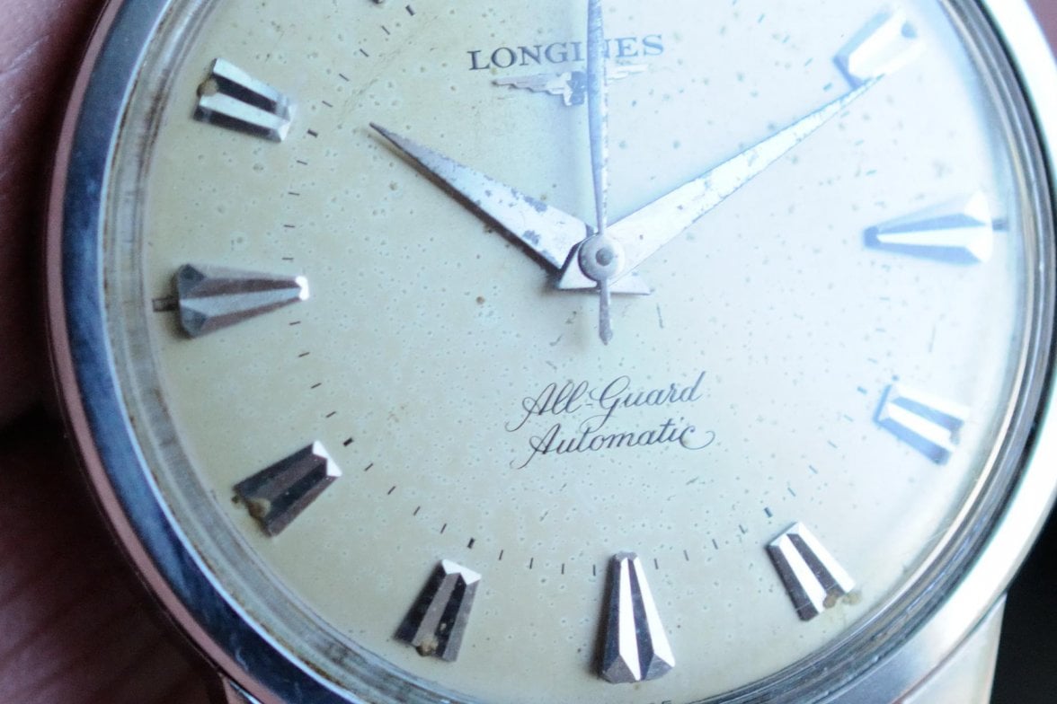
Here's another Automatic in that style, from a much older dial, but same style.


See how the tail of the "c" looks compared to your example?
 
Posts
17
Likes
6
I'm not sure about that, I wonder if some of that isn't distortion from the crystal. The 1 and 2 of the 12 look higher and lower, too.

Here's another Automatic in that style, from a much older dial, but same style.


See how the tail of the "c" looks compared to your example?
Yup, without a doubt the 'c' looks very different. Hmm... I'd be interested in knowing if there were any variations from certain generations and models or if they are all supposed to be the exact same. This model is supposed to be from around 1968 or so I've been told when referencing calibre 501
 
Posts
3,772
Likes
20,184
I the stickies of this forum there is an excellent monograph on the Longines house automatics by @ulackfocus. Check it out.
 
Posts
17
Likes
6
I the stickies of this forum there is an excellent monograph on the Longines house automatics by @ulackfocus. Check it out.
Thanks for the recommendation!
 
Posts
7,269
Likes
76,273
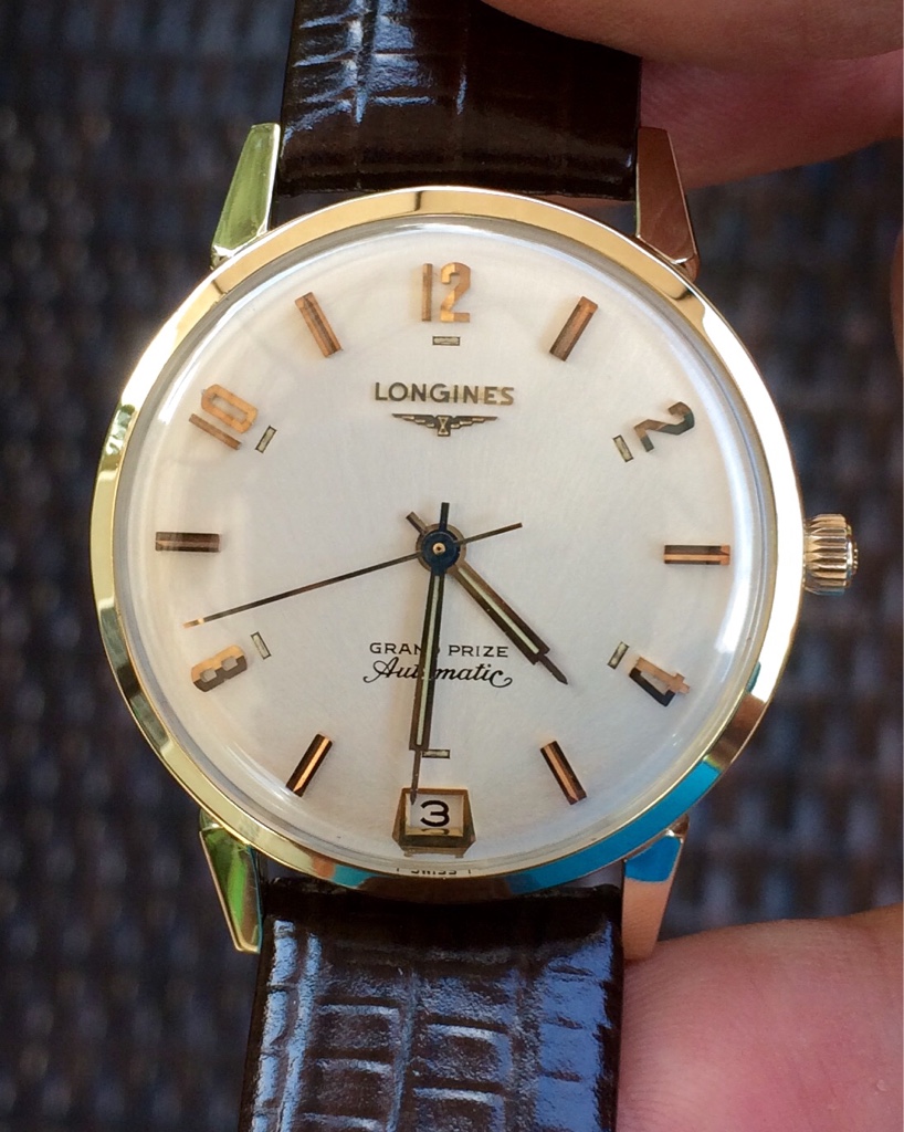
The script in 'Automatic' makes me suspicious, too; might need more examples to compare it to...

I've seen some slight variation in the extend of the 'swirl' upwards in dials considered original, but yours has significantly less 'swirl' than I've seen. Also, 'Automatic' doesn't look to be aligned straight to me...

Here's mine:

Edited:
 
Posts
17
Likes
6
The script in 'Automatic' makes me suspicious, too; might need more examples to compare it to...

I've seen some slight variation in the extend of the 'swirl' upwards in dials considered original, but yours has significantly less 'swirl' than I've seen. Also, 'Automatic' doesn't look to be aligned straight to me...

Here's mine:

That Grand Prize is a beauty and thanks for your thoughts on this. It's good to see your example with the swirl around the end. Looks like there may be other variations other than those that have been shown in the sticky.

To be honest I really don't know what to think now. I am feeling though that it may be leaning more towards a non-original piece.
 
Posts
702
Likes
715
The script in 'Automatic' makes me suspicious, too; might need more examples to compare it to...

I've seen some slight variation in the extend of the 'swirl' upwards in dials considered original, but yours has significantly less 'swirl' than I've seen. Also, 'Automatic' doesn't look to be aligned straight to me...

Here's mine:


Here is my Ultra Chron chronometer which swirls both 'outwards' and 'inwards'. The swirl is outward when compared to the top ridge of the 'C', and closes into a loop.

It is a 1970s retailed in Japan.

 
Posts
271
Likes
251
Here is my Ultra Chron chronometer which swirls both 'outwards' and 'inwards'. The swirl is outward when compared to the top ridge of the 'C', and closes into a loop.

It is a 1970s retailed in Japan.

What a beauty!
 
Posts
17
Likes
6
Here is my Ultra Chron chronometer which swirls both 'outwards' and 'inwards'. The swirl is outward when compared to the top ridge of the 'C', and closes into a loop.

It is a 1970s retailed in Japan.

Very nice looking timepiece and a great learning opportunity as well. I guess I'll be more careful in my next acquisition and ask all the experts here first before pulling any triggers.
Thanks everyone.
 
Posts
12,540
Likes
16,894
I lean to original.

However, you need to see it in person to make a determination for sure.
gatorcpa
 
Posts
702
Likes
715
C clift
Very nice looking timepiece and a great learning opportunity as well. I guess I'll be more careful in my next acquisition and ask all the experts here first before pulling any triggers.
Thanks everyone.
From what i've read, especially ulackfocus' sticky, the facts are that the 'c' must have been different for each era. The All Guard above was a very early example. For the lack of a better word, maybe the 'c' has strayed and curved more and more throughout the years. Both the Grand Prize and my Ultra Chron are probably later examples (well, mine is 1970, and invoiced August 1970 as told by Longines department) and i suspect your Admiral must be a later example. I still stick by my view that it is fully original. The crown is worn and I am assuming that is the Longines signature that is wearing off, which is a shame if you are particular about crowns like me.
 
Posts
17
Likes
6
From what i've read, especially ulackfocus' sticky, the facts are that the 'c' must have been different for each era. The All Guard above was a very early example. For the lack of a better word, maybe the 'c' has strayed and curved more and more throughout the years. Both the Grand Prize and my Ultra Chron are probably later examples (well, mine is 1970, and invoiced August 1970 as told by Longines department) and i suspect your Admiral must be a later example. I still stick by my view that it is fully original. The crown is worn and I am assuming that is the Longines signature that is wearing off, which is a shame if you are particular about crowns like me.

Great points made and you could be right about this Admiral being later than the original 1968 estimate I received. Thanks for your thoughts on this and I'll hang on to it for a bit longer. Wondering if Longines themselves have a validation service available? Worth emailing them at the least to find out.

Much appreciated! 😀