- Posts
- 13
- Likes
- 0
jmega
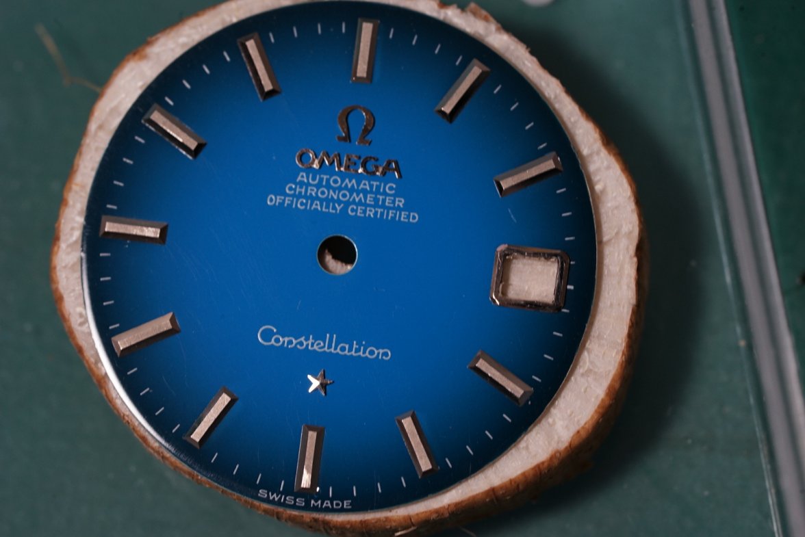
·I have just got this watch and am happy with it however just noticed the two minute markers on either side of the 12 o'clock marker don't seem to be perfectly in line. Is this a known issue with watches such as this? I have searched and found other examples with a similar issue but would like to know any expert opinions. Thanks!
t

t