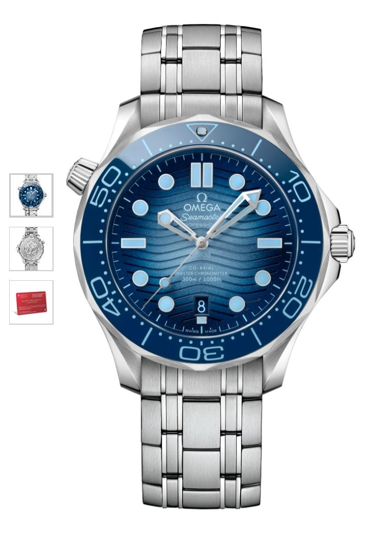
Omega Seamaster 75th Anniversary Leaked

Posts
91
Likes
91
In what way? Yes the Seamaster branding predates the Submariner model but both Rolex and Omega had waterproof watches in the 1930s, Rolex in the 1920s in fact which is what the Oyster branding is all about. Im not sure where you think the oneupmanship is?

I am totally surprised that we have Rolex fan boys on a Omega forum.

I actually despise Rolex, in the way I was personally treated and latterly stealing the Autism awareness logo.

Rolex boast 1953, however they were beaten by Blancpain. Omega state Seamaster since 1948… better ask them!
 
Posts
2,528
Likes
3,391
I’ve been struggling to articulate what it is about these all blue watches that bothers me, then it struck me.


Guess if you like rockin’ a Canadian Tuxedo, these would be perfect.

😉
 
Posts
9,931
Likes
15,596
I am totally surprised that we have Rolex fan boys on a Omega forum.

I actually despise Rolex, in the way I was personally treated and latterly stealing the Autism awareness logo.

Rolex boast 1953, however they were beaten by Blancpain. Omega state Seamaster since 1948… better ask them!

Rolex fan boy lol. I am actually flattered since many would consider me further down the Omega rabbit hole than is healthy so I'll take that. You are throwing out random dates for incomparables there. I already said why earlier but continue to witter all you like if it makes you happy. There is nothing particularly significant in Omega launching the Seamster label in 1948. It was a marketing first but not particularly a technical leap. As I said, many other waterproof watches had come before, many from Omega in fact.
 
Posts
654
Likes
1,031
Not really - Omega has done these gradient dials in the past as well...

Ok, fashion is a ciclycal system, but Omega nowadays is one step behind other brands.
 
Posts
318
Likes
1,963
IF I could perhaps turn this thread into a slightly different direction. I had a "meh" reaction at first to this release, HOWEVER, now that time has passed, I think there is a lot of OMEGA positive things to say. First, the use of the spectrum of blue colors tied to depth rating brings the entire Seamaster line into perspective and was very cool. The change to the 300 heritage, to add a ceramic versus aluminum bezel and non-contrasting sandwich dial lime, as well as the intro of resized pro-plof was very cool. And the ultra deep isn't a watch I'm likely to buy, but I liked everything about the thinking in the trench and the whimsical black light "Omega was here..." move.
 
Posts
153
Likes
193
I'll look at these in person but none really call to me, not like the green SMP from last year. I mean, maybe if I hadn't bought the green, I'd likely be a little more interested.


I read on the Omega website:

"A blue ceramic bezel with a Summer Blue enamel (Grand feu) diving scale encircles the dial . . . "

The diving scale is the numbers, etc. on the insert, correct?
I love my black SMP and I agree this reference does not motivate me to open the wallet. I do wonder if I didn’t own one already and purchased this reference would the trendy color design get old and tired after a while and go from summer blue to bummer blue….
 
Posts
2,528
Likes
3,391
IF I could perhaps turn this thread into a slightly different direction. I had a "meh" reaction at first to this release, HOWEVER, now that time has passed, I think there is a lot of OMEGA positive things to say. First, the use of the spectrum of blue colors tied to depth rating brings the entire Seamaster line into perspective and was very cool. The change to the 300 heritage, to add a ceramic versus aluminum bezel and non-contrasting sandwich dial lime, as well as the intro of resized pro-plof was very cool. And the ultra deep isn't a watch I'm likely to buy, but I liked everything about the thinking in the trench and the whimsical black light "Omega was here..." move.

And you lose the lumed bezel on the 300 Heritage along with the iconic orange hand on the PloProf. All in all, while there are good aspects of all of these watches, I don’t think any one nailed it from a design point. Just making everything a different shade of blue is about as exciting as making your kitchen all white.
 
Posts
153
Likes
193
And you lose the lumed bezel on the 300 Heritage along with the iconic orange hand on the PloProf. All in all, while there are good aspects of all of these watches, I don’t think any one nailed it from a design point. Just making everything a different shade of blue is about as exciting as making your kitchen all white.
LOL. The hot trend is color, some love it and some stay away from it. I tend to be conservative about color…regular old black, or dark blue, or silver. They work with basically all clothing choices, and they tend to blend in a complimentary way vs. screaming from your wrist. To each their own, that’s just me, but hot trends come and go so I prefer more staying power with timeless choices on expensive luxury goods. No judgement on anyone though who likes a color you can see when orbiting Earth! 😀
 
Posts
160
Likes
181
2220.80.00 is the best blue SMP IMHO. I had the black SMP and even thought it was gorgeous. The bezel was OTT. The aluminium bezels just feel better
 
Posts
5,298
Likes
18,387
Color in, color out...


So yesterday..,


And finally...


All in all, nice to have options.
 
Posts
2,528
Likes
3,391
LOL. The hot trend is color, some love it and some stay away from it. I tend to be conservative about color…regular old black, or dark blue, or silver. They work with basically all clothing choices, and they tend to blend in a complimentary way vs. screaming from your wrist. To each their own, that’s just me, but hot trends come and go so I prefer more staying power with timeless choices on expensive luxury goods. No judgement on anyone though who likes a color you can see when orbiting Earth! 😀

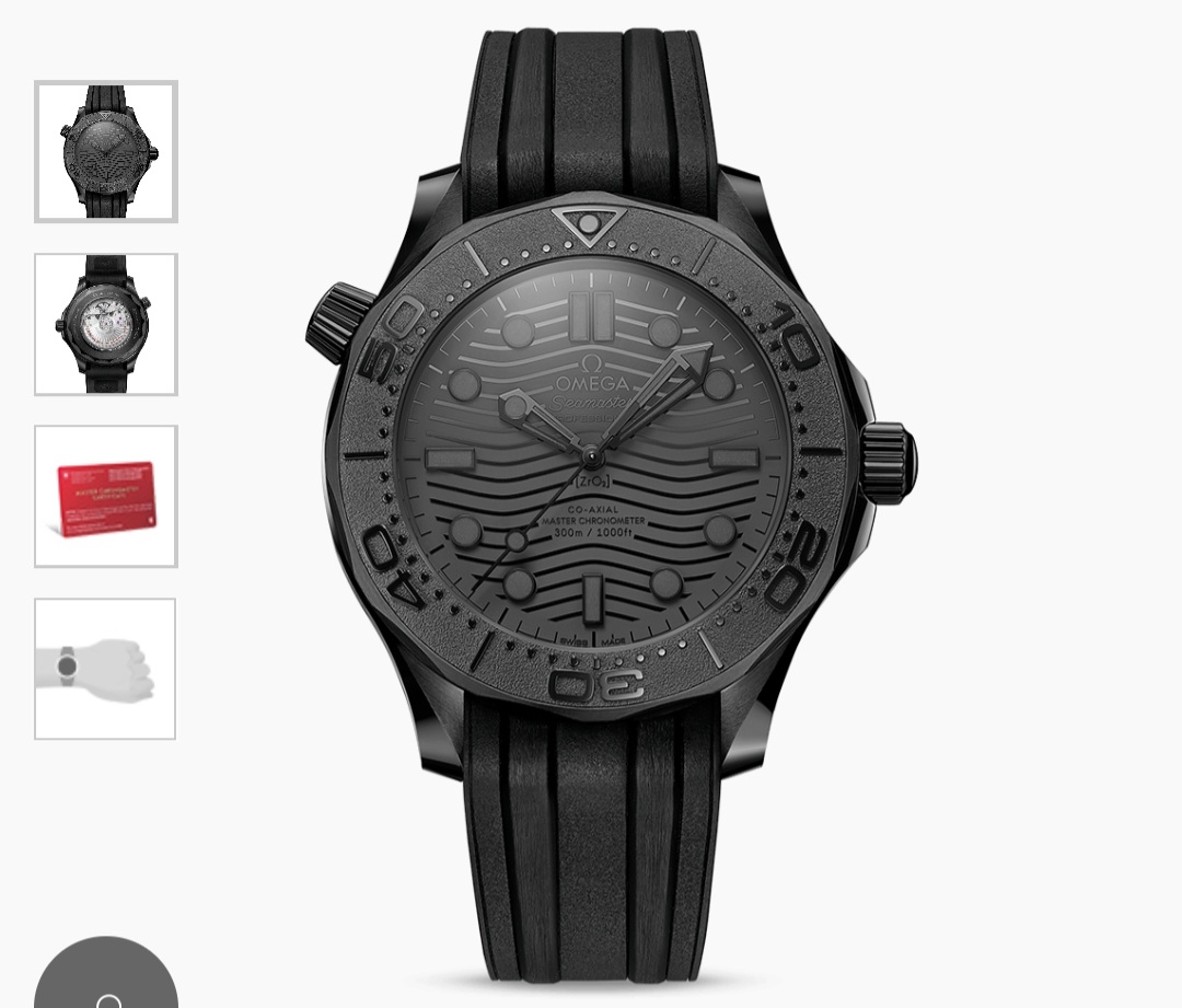
To clarify, it’s not the color that bothers me, but the monochromatic color. I appreciate different colored dials and bezels, but having the same color everywhere (indices, text, dial, bezel) is just … blah. And I also don’t like the monochromatic black ceramic Seamaster either. I can appreciate it is a “style” but I’d rather have some contrast.

For example, on the 75th Anniversary PLO-Prof. Imagine if they had just kept the orange minute hand and bezel release. That would have popped!

And for the Seamaster 300 heritage — what if the indices and bezel lettering was just white instead of blue. I’ve seen a few pictures of the Pro model and the 300 heritage in direct sunlight and it is hard to differentiate the markers and hands from the dial.
 
Posts
2,833
Likes
3,877
I love my black SMP and I agree this reference does not motivate me to open the wallet. I do wonder if I didn’t own one already and purchased this reference would the trendy color design get old and tired after a while and go from summer blue to bummer blue….
That’s the issue with comparing. Black is always going to be timeless, which is why I bought mine. If you were choosing between or selling Black to buy the 75th Blue then I could understand the potential anxiety long term. If you had both though, neither would ever feel old.

I have Black and potentially getting the new one to alternate between. Happy days!
Edited:
 
Posts
64
Likes
258
I don’t mind the look. Bummer about the size of the SMP staying at 42. Will still be intrigued to see it in person though.
 
Posts
1,438
Likes
2,211
I don’t mind the look. Bummer about the size of the SMP staying at 42. Will still be intrigued to see it in person though.

Agree.

I could never get mine to fit properly, despite the fact that I can pull off watches like the MM300 and Sinn U1/UX without issues. Def easier on rubber than steel, but still.

A 40mm SMP Diver that's a bit thinner with a more comfortable bracelet and an actually useable bezel would tempt me back to the field.
 
Posts
153
Likes
193
To clarify, it’s not the color that bothers me, but the monochromatic color. I appreciate different colored dials and bezels, but having the same color everywhere (indices, text, dial, bezel) is just … blah. And I also don’t like the monochromatic black ceramic Seamaster either. I can appreciate it is a “style” but I’d rather have some contrast.

For example, on the 75th Anniversary PLO-Prof. Imagine if they had just kept the orange minute hand and bezel release. That would have popped!

And for the Seamaster 300 heritage — what if the indices and bezel lettering was just white instead of blue. I’ve seen a few pictures of the Pro model and the 300 heritage in direct sunlight and it is hard to differentiate the markers and hands from the dial.
Can’t disagree with this. That’s why I chose the black SMP…the contrast of the white indices on black just looks so great to me and makes it very easy to read in any light conditions….even without my reading glasses.
 
Posts
1,189
Likes
2,231
That's why the green works for me; the contrast. Stark white against dark green. It helped that if was a new color.
 
Posts
153
Likes
193
That’s the issue with comparing. Black is always going to be timeless, which is why I bought mine. If you were choosing between or selling Black to buy the 75th Blue then I could understand the potential anxiety long term. If you had both though, neither would ever feel old.

I have Black and potentially getting the new one to alternate between. Happy days!
Nice! Strangely what I do really like on this new model is the Poseidon case back. Don’t know why either, just drawn to it. Would love it on my current black SMP vs. the transparency for viewing the 8800….since not a lot of it is visible anyway.
 
Posts
153
Likes
193
That's why the green works for me; the contrast. Stark white against dark green. It helped that if was a new color.
I was really torn about the green vs. black…it’s a great shade of green that almost looks black in some light. I think Omega totally nailed that color!