Omega Seamaster 600 redial or not?
Aroxx
··Sets his watchX350 XJR
··Vintage Omega AficionadoWhat is it about the dial you think is off?
Davidt
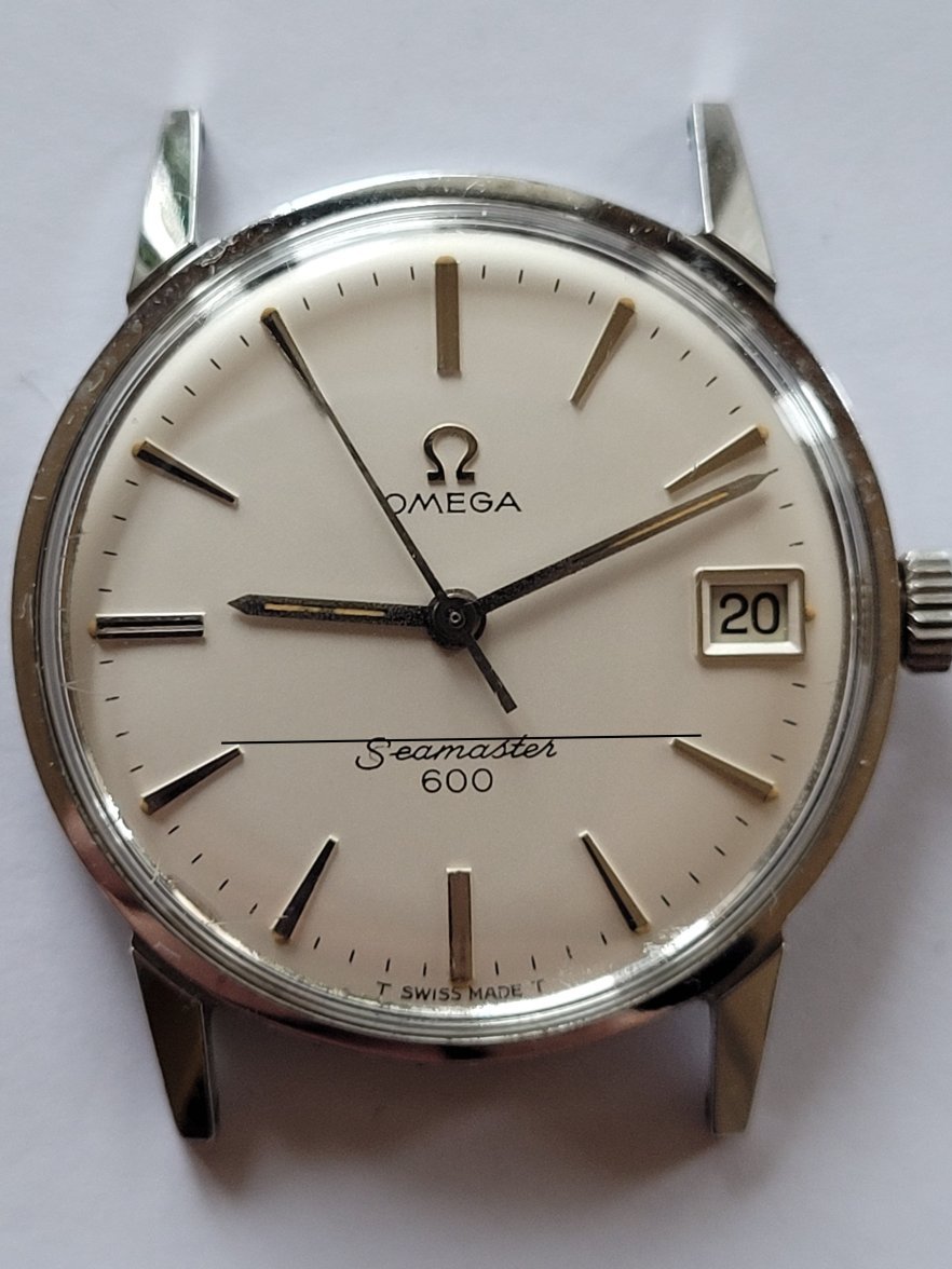
·Some of the minute markers looking mis aligned but I think that’s the angle and shadow. I vote original.
Shabbaz
·Dont see anything wrong
__ryan__
·This one is tough, but there's something about the text that bothers me.
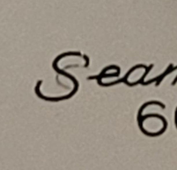
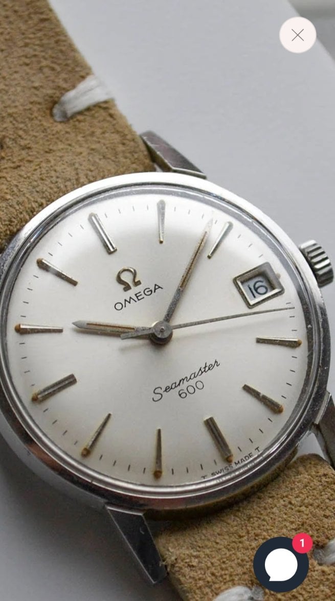
From the serial number, it dates to ~1965. I looked up another 135.012 in the 22M range, given below. It's a pretty ratty dial, but that gives me some confidence that it's original. As you can see, the text placement on the OP watch looks to be quite a bit higher on the dial. The faint mark beneath the leading "S" might be the previous text, positioned lower.
The "Seamaster" text on the OP watch also appears to exhibit some differences. The loop in the first "e" looks to be more closed, and it has a point on the right hand side. The font might also be a bit heavy.
Then again, there were variations in font over the years. I was hoping to eliminate that by finding an example with a similar serial. Difficult to say, but I suspect a redial, unfortunately.
hoshimachi
·This one is tough, but there's something about the text that bothers me.
From the serial number, it dates to ~1965. I looked up another 135.012 in the 22M range, given below. It's a pretty ratty dial, but that gives me some confidence that it's original. As you can see, the text placement on the OP watch looks to be quite a bit higher on the dial. The faint mark beneath the leading "S" might be the previous text, positioned lower.
The "Seamaster" text on the OP watch also appears to exhibit some differences. The loop in the first "e" looks to be more closed, and it has a point on the right hand side. The font might also be a bit heavy.
Then again, there were variations in font over the years. I was hoping to eliminate that by finding an example with a similar serial. Difficult to say, but I suspect a redial, unfortunately.
Did/Does Omega stamp their logo on the dial all at once?
If not, couldn't there be some variations of spacing due to human error?
hoshimachi
·The weird mark within the "S" looks like a half-deleted "S"
The Seamaster font also seems a little off to me.... it's a little too thick and crisp.
I think the dial was not completely covered before a redial. But I may very well be wrong.
If this is a redial, it's very well done.
The Seamaster font also seems a little off to me.... it's a little too thick and crisp.
I think the dial was not completely covered before a redial. But I may very well be wrong.
If this is a redial, it's very well done.
Davidt
·I still think it’s original. Things weren’t perfect in the 60’s and QC wasn’t what it is today. Look at the overall condition of the watch. These SM600’s tend to hold up pretty well and it doesn’t look like one that’s been trashed and would need a redial.
the font is bang on and even has perfectly aged lume dots at the end of each hour marker. Very few people can reapply lume this well to match a vintage dial and would someone really go to all that effort for a £500 watch?
Still original for me and natural variation explains the slight issues.
the font is bang on and even has perfectly aged lume dots at the end of each hour marker. Very few people can reapply lume this well to match a vintage dial and would someone really go to all that effort for a £500 watch?
Still original for me and natural variation explains the slight issues.
hoshimachi
·I still think it’s original. Things weren’t perfect in the 60’s and QC wasn’t what it is today. Look at the overall condition of the watch. These SM600’s tend to hold up pretty well and it doesn’t look like one that’s been trashed and would need a redial.
the font is bang on and even has perfectly aged lume dots at the end of each hour marker. Very few people can reapply lume this well to match a vintage dial and would someone really go to all that effort for a £500 watch?
Still original for me and natural variation explains the slight issues.
I wonder if there will come a day when "refinishing" gets skillful to a point that even experts can't tell a difference.
I wonder if such a day (if it comes) will mark bliss or doom. Safe-queen collectors would probably hate it, but the average-folk would love it I feel.
Ome
·Davidt
·I wonder if there will come a day when "refinishing" gets skillful to a point that even experts can't tell a difference.
I wonder if such a day (if it comes) will mark bliss or doom. Safe-queen collectors would probably hate it, but the average-folk would love it I feel.
I think average folk won’t care, most normal people are perfectly happy with decent enough redials.
1:1 (or very close) repros are already available for certain parts of some watches. I don’t hit this ever extending to all males and models as the financial reward simply isn’t there.
hoshimachi
·I think average folk won’t care, most normal people are perfectly happy with decent enough redials.
1:1 (or very close) repros are already available for certain parts of some watches. I don’t hit this ever extending to all males and models as the financial reward simply isn’t there.
Just for clarification,
I meant "average" as in the average Omegaforums member.
Now that I think about it, being on this forum is not "average" haha.
Shabbaz
·I wonder if there will come a day when "refinishing" gets skillful to a point that even experts can't tell a difference.
Anyway, I still dont see any problems with this watch. I had so many 600's in my life it would be funny I still can not see the difference between a original and a refinished one.


