Omega 2531.80.00 Thin Writing

Posts
2
Likes
0
Hey All

I recently picked up a Seamaster 2531.80.00, a watch i have always wanted but could not afford until a found a deal on ebay that was within my budget. Everything in the photos looked 100%, watch had correct serial number and everything else checked out. the seller had heaps of good feedback selling similar watches.

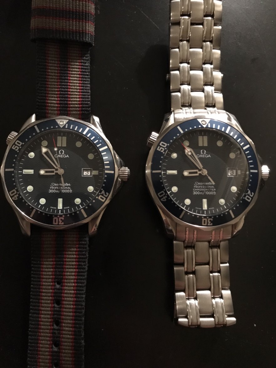
But when i got it i noticed the writing on the dial is slightly thinner than my 2541.80.00 (that i know is genuine)


I also searched a few images online and found that the omega logo placement on the thin writing version is dead centre in the peak of a wave on the dial. while on the other one the logi is halfway through a background wave,
i have found images of both variations, but alot less of the thinner wirting one,

does any one have any idea or explination for these vatriations ? do i have a fake or a redialed watch?
 
Posts
2,037
Likes
5,439
I'll make an entirely speculative suggestion - one has an auto movement, the other a quartz, so possibly slightly different dials due to integration with the different movements.

@Archer will probably know if this is the case 馃槈
 
Posts
28,236
Likes
72,368
does any one have any idea or explination for these vatriations ? do i have a fake or a redialed watch?

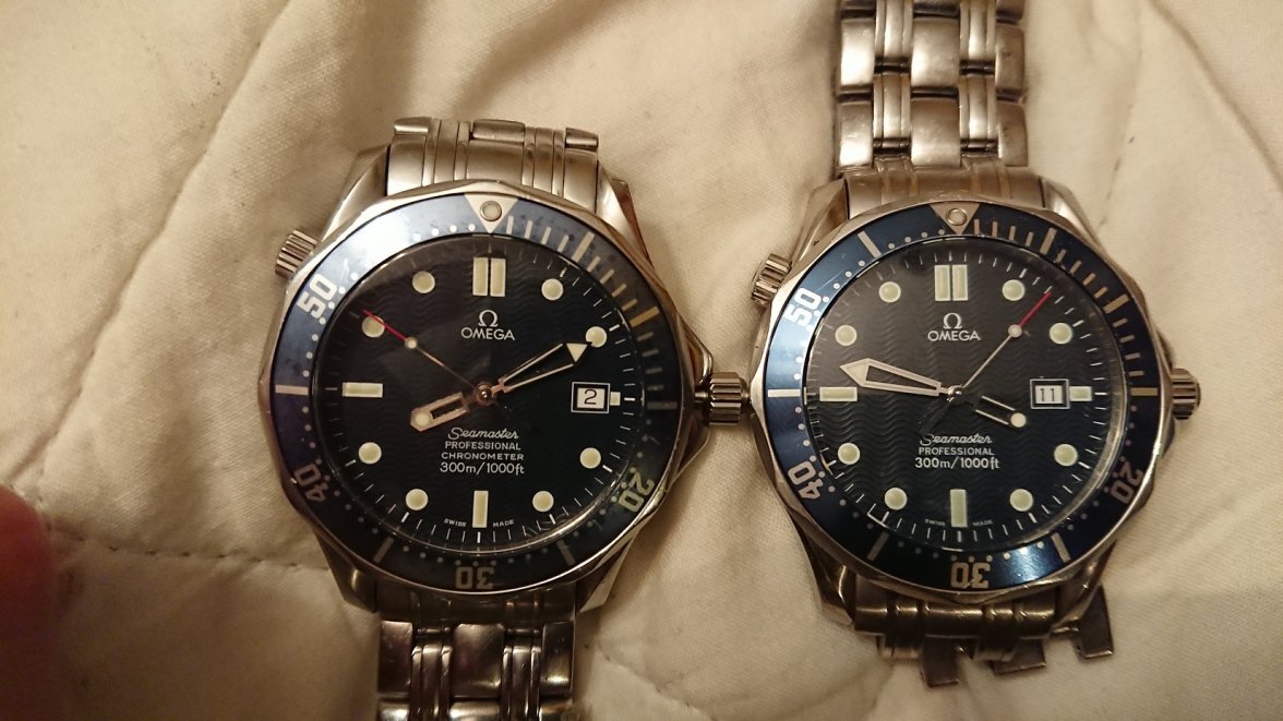
If I correct the colour on your photo for white balance, it looks like the lume plots on the 25318000 are slightly yellow - is that what they are like in real life?

If so, I think the difference you are seeing is related to the era that the dial was made in. Looking at photos of some of the 25318000's that I've serviced, the tritium dial models seems to have slightly thinner printing on the dial than the later luminova dials do.

Of course you are comparing 2 completely different dials in person, because one is for a quartz watch and the other for a Cal. 1120, but it does appear that there are some minor differences in the fonts on the mechanical watches.

Otherwise the watch looks fine to me, but if you want to PM me the serial number I'll just double check it for you against the model it should be.

Cheers, Al
 
Posts
9,982
Likes
15,663
As the oracle says above, if one is pre 1997 then it will have the earlier tritium lume dial which has a subtly different font to the later S-L lume version, The tells are the shape of the 3 in '300m' which is symmetrical on one and not the other including other small details inc the shape of the f in 'ft'. I can't remember which is which from memory, but if I had to guess I would say the LHS watch is tritium and thus pre-1997

It would, as noted above, be more of a meaningful comparison if both were the same model but it is usually pretty easy to tell in real life, the ones with beiger dial plots tend to be tritium, the SL plots stay pale green. Interestingly the hands seem to fade less, whatever the lume material.
 
Posts
2,037
Likes
5,439
I also notice the date window on the quartz is placed slightly closer to the centre of the face and has a slightly bigger lume plot at the 3 o'clock position - presumably dictated by the movement design.
 
Posts
333
Likes
784
This is the font on an two year old service replacement dial.

 
Posts
2
Likes
0
OWa OWa
This is the font on an two year old service replacement dial.


Thanks for all the answers guys. because the watch is in the 800XXXX serial range i have a feeling it is more likley to be a replacment dial (like the poster above) than an older tritium one.

did they change back to thinner writing in the new replacemnt dials ?
 
Posts
52
Likes
192
There have always been very minor variations in the dials on this model - dial script appearance, wave positioning, wave 'depth', matt/shiny dial/lume etc etc.

It is certainly a genuine and correct dial, and judging from the lume 'hue' I would say it is original to the watch. I think it left the Omega factory like this.

I have three 2531.80s, all from a similar era and all original parts. Minor differences between the dials are readily observable (production variations? different factories or printing machines?). I really wouldn't read too much into it, seeing minor differences between your 2531 and 2541 certainly does not mean that either has had a replacement dial. In the past I have owned a year 2000 2531 that had never been opened - this had the thinner script and the wave pattern peak aligned with the Omega logo. You are absolutely right - it is more rare to observe this variant but I see that as a nice thing!

Enjoy it!
 
Posts
135
Likes
115
My two. The 2541 print looks slightly bolder than the 2531.