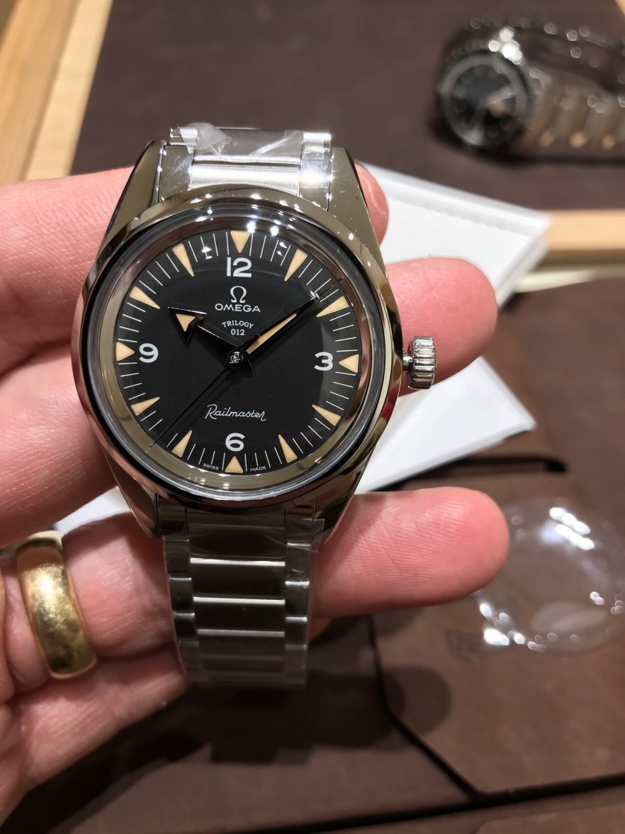
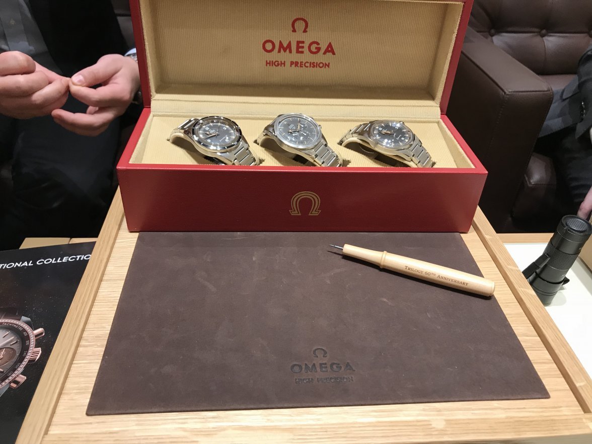
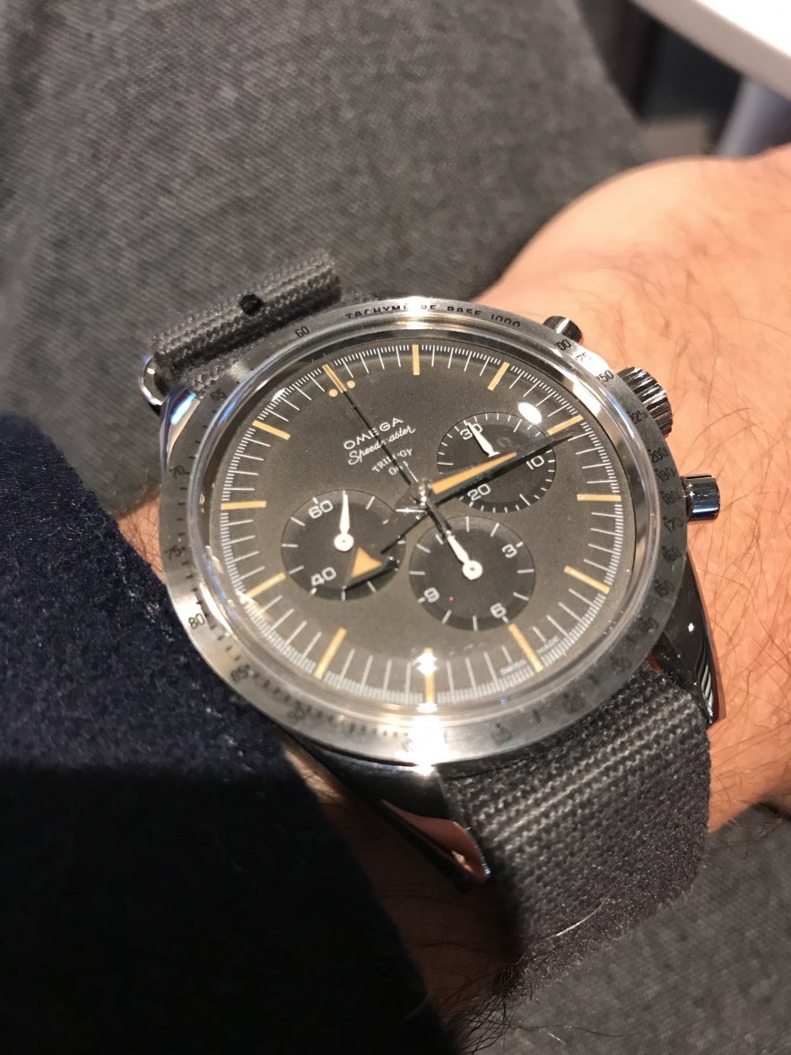
OMEGA 1957 Trilogy Limited Editions – Railmaster, Seamaster 300, Speedmaster’57

Posts
639
Likes
1,416
I personally think it matters not a single jot which of these supposedly different dial fonts you have. This sort of thing matters on a watch from 40 years ago if it can be used to detect a redial or fake. The 60th Anni reissue is not a direct copy of any earlier watch. If it were it would use a different movement (the 321), different lume material (tritium), plain caseback engraving etc etc so whether they choose to build them with a slight variation in dial due presumably to 2 suppliers or whatever isn't a biggie in the grand scheme of things to my mind.

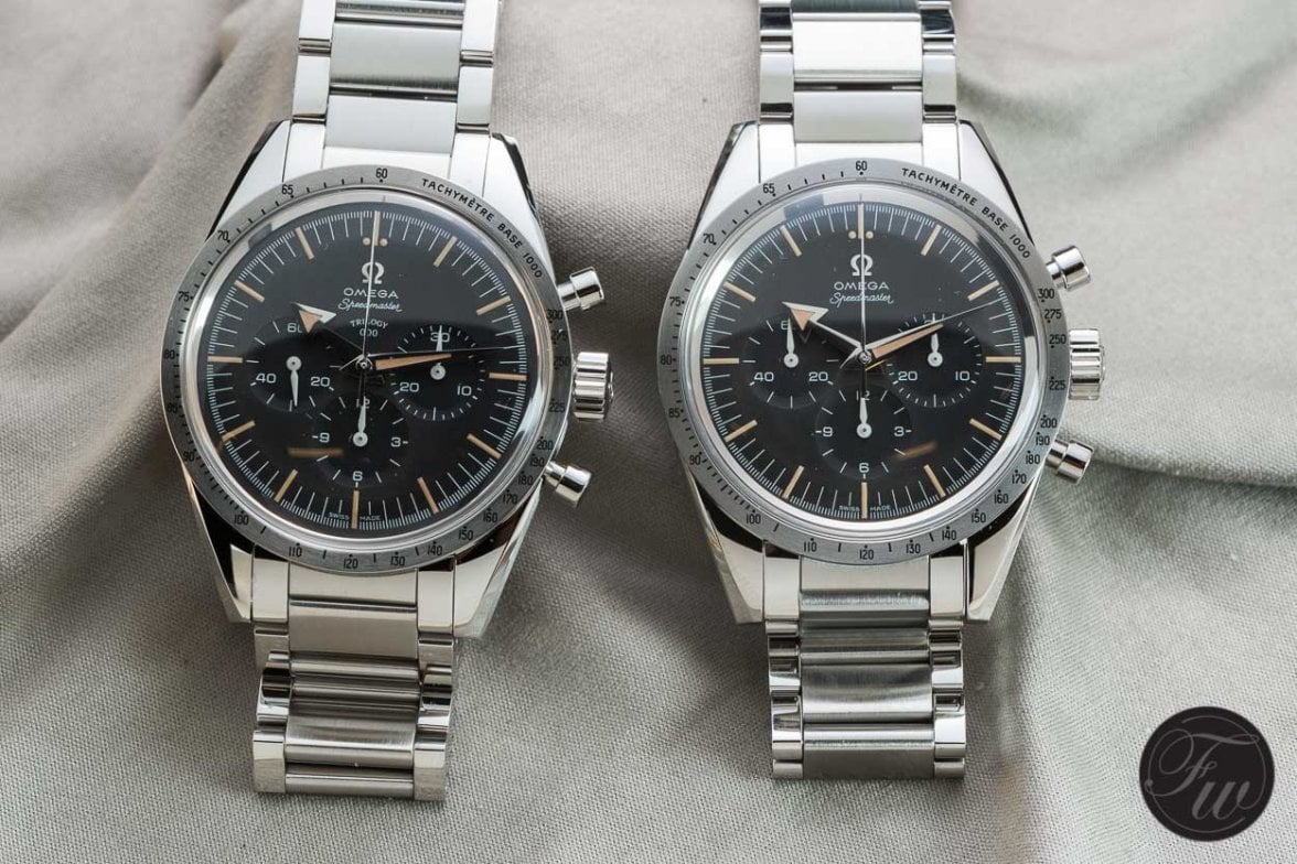
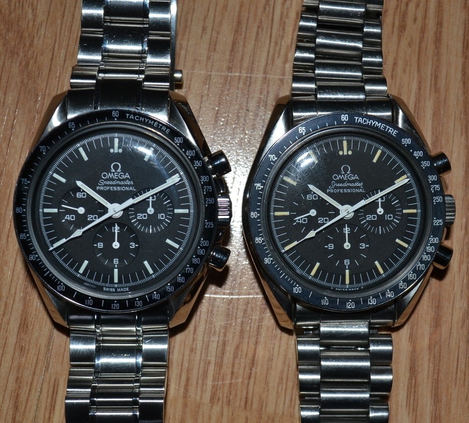
In 1957 they used radium not tritium. Collectors love to spot these slight differences. Check out the regular speedmaster (left) and the different font used on the 1989 20th anniversary edition.
 
Posts
206
Likes
737
Well we don’t know if these different dial fonts are just a part of a plan from Omega. Remember that the 2915-1 came with 2-3 different dial fonts.
 
Posts
234
Likes
248
I personally think it matters not a single jot which of these supposedly different dial fonts you have. This sort of thing matters on a watch from 40 years ago if it can be used to detect a redial or fake. The 60th Anni reissue is not a direct copy of any earlier watch. If it were it would use a different movement (the 321), different lume material (tritium), plain caseback engraving etc etc so whether they choose to build them with a slight variation in dial due presumably to 2 suppliers or whatever isn't a biggie in the grand scheme of things to my mind.

I don't think so, because we are talking about a new watch. It's like buying a new car. You can expect to get what you ordered.
Edited:
 
Posts
234
Likes
248
Well we don’t know if these different dial fonts are just a part of a plan from Omega. Remember that the 2915-1 came with 2-3 different dial fonts.

Well, they should have told us something about their "part of a plan". There are no type 2 dials in any official ad.
 
Posts
9,557
Likes
15,071
In 1957 they used radium not tritium. Collectors love to spot these slight differences. Check out the regular speedmaster (left) and the different font used on the 1989 20th anniversary edition.
True but I think you are missing my point in that it doesn't really matter in this case. The watch is not an exact copy of anything so no font version is right or wrong (to quote nerdbedusa who has stated that there is a 'wrong' version). There is variation in the quality of lume application too (as is obvious from some of the shots on this very thread) and perhaps the original supplier was fired as some of the indices are decidedly wobbly. There were major dial issues with the Speedy Tuesday which took months to resolve. Perhaps there were similar with the 60th which meant that 2 suppliers or 2 designs were used. As I say, on a new watch what does it matter. If everyone with wobbly lume on their 60th regardless of font complained, a big chunk of watches would be going back. Chill out and enjoy it for what it is, not beat it up for what it isn't.
 
Posts
234
Likes
248
True but I think you are missing my point in that it doesn't really matter in this case. The watch is not an exact copy of anything so no font version is right or wrong (to quote nerdbedusa who has stated that there is a 'wrong' version). There is variation in the quality of lume application too (as is obvious from some of the shots on this very thread) and perhaps the original supplier was fired as some of the indices are decidedly wobbly. There were major dial issues with the Speedy Tuesday which took months to resolve. Perhaps there were similar with the 60th which meant that 2 suppliers or 2 designs were used. As I say, on a new watch what does it matter. If everyone with wobbly lume on their 60th regardless of font complained, a big chunk of watches would be going back. Chill out and enjoy it for what it is, not beat it up for what it isn't.

True but I think you are missing my point in that it doesn't really matter in this case. The watch should be an exact copy of the one that was advertised.

A 'wrong' dial is just wrong, as long as it does not look like the one that was officially offered and shown by OMEGA.

We are living in 2017, not in 1957.
 
Posts
9,557
Likes
15,071
True but I think you are missing my point in that it doesn't really matter in this case. The watch should be an exact copy of the one that was advertised.

A 'wrong' dial is just wrong, as long as it does not look like the one that was officially offered and shown by OMEGA.

We are living in 2017, not in 1957.
So sell up and move on, you may even make money on it but I don’t see how complaining about it and telling people that theirs is wrong in some way helps you or anyone else. If you spotted the font difference then bravo, kudos for your powers of observation but beyond that I kind of think ‘so what’.
 
Posts
234
Likes
248
Ok. 'So what' do you want to tell me or us with your statement?

Would you accept a new car that comes with the 'wrong' colour? Would you just say 'so what'?
 
Posts
9,557
Likes
15,071
Ok. 'So what' do you want to tell me or us with your statement?

Would you accept a new car that comes with the 'wrong' colour? Would you just say 'so what'?
If you honestly think that the microscopic differences in font weight you are getting hot under the collar about are analogous to a different colour on a car order then there is probably no point in me debating it further with you since you have lost perpective IMO. You are clearly determined to maintain that some of these are right and some are wrong. What do you propose anyone does about it?
 
Posts
234
Likes
248
That's not so difficult. If I had a Speedy LE with a 'wrong' dial, I would ask my friendly dealer to order and mount a matching one.

Wish I could do that for some 2915 projects here...😉
 
Posts
9,557
Likes
15,071
That's not so difficult. If I had a Speedy LE with a 'wrong' dial, I would ask my friendly dealer to order and mount a matching one.

Wish I could do that for some 2915 projects here...😉
So your solution is a re-dial? Think about how ironic that sounds bearing in mind you have been moaning for the past 5 pages about originality or lack thereof. Your attention to detail is to be applauded but is probably better directed at a vintage watch rather than a brand new homage issue which as you have already said many times isn’t all that close a copy of the original. Maybe get the dealer to drop in a 321 movement while they are at it too.
 
Posts
234
Likes
248
So your solution is a re-dial? Think about how ironic that sounds bearing in mind you have been moaning for the past 5 pages about originality or lack thereof. Your attention to detail is to be applauded but is probably better directed at a vintage watch rather than a brand new homage issue which as you have already said many times isn’t all that close a copy of the original. Maybe get the dealer to drop in a 321 movement while they are at it too.

Yes. If it's a 'real dial', it's a 'real deal'... 😉

I guess the last words should be up to you. Have a nice day! 😀
 
Posts
392
Likes
483
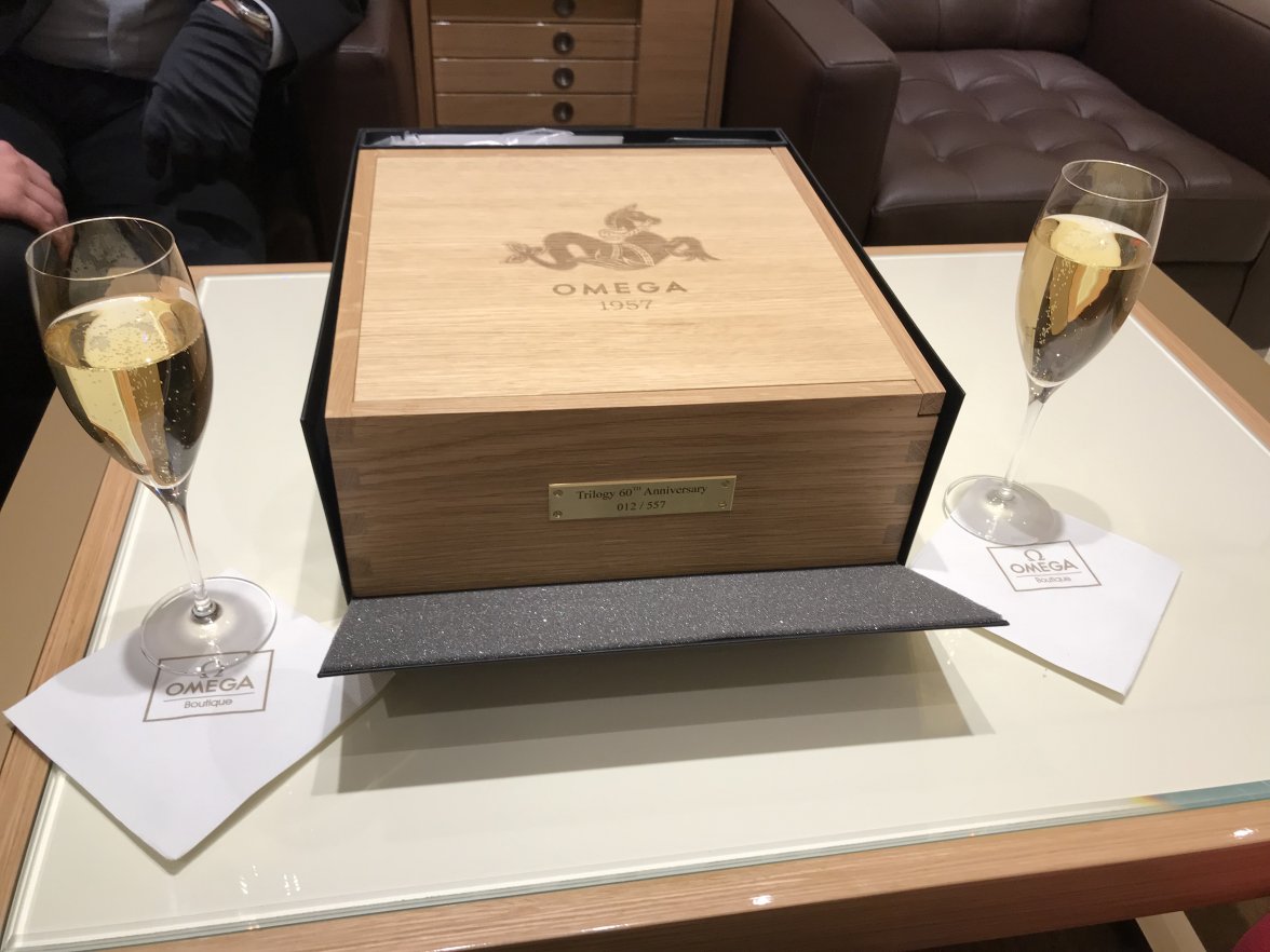
Taking delivery of #12; biggest surprise was the leather watch display pad on the underside of the box lid; very neat.
Lucky man. Hopefully getting one but who knows.
 
Posts
1,813
Likes
9,381
Yes. If it's a 'real dial', it's a 'real deal'... 😉

I guess the last words should be up to you. Have a nice day! 😀

Let’s see if I’ve got this straight:-

@Toishome has a short one which isn’t a right one but a wrong one.

The right one is in fact the wrong one so it should be left well alone.

The left one it seems is the right one and should be taken home.

“G”: it’s a tough sort of game; sometimes too short and others too long, but surely these aren’t just grounds for a Nerd to bemoan.

Whatever. My Raildial is the real dial
and that sir is the long or rather short of it!

This is the sort of confusion you get into when you have too much time on your “hands”.
 
Posts
192
Likes
185
Let’s see if I’ve got this straight:-

@Toishome has a short one which isn’t a right one but a wrong one.

The right one is in fact the wrong one so it should be left well alone.

The left one it seems is the right one and should be taken home.

“G”: it’s a tough sort of game; sometimes too short and others too long, but surely these aren’t just grounds for a Nerd to bemoan.

Whatever. My Raildial is the real dial
and that sir is the long or rather short of it!

This is the sort of confusion you get into when you have too much time on your “hands”.

And the unanswered question is: What do you call the part of the "G" that is long or short? 😀

It's too bad this dial/font discussion wasn't started in the "60th '57 Anniversary Speedmaster" thread so the Railmaster and Seamaster fans wouldn't be rolling their eyes.
 
Posts
1,874
Likes
8,063
So sell up and move on, you may even make money on it but I don’t see how complaining about it and telling people that theirs is wrong in some way helps you or anyone else. If you spotted the font difference then bravo, kudos for your powers of observation but beyond that I kind of think ‘so what’.
I, with due respect, don’t agree with your logic. It’s not proper, rather ridiculous to me.
 
Posts
1,874
Likes
8,063
And the unanswered question is: What do you call the part of the "G" that is long or short? 😀

It's too bad this dial/font discussion wasn't started in the "60th '57 Anniversary Speedmaster" thread so the Railmaster and Seamaster fans wouldn't be rolling their eyes.
Transparency dear, transparency. All Omega fans should know how meticulous Speedmaster fans are when it comes to observation skills. And how difficult it would be for Omega to satisfy such difficult nerds. And why not all Omega fans should know such a major controversy!